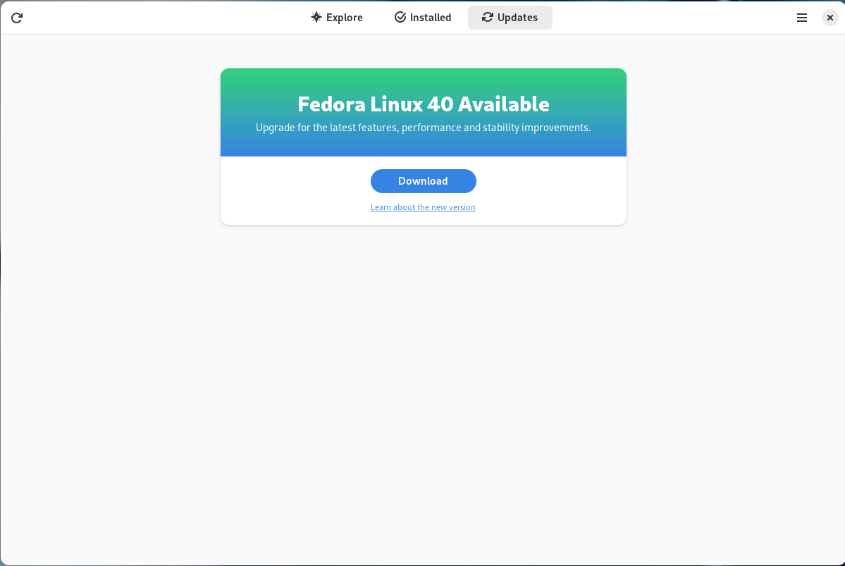
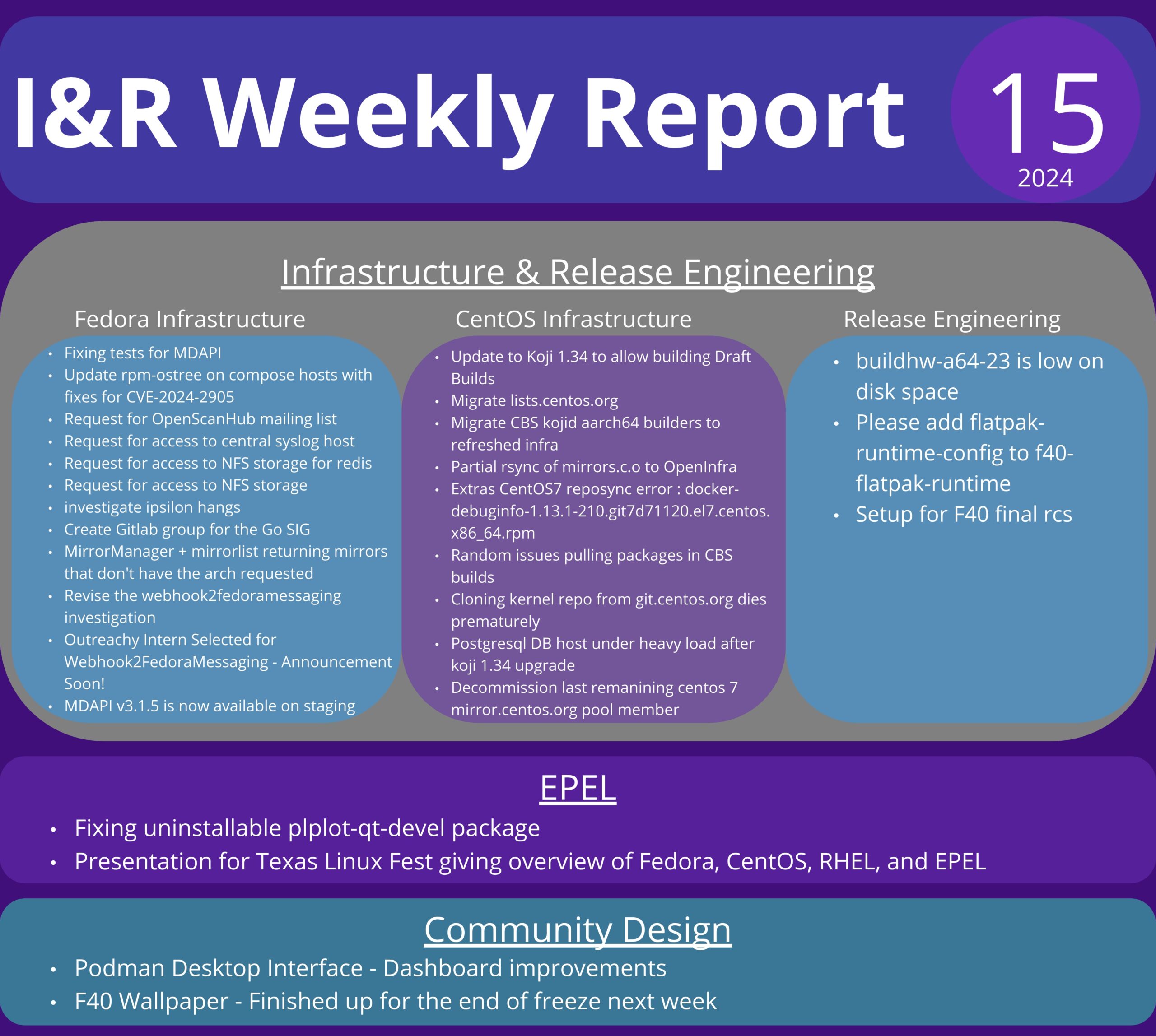
En ce mardi 23 avril, les utilisateurs du Projet Fedora seront ravis d'apprendre la disponibilité de la version Fedora Linux 40.
Fedora Linux est une distribution communautaire développée par le projet Fedora et sponsorisée par Red Hat, qui lui fournit des développeurs ainsi que des moyens financiers et logistiques. Fedora Linux peut être vue comme une sorte de vitrine technologique pour le monde du logiciel libre, c’est pourquoi elle est prompte à inclure des nouveautés.
Cette 40e édition propose principalement une mise à jour de son interface principale GNOME 46 et de son concurrent KDE Plasma 6 qui passe à Wayland par défaut au passage.
Expérience utilisateur
Passage à GNOME 46. Cette version se démarque par beaucoup d'améliorations pour son navigateur de fichiers nommé Fichiers. Il dispose dorénavant, en plus d'une recherche dans le dossier et sous-dossiers en cours, d'une recherche globale utilisable via le bouton dédié avec une icône de loupe ou par le raccourci clavier Ctrl+Shift+F
(contrairement à la recherche locale qui se fait via le raccourci Ctrl+F
). Il permet de chercher dans l'ensemble du répertoire utilisateur voire davantage selon les préférences de l'utilisateur.
L'icône de loupe prend place où était l'icône de progression lors des opérations sur les fichiers comme les décompressions ou la copie de fichiers. De fait ces opérations sont affichées en bas de la barre latérale ce qui permet d'afficher plus d'informations en un coup d’œil. L'application bénéficie en outre d'améliorations de performances en particulier pour afficher de gros dossiers avec des images ou lors du passage d'une vue liste à une vue par icônes et vice-versa. Plus de périphériques sur le réseau peuvent être découverts automatiquement permettant notamment de parcourir leurs fichiers.
GNOME prend en charge les comptes Microsoft OneDrive ce qui permet de facilement parcourir les fichiers sauvegardés avec ce service. Dans les comptes à distance, le protocole WebDAV est aussi pris en charge pour l'accès à des calendriers, listes de contacts et autres fichiers partagés. Pour l'authentification de ces comptes en ligne, le navigateur par défaut est utilisé dorénavant ce qui permet d'utiliser une plus grande diversité de moyens d'authentifications comme l'usage de périphériques USB dédiés.
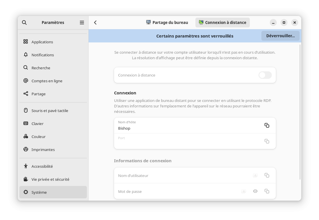
Pour les amateurs de la connexion distante, il est maintenant possible de se connecter à GNOME graphiquement à distance via le protocole RDP. Auparavant seulement une session ouverte pouvait être pilotée ainsi. Cette option est désactivée par défaut et nécessite des droits appropriés, tout se configure via le panneau de configuration tout comme le bureau distant.
En parlant du panneau de configuration, ce dernier a été amélioré en regroupant plusieurs configurations par sections afin d'améliorer la clarté de l'application. La liste des menus devenait particulièrement importante et rendait difficile la localisation des éléments à configurer. De plus, la configuration du pavé tactile a été améliorée pour permettre de choisir entre le clic dans un coin ou le clic à deux doigts pour réaliser l'équivalent d'un clic droit avec ce périphérique.
Côté accessibilité, le lecteur d'écran Orca a été modernisé pour le rendre plus performant, plus fiable et plus compatible avec les applications Wayland ou celles exécutées dans un bac à sable tel que Flatpak. Il est possible de couper temporairement Orca avec le raccourci clavier Ctrl+Alt+Shift+Q
ce qui est particulièrement utile en cas de conflit entre deux lecteurs d'écran ou si une application utilise du son aussi.
Les notifications dans GNOME indiquent par quelle application elles ont été émises. Il est maintenant possible d'étendre facilement la notification afin de pouvoir la visualiser en entier, utilisant une vue plus compacte par défaut.
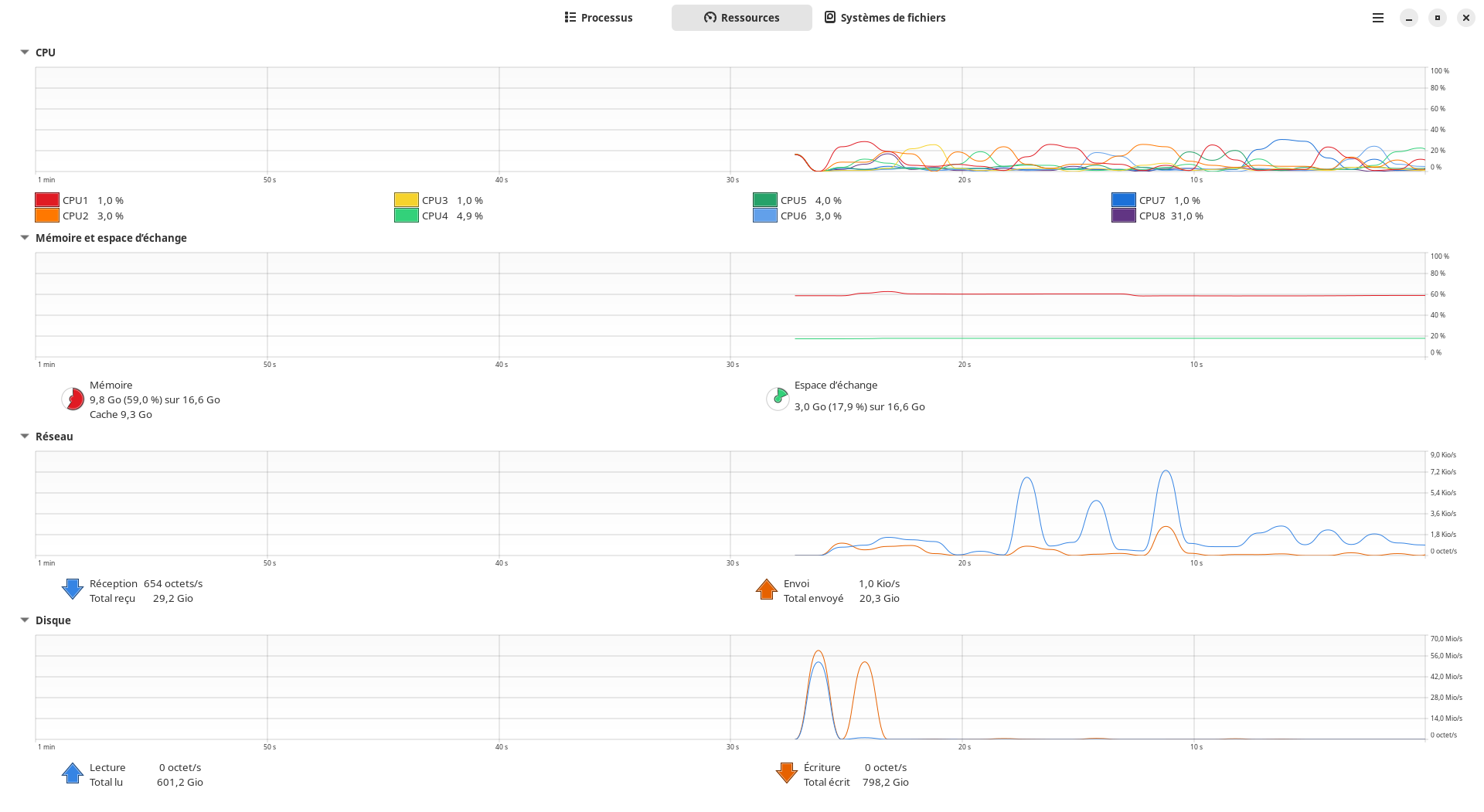
De manière plus générale, GNOME bénéfice d'améliorations de performances notamment pour son terminal, son moniteur système qui bénéficie aussi d'un graphe dédié aux entrées / sorties sur les espaces de stockage, pour l'enregistrement de l'écran, le visionneur d'images ou encore pour la recherche globale de GNOME. L'ensemble des applications GTK4 bénéficie d'un nouveau moteur de rendu qui améliore le rendu du texte mais aussi les performances.
L'environnement de bureau KDE Plasma change de version majeure avec sa nouvelle version 6. Au passage Plasma 6 utilise Wayland par défaut, et s'il était prévu de supprimer totalement la possibilité de l'utiliser avec X11 pour simplifier la maintenance, des volontaires ont permis de repousser l'échéance pour l'instant.
Sous le capot, cette version utilise la nouvelle bibliothèque majeure graphique qu'elle emploie à savoir Qt 6. C'était l'occasion par ailleurs de rationaliser les différentes couches techniques et APIs internes afin de supprimer ce qui n'était plus au goût du jour ou trop peu employé pour être maintenu.
Cette version propose la prise en charge partielle du rendu des couleurs en HDR pour les applications et matériel compatibles, mais aussi un profil de couleur spécifique par écran afin d'avoir un rendu fidèle des couleurs. Dans cette thématique pour les personnes souffrant de daltonisme ou d'autres formes de maladies dichromatiques peuvent utiliser des filtres pour améliorer la lisibilité des applications et de leur contenu.
Dans les changements plus classiques, la barre principale est par défaut en mode flottant comme pour beaucoup de docks d'autres environnement de bureaux ou systèmes d'exploitation. Il est bien sûr possible de changer tout cela dans les paramètres et plus encore concernant cette barre principale. Concernant l'affichage principal, l'effet cube en cas de changement de bureau virtuel est de nouveau disponible. Pour la capture d'écran, il est possible de choisir une zone arbitraire de l'écran, d'utiliser le codec VP9 pour les enregistrements vidéos et de choisir sa qualité.
Le thème par défaut de l'environnement nommé Breeze bénéficie d'un rafraichissement, il utilise moins de cadres et a un affichage un peu plus compact.
Comme pour GNOME, la recherche a bénéficié d'un effort important. En plus de permettre la conversion de fuseaux horaires ou de trier les résultats par type, les performances sont grandement améliorées : jusqu'à 200% plus rapide pour chercher des documents, jusqu'à 60% plus rapide pour trouver une application, le tout jusqu'à moins 30% d'usage du processeur. La recherche obtient les résultats pour les textes traduits dans votre langue ou en anglais pour les noms ou les descriptions d'applications par exemple.
Il est dorénavant possible de s'authentifier par mot de passe ou par empreinte digitale en même temps, il n'est plus nécessaire de forcer l'une des deux options.
Et tant d'autres changements encore.
Gestion du matériel
Fourniture de ROCm 6 pour améliorer la prise en charge de l'IA et le calcul haute performance pour les cartes graphiques ou accélérateurs d'AMD. Il concerne notamment les puces AMD Instinct MI300A et MI300X, et fournit de nouveaux algorithmes optimisés du mécanisme d'attention et de bibliothèques de communication. Il permet l'usage de flottant 8 bits pour gagner en consommation mémoire au détriment de la précision du modèle pour PyTorch et hipblasLT. Via la plateforme AMD Infinity Hub, il est possible d'obtenir des paquets prêts à l'usage pour certains travaux en IA ou calculs haute performance notamment pour les calculs scientifiques.
Passage à l'étape 2 de la prise en charge du noyau unifié nommée UKI (donc unifiant noyau, initrd, ligne de commande du noyau et signature) pour les plateformes avec UEFI mais rien ne change par défaut à ce sujet. L'objectif dans cette phase est de pouvoir démarrer sur de tels noyaux directement sans chargeur de démarrage intermédiaire, tout en offrant la possibilité de démarrer sur d'autres noyaux et de passer automatiquement au noyau suivant par défaut suite à une mise à jour. Les machines Aarch64 (ARM 64 bits) peuvent également s'en servir maintenant. Une image pour cette architecture et x86_64 doit également être fournie pour un contexte de virtualisation en étant basée sur ces fichiers kickstart.
Si vous souhaitez tester cela sur un système existant, vous pouvez installer les paquets virt-firmware
, uki-direct
avant d'exécuter le script sh /usr/share/doc/python3-virt-firmware/experimental/fixup-partitions-for-uki.sh
pour configurer les partitions proprement afin d'être découvrables par le système, puis enfin installer le paquet kernel-uki-virt
pour qu'il installe le noyau proprement avec la nouvelle méthode. Il est préférable de tester cela sur une machine virtuelle ou si vous savez ce que vous faites avec du matériel standard type ahci / nvme pour le stockage principal. Bien sûr ce travail reste expérimental et est réservé à ceux qui savent comment faire pour réparer le système en cas de problèmes.
Internationalisation
Le gestionnaire d'entrée de saisie IBus passe à la version 1.5.30. Les commandes pour lancer et relancer IBus fonctionnent depuis l'environnement Plasma Wayland dorénavant, et pour cet environnement aussi les préférences sont maintenant accessibles depuis le menu non contextuel.
Mise à jour de ibus-anthy 1.5.16 pour la saisie du japonais. Le principal changement est la conversion possible d'ère japonaise avec 2024.
Administration système
NetworkManager tente de détecter par défaut les conflits d'usage d'adresse IPv4 avec le protocole Address Conflict Detection (RFC 5227) avant de l'attribuer à la machine. En somme au moment de s'attribuer une adresse IP donnée, une requête ARP est envoyée au réseau concernant cette adresse. Si une réponse est obtenue, l'adresse est déjà utilisée et n'est donc pas exploitable sans perturber le réseau. Ce mécanisme existe pour les réseaux avec IP fixes ou même avec un serveur DHCP central car rien n'empêche la présence d'une machine configurée avec une IP fixe dans le réseau malgré tout. Si le réseau a un serveur DHCP et qu'un conflit est détecté, la réponse DHCPDECLINE sera envoyée pour obtenir peut être une autre adresse. En cas de conflit une erreur sera rapportée permettant à l'utilisateur de diagnostiquer le problème et d'y apporter une solution. Par défaut le système attendra 200 ms avant de décider qu'il n'y a aucune réponse. Pour l'IPv6 cela est inclus dans le standard RFC 4862 ce qui rend ce changement non nécessaire dans ce cas de figure.
NetworkManager va utiliser une adresse MAC aléatoire par défaut pour chaque réseau Wifi différent, et cette adresse sera stable pour un réseau donné. En effet, certains systèmes utilisent l'adresse Mac pour identifier les machines en déplacement de réseau en réseau permettant une pseudo géolocalisation ce qui nuit à la vie privée. Mais la méthode usuelle de changer d'adresse MAC aléatoirement à chaque connexion pose un problème en cas de réseau restreignant l'accès à certaines adresses MAC uniquement ou en changeant d'adresse IP à chaque reconnexion. Cette méthode est un compromis entre le respect de la vie privée et le confort d'utilisation. Cela est fait en ajoutant la configuration wifi.cloned-mac-address="stable-ssid"
dans le nouveau fichier /usr/lib/NetworkManager/conf.d/22-wifi-mac-addr.conf
.
Les entrées des politiques SELinux qui font référence au répertoire /var/run
font maintenant référence au répertoire /run
. Il y a dix ans déjà que le premier répertoire a bougé vers le deuxième chemin mais SELinux a gardé les vieilles règles en utilisant un lien d'équivalence entre eux pour permettre leur utilisation. Cependant certains outils comme restorecon
ne gèrent pas bien cette situation tout comme les administrateurs systèmes qui ne sont pas sûrs de comment écrire proprement de nouvelles règles. Pour résoudre le problème le lien d'équivalence passe de /run = /var/run
à /var/run = /run
.
L'outil SSSD ne prend plus en charge les fichiers permettant de gérer les utilisateurs locaux. Il pouvait exploiter les fichiers /etc/passwd
et /etc/group
via l'utilisation de l'option id_provider=files
. Cependant cette option n'est plus proposée par le projet officiel et n'était à l'époque conservée que pour permettre l'authentification via des cartes à puce ou l'enregistrement de sessions. Mais dans les deux cas il est possible de passer à la méthode proxy via l'option id_provider=proxy
pour le remplacer dans ces cas d'usage. Un guide officiel est proposé pour effectuer la conversion pour ceux qui en ont besoin.
DNF ne téléchargera plus par défaut la liste des fichiers fournie par les différents paquets. Jusqu'à présent il le faisait par défaut parmi d'autres métadonnées, mais cette information n'est en réalité nécessaire que dans certains cas précis qui ne concernent pas celui de la majorité des utilisateurs. Notamment pour quelques paquets ayant une dépendance envers un fichier particulier plutôt qu'un paquet donné ou si on cherche un paquet fournissant un fichier spécifique. Cela permet de réduire les ressources consommées chez les utilisateurs mais aussi au sein de l'infrastructure de Fedora car il n'est plus nécessaire de fournir ces données assez conséquentes de manière systématique.
L'outil fwupd pour mettre à jour les firmwares va utiliser passim comme cache pour partager sur le réseau local les métadonnées liées aux mises à jour disponibles pour les firmwares. Ce fichier qui représente environ 1 Mio est téléchargé quotidiennement parfois sur des liaisons coûteuses. Ainsi la pression est réduite sur les infrastructures notamment le CDN fwupd et la bande passante en utilisant localement la ressource quand elle est disponible. Passim utilise avahi pour signaler son service sur le réseau local qui est disponible via le port 27500 afin que les autres clients puissent identifier si des métadonnées sont disponibles localement.
Les systèmes Fedora Silverblue et Kinoite disposent de bootupd pour la mise à jour du chargeur de démarrage. Par conception les systèmes avec rpm-ostree comme ceux-ci n'ont pas le chargeur de démarrage qui se met à jour par ce biais car cela n'est pas une opération sûre. En effet, la mise à jour de ces systèmes repose sur le principe de transaction pour que le passage d'un état à un autre soit fiable, cependant ce mécanisme ne fonctionne pas bien pour le chargeur de démarrage qui est un composant distinct et critique. On retrouve la même problématique pour les systèmes utilisant un mécanisme de mise à jour basé sur une partition A et B et passant de l'un à l'autre. D'où la création de cet utilitaire qui est mis à disposition pour ceux qui le souhaitent, du moins pour les machines disposant d'un EFI. La mise à jour est pour le moment manuelle à la demande avec la commande bootupctl update
. La mise à jour automatique sera prévue dans le futur.
Le paquet libuser
est marqué en voie de suppression pour Fedora 41 alors que le paquet passwd
est supprimé. La bibliothèque libuser sert à cacher les différences entre les utilisateurs locaux et distants via le protocole LDAP. Mais la prise en charge de ce protocole reste incomplet et il n'y a pas de plan pour aller plus loin, comme sssd
peut la remplacer dans ce rôle, la décision de la supprimer prochainement de Fedora fait sens. Pour l'instant seuls les paquets usermode
et util-linux
en ont encore besoin. Le paquet passwd
quant à lui disparaît pour se débarrasser de la dépendance à libuser. La commande pour changer de mot de passe ne change pas, mais est fournie par le paquet shadow-utils
.
Le paquet cyrus-sasl-ntlm
a été supprimé. Le protocole d'identification NTLM n'est plus maintenu, au profit du protocole Kerberos et ce composant dans SASL n'est plus maintenu depuis des années justifiant une telle décision.
La gestion des droits utilisateurs pam_userdb passe de la base de données BerkeleyDB à GDBM. BerkeleyDB 5.x fourni par Fedora n'est plus à jour ce qui pose des soucis en terme de bogues et de sécurité, d'autant plus avec le rôle de PAM dans le système. La licence de BerkeleyDB a changé dans la branche 6.x, passant de BSD à AGPL rendant impossible l'adoption de cette version plus à jour pour ce composant, les licences n'étant pas compatibles. Ainsi GDBM se pose comme une alternative pour résoudre ce problème. BerkeleyDB 5.x a débuté sa sortie du projet Fedora depuis Fedora 33, ceci est une étape de plus dans cette direction.
Le filtre antispam bogofilter utilise SQLite au lieu de BerkeleyDB pour gérer sa base de données interne. La raison est analogue au paragraphe précédent.
Le serveur LDAP 389 passe de la version 2.4.4 à la version 3.0.0. Le projet abandonne la prise en charge de BerkeleyDB pour sa base de données interne pour la même raison que précédemment. En dehors de cela qui introduit des incompatibilités, cette mise à jour est en réalité assez mineure sur les autres aspects en fournissant essentiellement des correctifs de bogues.
Le paquet iotop
est remplacé par iotop-c
. Si le nom du paquet change, celui du binaire installé ne change pas. iotop n'est plus vraiment maintenu depuis une dizaine d'années et est sévèrement concurrencé par iotop-c sur cet aspect qui bénéfice en plus d'une empreinte mémoire plus petite étant rédigé en C au lieu de Python. Il n'est pas pertinent aux yeux des mainteneurs de maintenir les deux ainsi.
L'orchestrateur de conteneurs Kubernetes évolue de la version 1.27 à la version 1.29. Ce changement est communiqué car Kubernetes déconseille le saut des versions ce que Fedora fait actuellement en passant à la version 1.28 en fournissant ainsi la dernière version disponible. Cette version propose aux utilisateurs la possibilité d'avoir un écart de version de n-2 à n-3 pour les versions mineures entre le nœud principal et le plan de contrôle. Il est également possible si un nœud est indisponible suite à une panne ou à un état non récupérable de démarrer les services qu'il gérait dans un autre nœud dans un état sain. Le mode d'accès aux données ReadWriteOncePod
devient accessible sans restrictions, permettant de restreindre l'accès à des données à un seul pod à la fois plutôt qu'à un seul nœud, pour réduire le risque d'accès concurrents en particulier en écriture. De même le module KMS v2 est disponible à tous pour réaliser les services de chiffrement pour vos APIs.
Par ailleurs les paquets de Kubernetes sont restructurés. L'objectif est de se rapprocher de l'organisation du projet upstream et de simplifier la vie des utilisateurs. Ainsi le paquet kubernetes
récupère l'utilitaire kubelet
qui avait son paquet dédié et les services fournis via l'ancien sous-paquet kubernetes-master
sont renommés kubernetes-systemd
. Les paquets kubernetes-client
et kubernetes-kubeadm
restent inchangés.
Pendant que podman est mis à jour vers la version 5. Cette version abandonne la prise en charge des cgroupv1 du noyau, de même que les plugins CNI ou la base de données clé / valeur Boltdb au profit de SQLite pour les nouvelles instances. Le format des fichiers de configuration pour les podman machines a été profondément remanié, rendant nécessaire la recréation des machines virtuelles concernées conçues avant cette version.
Le paquet wget2
remplace le paquet }}wget}} en fournissant une nouvelle version. Cette version propose du code multithreadé et qui télécharge plus vite grâce à la prise en charge du protocole HTTP2 avec la compression ou le téléchargement parallèle. Il propose plus d'options, il a également plus de tests automatiques pour s'assurer de sa robustesse dans le temps. Sa réécriture dans un style plus moderne devrait faciliter l'adoption de nouveaux protocoles à l'avenir. Par contre les protocoles dépassés WARC et FTP sont moins bien pris en charge. La licence change pour GPLv3+, de même que sa bibliothèque libwget2 vers LGPLv3+.
Le gestionnaire de base de données PostgreSQL migre vers sa 16e version. De part l'arrêt des modules, les paquets pour des versions alternatives sont également réintroduits. Ainsi les paquets postgresql15*
font leur apparition pour la prise en charge de la version précédente, et les paquets postgresql17*
seront proposés quand la 17e version sera disponible. En terme de changements apportés par cette nouvelle version, les jointures FULL
ou OUTER
sur des hash peuvent être parallélisées pour de meilleures performances. Il est dorénavant possible de répliquer des données depuis des serveurs dans un état standby, de même la réplication peut être appliquée en parallèle pour de larges transactions afin d'améliorer les performances de l'opération. La vue pg_stat_io
fournit des informations statistiques concernant les entrées et sorties. SQL/JSON qui est introduit dans le standard SQL bénéficie de constructeurs dédiés pour créer des objets JSON mais aussi des fonctions identités pour connaître le type des clés. Et ce parmi de nombreuses corrections de bogues et d'amélioration de performances.
Les paquets MySQL et MariaDB sont remaniés et mis à jour vers la version 10.11 pour MariaDB. Le paquet community-mysql
est renommé mysql
tandis que le paquet mariadb
ne fourni plus de binaires avec le nom mysql
. En effet la décision à l'époque a été prise car il semblait convenu que MariaDB remplacerait MySQL tout comme LibreOffice a supplanté OpenOffice.org mais force est de constater que les deux projets vont cohabiter longtemps. Cela rend le tout plus simple pour l'utilisateur. Cependant, puisque ces logiciels évoluent séparément, ils deviennent peu à peu incompatibles et le mainteneur abandonne la possibilité d'utiliser MariaDB comme serveur avec MySQL comme client et vice-versa. Aucune autre distribution en fournissait une telle possibilité et cela devenait difficile à maintenir car cela était source de problèmes.
En terme de nouvelles fonctionnalités pour MariaDB, il est possible de lire entièrement les tables Information Schema Parameters et Information Schema Routines tout en améliorant les performances dans la procédure. Il est possible de savoir combien de temps une requête passe dans l'optimiseur via l'option ANALYZE FORMAT=JSON
. Les semi-jointures pour la mise à jour ou la suppression de données sont optimisées. Les privilèges SUPER
et READ ONLY ADMIN
sont dorénavant distincts, à ce sujet il est possible de fournir à tous les utilisateurs des droits spécifiques via la requête GRANT <privilege> ON <database>.<object> TO PUBLIC
.
Développement
Mise à jour de la suite de compilation GNU : GCC 14.0, binutils 2,41, glibc 2.39 et gdb 14.1.
Concernant la suite de compilateurs GCC, elle continue l'amélioration de la prise en charge des langages C23 et C23, alors que débute la prise en charge de la future norme C26. De nombreux modèles de puces Aarch64 et x86_64 bénéficient de micro-optimisations, tandis qu'il y a un début de prise en charge des nouvelles instructions pour l'architecture x86_64 d'Intel dénommées APX et AVX10. L'analyseur statique de code peut afficher visuellement les dépassements de tampons pour mieux comprendre ce qui se passe en mémoire.
Pour la suite d'outils binutils, cela se concentre surtout sur la prise en charge plus étendue des instructions des architectures Aarch64, RISC-V et x86_64.
Quant à la bibliothèque standard C glibc, cela se traduit par de nombreuses améliorations comme la prise en charge de la pile cachée pour éviter les attaques par modification d'adresse de retour, ce que Fedora Linux active par ailleurs. De même pour limiter certaines attaques, la glibc propose de pouvoir réécrire au lancement la PLT pour obtenir les adresses des fonctions des bibliothèques dynamiques plutôt que de les avoir lors du premier appel à chaque fonction. Le programme démarre plus lentement mais est plus sûr pour la suite. L'en-tête <stdbit.h>
fait son apparition pour les manipulations sur les bits, opérations basées sur la norme de C20. Et une nouvelle fonction posix_spawnattr_setcgroup_np
est ajoutée pour démarrer un processus dans un cgroup donné afin d'éviter des situations de concurrence entre le moment où le processus est démarré et où les restrictions s'appliquent.
Enfin le débogueur gdb propose un début de prise en charge du protocole de Microsoft Debugger Adapter Protocol pour faire le lien entre les débogueurs et des IDEs ou éditeurs de code afin de faciliter leur intégration mutuelle. Il peut également gérer des entiers au delà de 64 bits, de même que d'appeler une commande shell avec l'instruction $_shell
pour obtenir son résultat. Les instructions de l'architecture Aarch64 SME et SME2 commencent à être gérées et l'API Python est considérablement étoffée pour ceux qui veulent scripter le débogueur.
La suite de compilateurs LLVM est mise à jour à la version 18. Fedora en profite pour que CLang utilise des informations de débogage au format DWARF-5 au lieu de DWARF-4 par défaut comme appliqué par le projet amont. Pour simplifier la procédure de compilation de Fedora pour les paquets utilisant cette chaîne de compilation, le Fat-LTO sera employé pour permettre l'usage du LTO quand c'est possible comme cela était déjà le cas avec GCC. Jusqu'alors ces paquets étaient compilés avec LTO par défaut avec une éventuelle conversion vers ELF à la main si la compatibilité le nécessitait ce qui était particulièrement lourd. Par ailleurs les paquets de compatibilité des versions précédentes fournissent les binaires des différents utilitaires et non plus seulement les bibliothèques et en-têtes.
Concernant les nouveautés apportées par le projet en lui même, comme pour la chaîne de compilation GNU, les architectures Aarch64, x86_64 ou RISC-V sont mieux gérées. Le compilateur CLang suit GCC avec du travail sur C20, C23 pour améliorer la compatibilité avec le standard et le début de prise en charge de la future norme C++26.
Mise à jour de la bibliothèque C++ Boost à la version 1.83. Depuis la version 1.81, cette bibliothèque propose un module pour communiquer avec les bases de données MySQL ou encore une bibliothèque Compat:
pour fournir en code compatible C++11 des ajouts proposés par les standards ultérieurs.
Le langage Go passe à la version 1.22. La sémantique de la boucle for évolue un peu avec la création de la variable de boucle à chaque itération de boucle plutôt qu'à la première avec mise à jour à chaque passage. De plus il accepte l'usage des plages de valeurs basées sur des entiers. L'exécution des programmes gagne 1 à 3% grâce à l'optimisation de la localisation mémoire des métadonnées du ramasse miette. Les programmes compilés avec un profil d'optimisation peuvent gagner entre 2 et 14% de performances par rapport à la version précédente grâce à la possibilité d'appliquer la technique sur plus de fonctions qu'avant.
Le JDK de référence pour Java passe de la version 17 à 21. OpenJDK peut maintenant faire du filtrage par motif dans une instruction switch
. Il est possible aussi d'affecter le résultat d'une identification de type dans une variable directement afin de pouvoir s'en servir immédiatement. Des fils d'exécution virtuels font leur apparition qui sont plus légers et performants, plutôt dédiés à des tâches courtes avec beaucoup d'attentes, ces tâches peuvent ainsi bénéficier de meilleure performance notamment en terme de latence. Il introduit également une API pour les collections d'objet en séquence (donc ordonnées). De même une nouvelle API pour manipuler les clés cryptographiques symétriques fait son entrée. Le ramasse miette Z Garbage Collector améliore ses performances.
Ruby 3.3 surveille sa syntaxe avec Prism. Prism est un gem introduisant un nouveau parseur très flexible qui a vocation à remplacer Ripper. Le compilateur juste à temps YJIT bénéficie de nombreuses améliorations comme de meilleures performances, une réduction de la consommation mémoire avec un code généré plus compact et avec moins de métadonnées et un temps de compilation plus court. Un concurrent RJIT fait son entrée, écrit en pur Ruby et non en C comme YJIT, il a plus vocation à servir de terrain d'expérimentation. Le ramasse miette est également plus performant.
Le langage PHP utilise la version 8.3. Cette version permet de définir des classes constantes, il propose également un attribut #\Override
si une classe surcharge une méthode d'une classe parente. Une nouvelle fonction json_validate
permet de vérifier la validité d'un JSON sans le décoder. Le Randomizer
a plus de méthodes pour permettre de générer des noms ou nombres aléatoires suivant les besoins.
La boîte à outils pour le machine learning PyTorch fait son entrée dans Fedora. L'objectif est de fournir une meilleure expérience pour les développeurs de ce genre de solution. Un groupe de travail dédié s'est mis en place avec une réunion bi-hebdommadaire. Pour le moment l'architecture x86_64 est la seule prise en charge avec un effort important mis sur les solutions AMD.
Le paquet python-sqlalchemy
utilise la nouvelle branche majeure 2.x du projet, le paquet python-sqlalchemy1.4 est proposé pour garder la compatibilité. Cette version apporte entre autre de l'annotation de type ce qui permet de construire des ORM sur un modèle déclaratif. Les opérations d'insertions sont aussi bien plus performantes quelque soit le gestionnaire de base de données derrière.
La bibliothèque de validation des données Pydantic utilise dorénavant la version 2. Outre l'amélioration des performances, il change radicalement son API ce qui coupe la compatibilité ascendante.
La bibliothèque Thread Building Blocks passe du fil 2020.3 au fil 2021.8. De même la compatibilité ascendante n'est pas garantie ce qui a rendu ce portage compliqué.
La bibliothèque OpenSSL 1.1 est supprimée ne laissant que la dernière version de la branche 3.x. Depuis Fedora 36 la branche 3 est employée par défaut dans Fedora. OpenSSL 1.1 n'est plus maintenue depuis fin de l'année dernière ce qui rend sa maintenance délicate et non sûre d'où son abandon malgré la faible compatibilité entre les deux versions pour ceux qui s'en servait encore.
Les bibliothèques zlib et minizip utilisent leur variante zlib-ng et minizip-ng dorénavant. Ces versions sont plus rapides grâce à l'emploi des instructions plus modernes des processeurs actuels tout en gardant la compatibilité par rapport à l'implémentation de référence.
Le langage Python ne bénéficie plus de la version 3.7. Depuis juin de l'année dernière cette version n'est plus maintenue et il n'y a pas de raison de poursuivre son maintien dans les dépôts en tant que version de compatibilité.
Projet Fedora
L'édition Cloud sera construite avec l'utilitaire Kiwi dans Koji. L'utilitaire ImageFactory employé jusqu'à présent n'est plus maintenu. Les outils mkosi
et osbuild
ont été considérés mais non retenus, le premier car il manque de flexibilité pour fournir toutes les images souhaitées, tandis que le second est certes adopté par l'équipe de Fedora Workstation mais ne semble pas adapté aux besoins des images clouds qui reposent sur d'autres technologies dont rpm-ostree et doit fournir des délivrables plus variés également. En effet l'image cloud cible Vagrant, Azure, AWS, GCP et peut dorénavant viser aussi les images pour WSL2 ou pour conteneurs directement.
Tandis que l'édition Workstation aura son image ISO générée avec l'outil Image Builder. En effet ce dernier bien que déjà employé par Fedora Workstation bénéficie enfin de la prise en charge des images ISO live. Il remplace donc les outils lorax/livemedia-creator qui avaient beaucoup de problèmes. Il devient aussi plus simple pour quiconque de générer son image ISO avec un simple fichier TOML pour le décrire et quelques utilitaires en ligne de commande.
L'image minimale ARM sera construite avec l'outil OSBuild. Comme dans le cadre de l'édition Cloud, il remplace l'utilitaire ImageFactory qui montrait ses limites. L'objectif à terme est de pouvoir supprimer totalement ou partiellement les hacks nécessaires à ce jour pour utiliser cette image sur une grande variété de systèmes ARM.
Fedora IoT bénéficiera d'images pouvant démarrer dans des conteneurs. Ainsi il est possible de tester le système dans des conteneurs plutôt que via de la virtualisation classique ou sur des machines physiques. Cette flexibilité peut aider le test par les utilisateurs mais également par ses mainteneurs.
Il bénéficiera également des images Simplified Provisioning. Fedora IoT peut ainsi utiliser l'utilitaire coreos-installer
pour l'installer sur le disque directement et ce en utilisant un argument noyau pour savoir sur quel disque l'installer. Ainsi pas besoin de fichier kickstart ou d’interaction avec l'utilisateur ce qui simplifie la procédure et son automatisation. Cela s'intègre parfaitement avec les dispositifs Fido Device Onboarding et Ignition pour la configuration de tels systèmes dans un environnement de production.
Et le tout sera construit en utilisant rpm-ostree unified core. L'ancien mode n'est en effet plus maintenu et moins testé. Le mode unifié permet au compose server, qui est l'image de base créée à partir de RPM, de fonctionner de manière similaire au client qui ajoute des commits par dessus pour personnaliser le contenu du système. Cela permet de simplifier la maintenance côté rpm-ostree mais aussi de résoudre certaines difficultés notamment pour la gestion du démarrage avec bootupd, les labels SELinux et l'utilisation de conteneurs pour les scriplets pré et post installations des paquets. Depuis Fedora Linux 39 où Silverblue et Kinoite ont amorcé la transition, l'édition IoT était la dernière variante à ne pas avoir franchi le pas.
Fedora sera construit avec DNF 5 en interne. Ainsi les outils Mock, Koji et Copr passent le cap, en attendant Fedora Linux 41 pour que cela soit le cas pour les utilisateurs de la distribution. L'objectif est ici double. Les développeurs de DNF auront un retour d'expérience grandeur nature sur cette version et permettra d'identifier d'éventuels problèmes. Pour l'infrastructure, DNF 5 est plus léger en mémoire, plus performant et consomme moins d'espace disque ce qui permettrait de gagner du temps dans la construction des RPM et des images et de réduire la pression sur le matériel employé à ces tâches.
Les macros forge passent du paquet redhat-rpm-config à forge-srpm-macros. Ces projets sont maintenant distincts upstream et ce premier dépend maintenant du second. L'objectif est de simplifier la possibilité d'exécuter des tests automatiques sur ces macros afin d'améliorer leur fiabilité.
Phase 3 de l'usage généralisé des noms abrégés de licence provenant du projet SPDX pour la licence des paquets plutôt que des noms du projet Fedora. L'objectif de cette phase est de poursuivre le travail entamé dans les versions précédentes en convertissant l'essentiel des paquets RPM vers ce nouveau format. Cependant le travail devrait être achevé pour l'ensemble des paquets pour Fedora Linux 41.
La construction de certains paquets échouera si l'éditeur de lien détecte certaines classes de vulnérabilité dans le binaire en construction. C'est la macro %{hardened_build
} qui est étendue pour fournir ce service, cela ne concerne que les paquets l'utilisant. Il peut ainsi générer une telle erreur s'il détecte une pile exécutable, un segment chargeable en mémoire avec des permissions en lecture, écriture et exécutable ou un fil d'exécution local ayant un segment exécutable. L'objectif est donc de renforcer le caractère non modifiable des sections mémoires exécutables pour limiter le risque de failles de sécurité. Cela est fait grâce à l'éditeur de lien BFD qui fournit de telles vérifications. Jusqu'à présent ces cas étaient détectés mais ne généraient que des avertissements qui étaient de fait ignorés.
Compilation des paquets en convertissant plus d'avertissements comme erreurs lors de la compilation des projets avec le langage C. L'objectif est de supprimer de plus en plus de code utilisant d'anciennes constructions qui sont source de bogues d'une part, mais qui seront aussi progressivement interdites par défaut avec les futures versions de GCC. Par ailleurs, certains de ces éléments pouvaient être bloquants pour l'adoption d'une nouvelle norme C de référence pour certains paquets.
Voici la liste des changements opérés :
- Suppression des déclarations implicites de fonctions : 54 paquets concernés ;
- Suppression du type implicite
int
quand le type est omis : 5 paquets concernés ;
- Obligation de mentionner les types dans les arguments lors de la déclaration de fonctions : aucun paquet concerné ;
- Interdiction de conversions implicites entre entier et pointeurs : 100 paquets concernés ;
- L'instruction
return
doit avoir les arguments qui correspondent au type de retour d'une fonction (donc pas d'argument si void
, et non vide si un entier est attendu par exemple) : 13 paquets concernés ;
- Interdiction des conversions implicites de pointeurs de types différents : 381 paquets concernés.
Certains changements devraient voir le jour dans le futur :
- Interdiction des déclarations de fonctions dans le style pré-C89 ;
- Interdiction d'utiliser des mots clés
bool
, true
ou false
avec des définitions locales plutôt que d'utiliser l'en-tête de la bibliothèque standard ;
- Déclarer une fonction sans argument comme
void foo()
aurait le même sens qu'en C++, à savoir équivalent à void foo(void)
plutôt qu'à accepter n'importe quel type d'arguments.
Clap de fin pour la construction des mises à jour au format Delta RPM. Ils sont désactivés par défaut dans la configuration de DNF et Fedora ne les générera plus. Cette fonctionnalité permettait pour les mises à jour de ne télécharger que la différence entre le paquet déjà installé et celui à mettre à jour. Cela permettait de réduire la quantité de données à télécharger, la machine de l'utilisateur pouvait reconstruire le paquet à partir de ces informations et ainsi obtenir la nouvelle version. Mais en pratique la fonctionnalité se révèle de moins en moins pertinente. Tout d'abord le processus n'est pas fiable à 100%, parfois la reconstruction échoue et dans ce cas le nouveau paquet est totalement téléchargé à nouveau ce qui conduit à un gaspillage de ressources. De plus peu de paquets étaient concernés, les delta RPM étaient d'ailleurs construits en général que d'une version à une autre ce qui la rend fonctionnelle surtout pour ceux qui mettent à jour très régulièrement leur système. Et pour que cette fonctionnalité soit exploitable, ces fichiers delta rpm font partie des métadonnées que DNF télécharge. Sauf que c'est le cas même si les delta rpm sont désactivés par l'utilisateur, ou pour les systèmes reposant sur rpm-ostree ou utilisant un GUI comme GNOME Logiciels car PackageKit comme rpm-ostree ne se servent pas de ces métadonnées. Au final cela pénalise toute l'infrastructure qui doit générer et stocker ces données, et beaucoup d'utilisateurs qui subissent les inconvénients sans les avantages le tout pour un gain jugé marginal pour ceux qui s'en servent : moins de 8% de réduction de la taille des téléchargements en moyenne.
Les JDKs ne sont générés qu'une fois, et rempaquetés ainsi à toutes les variantes du système. Pour cela les paquets du JDK sont générés à partir de la version la plus ancienne de Fedora Linux encore maintenue, et le résultat est directement réutilisé pour former les paquets des autres versions du système. Cela réduit considérablement le temps de validation de chaque JDK car il y a cinq fois moins de versions différentes à gérer. Cela permettra aux mainteneurs de maintenir la diversité actuelle des JDK à savoir les versions 1.8.0, 11, 17 et la dernière (actuellement la version 20). Si ce résultat ne permet pas de libérer assez de temps aux mainteneurs, la réduction du nombre de JDK à l'avenir pourrait être considérée.
Les images immuables pour les systèmes personnels comme Silverblue seront nommées sous la dénomination Atomic pour éviter la référence au terme immuable qui est confus pour les utilisateurs. Les noms de variantes Silverblue, Kinoite, Sericea et Onyx vont être préservés, l'objectif est de donner une dénomination commune qui utilise le terme Atomic déjà employé par l'édition Cloud par exemple. Le terme immuable est en effet considéré comme peu clair car si le système principal est majoritairement en lecture seule, il ne l'est pas totalement notamment pour la configuration ou les parties dynamiques du système. Alors que le système repose sur le concept d'atomicité en ayant une approche par état du système, d'où la nécessité de redémarrer pour changer cet état notamment lors d'une mise à jour par ailleurs.
L'objectif est donc purement au niveau de la communication autour de ces systèmes. Cependant les nouvelles variantes devraient utiliser ce terme dans ce nom comme par exemple Fedora XCFE Atomic si jamais cette variante prend vie un jour.
La communauté francophone
L'association

Borsalinux-fr est l'association qui gère la promotion de Fedora dans l'espace francophone. Nous constatons depuis quelques années une baisse progressive des membres à jour de cotisation et de volontaires pour prendre en main les activités dévolues à l'association.
Nous lançons donc un appel à nous rejoindre afin de nous aider.
L'association est en effet propriétaire du site officiel de la communauté francophone de Fedora, organise des évènements promotionnels comme les Rencontres Fedora régulièrement et participe à l'ensemble des évènements majeurs concernant le libre à travers la France principalement.
Si vous aimez Fedora, et que vous souhaitez que notre action perdure, vous pouvez :
- Adhérer à l'association : les cotisations nous aident à produire des goodies, à nous déplacer pour les évènements, à payer le matériel ;
- Participer sur le forum, les listes de diffusion, à la réfection de la documentation, représenter l'association sur différents évènements francophones ;
- Concevoir des goodies ;
- Organiser des évènements type Rencontres Fedora dans votre ville.
Nous serions ravis de vous accueillir et de vous aider dans vos démarches. Toute contribution, même minime, est appréciée.
Si vous souhaitez avoir un aperçu de notre activité, vous pouvez participer à nos réunions mensuels chaque premier lundi soir du mois à 20h30 (heure de Paris). Pour plus de convivialité, nous l'avons mis en place en visioconférence sur Jitsi.
La documentation
Depuis juin 2017, un grand travail de nettoyage a été entrepris sur la documentation francophone de Fedora, pour rattraper les 5 années de retard accumulées sur le sujet.
Le moins que l'on puisse dire, c'est que le travail abattu est important : près de 90 articles corrigés et remis au goût du jour.
Un grand merci à Charles-Antoine Couret, Nicolas Berrehouc, Édouard Duliège et les autres contributeurs et relecteurs pour leurs contributions.
La synchronisation du travail se passe sur le forum.
Si vous avez des idées d'articles ou de corrections à effectuer, que vous avez une compétence technique à retransmettre, n'hésitez pas à participer.
Comment se procurer Fedora Linux 40 ?

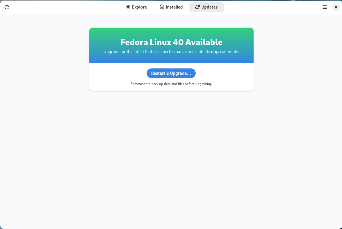
Si vous avez déjà Fedora Linux 39 ou 38 sur votre machine, vous pouvez faire une mise à niveau vers Fedora Linux 40. Cela consiste en une grosse mise à jour, vos applications et données sont préservées.
Autrement, pas de panique, vous pouvez télécharger Fedora Linux avant de procéder à son installation. La procédure ne prend que quelques minutes.
Nous vous recommandons dans les deux cas de procéder à une sauvegarde de vos données au préalable.
De plus, pour éviter les mauvaises surprises, nous vous recommandons aussi de lire au préalable les bogues importants connus à ce jour pour Fedora Linux 40.


 </figure>


 </figure>
<figure class="wp-block-image size-large">
</figure>
<figure class="wp-block-image size-large"> </figure>
<figure class="wp-block-image size-large">
</figure>
<figure class="wp-block-image size-large"> </figure>
<figure class="wp-block-image size-large">
</figure>
<figure class="wp-block-image size-large"> </figure>
</figure>
</figure>
 i7-13700H Processor


 You visited Fedora at Red Hat Summit 2024


 </figure>

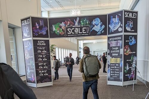 <figcaption class="wp-element-caption">Portal to Linux wonder: SCaLE 21x.</figcaption></figure>
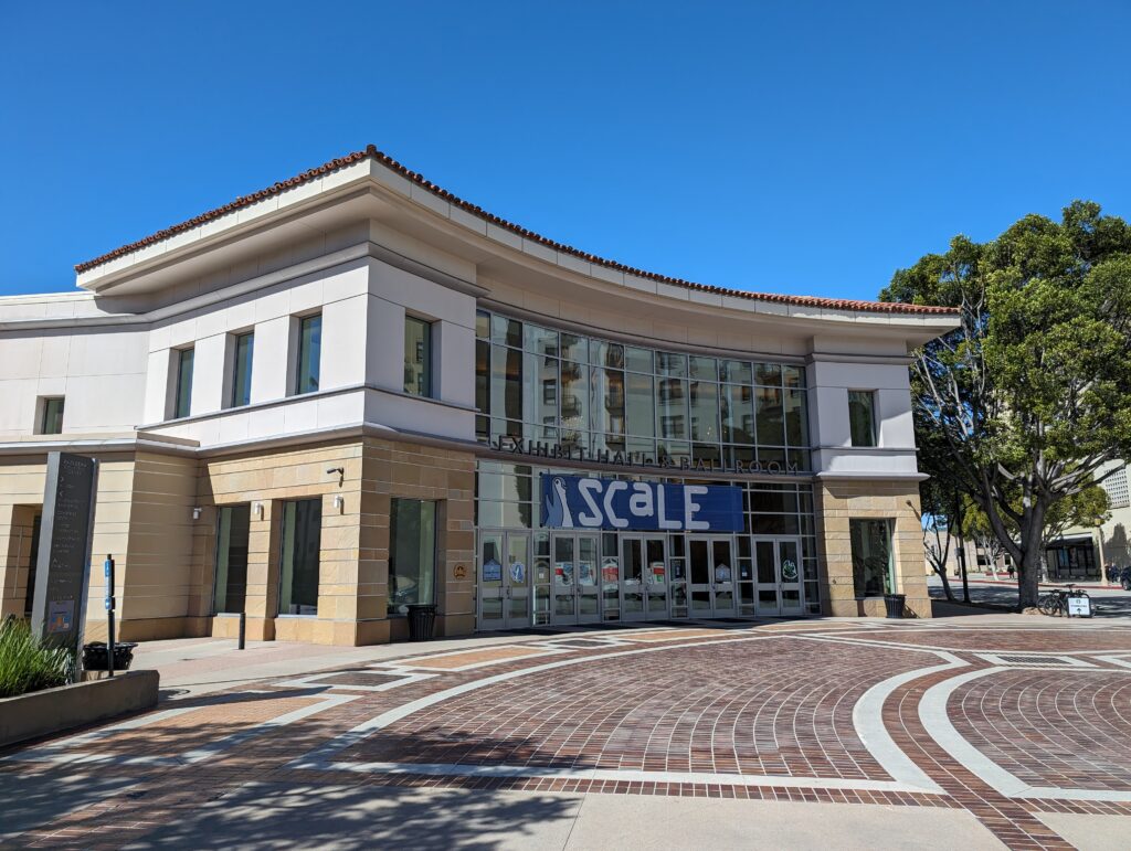 <figcaption class="wp-element-caption">Where SCaLE begins…The front of the main building of the Pasadena Convention Center.
 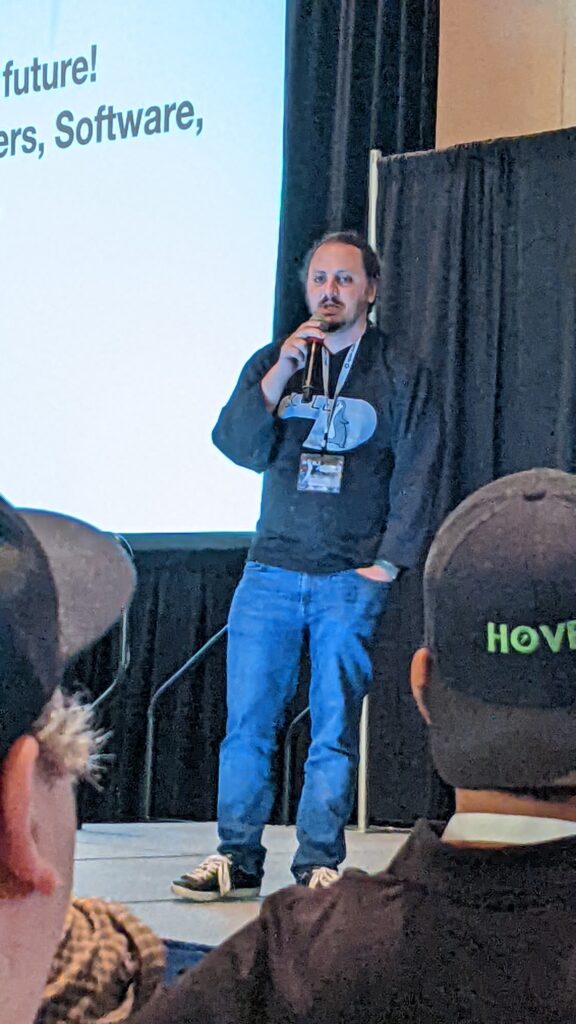 <figcaption class="wp-element-caption">Ilan Rabinovitch</figcaption></figure>
 <figcaption class="wp-block-jetpack-slideshow_caption gallery-caption">Portal to New Linux Ideas</figcaption></figure>
 <figcaption class="wp-block-jetpack-slideshow_caption gallery-caption">The back of the Fedora booth this year…a sheet wall..</figcaption></figure>
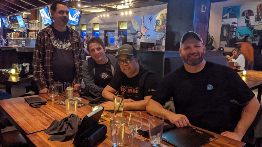 <figcaption class="wp-element-caption">From L to R: Matthew Miller, Shaun McCance, Perry Rivera, and Carl George</figcaption></figure>
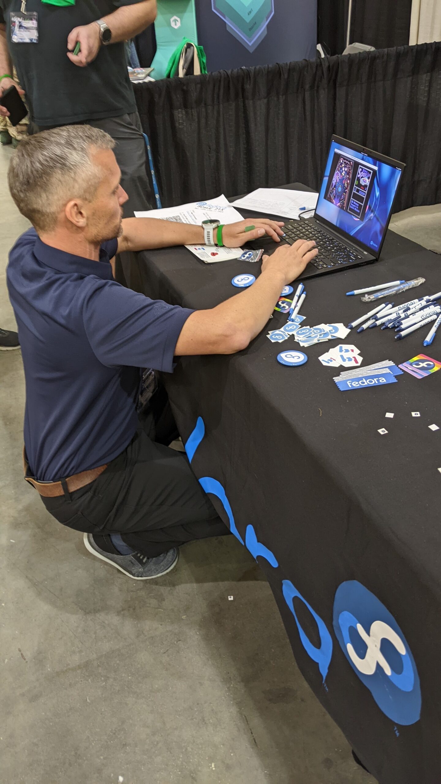 <figcaption class="wp-block-jetpack-slideshow_caption gallery-caption">A guest re-discovers pinball on an immutable desktop</figcaption></figure>
 </figure>
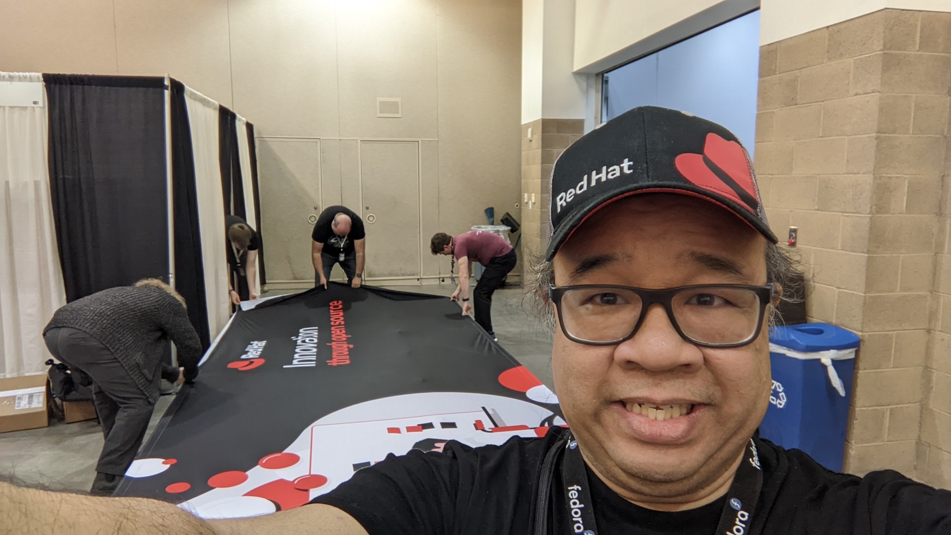 <figcaption class="wp-block-jetpack-slideshow_caption gallery-caption">Red Hatters setting up a booth</figcaption></figure>
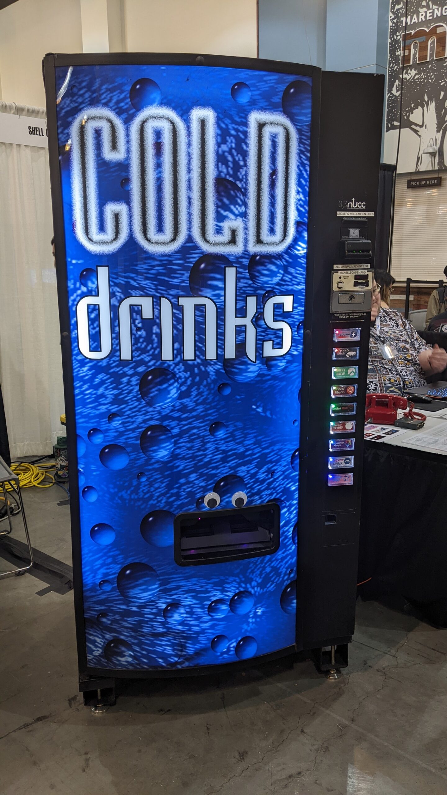 <figcaption class="wp-element-caption">Eye-deal VM Vending Re-use.</figcaption></figure>
<figure class="wp-block-image size-full">
<figcaption class="wp-element-caption">Eye-deal VM Vending Re-use.</figcaption></figure>
<figure class="wp-block-image size-full">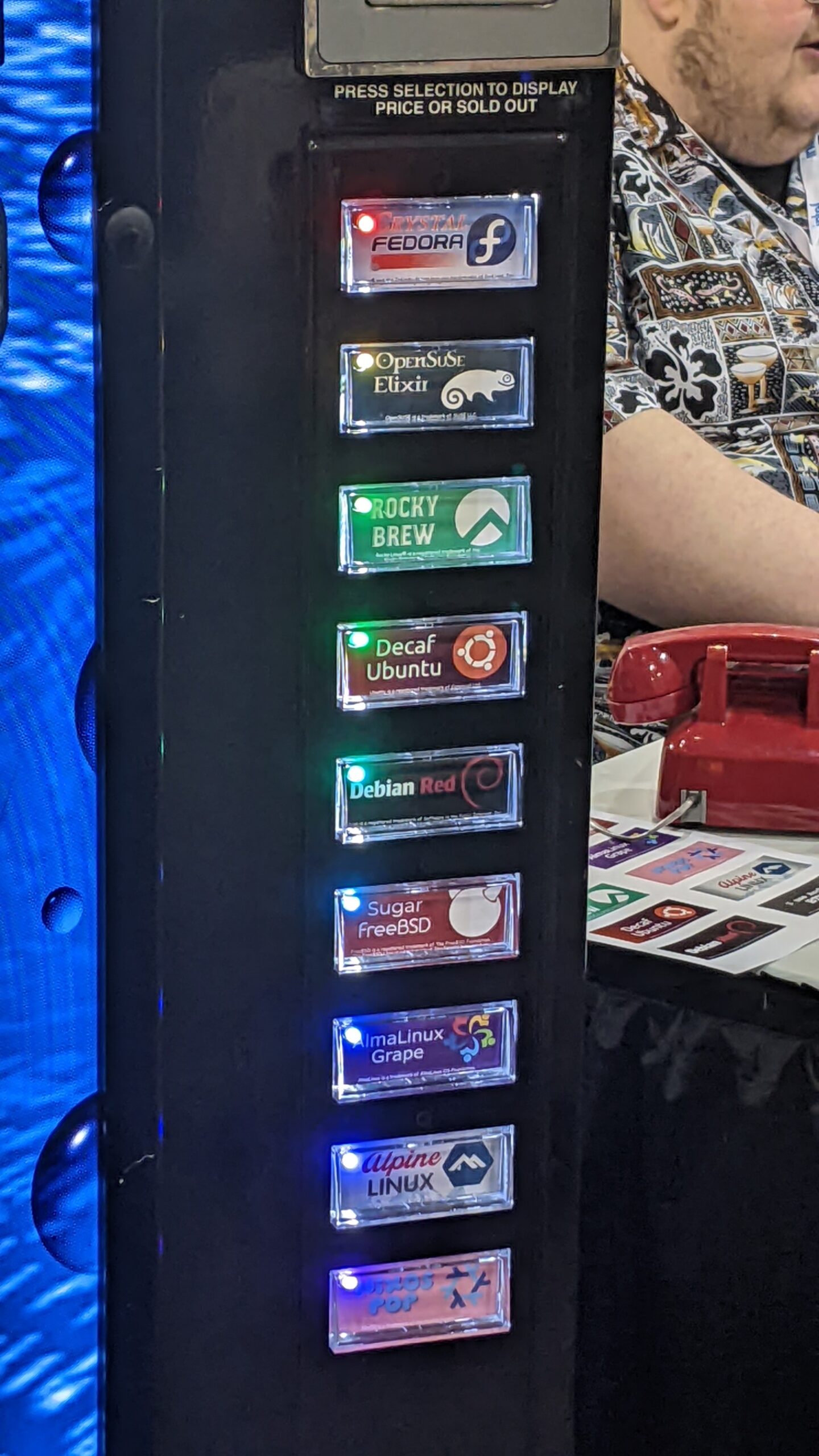 </figure>
</figure>
</figure>
 <figcaption class="wp-block-jetpack-slideshow_caption gallery-caption">El Portal Restaurant for dinner.</figcaption></figure>
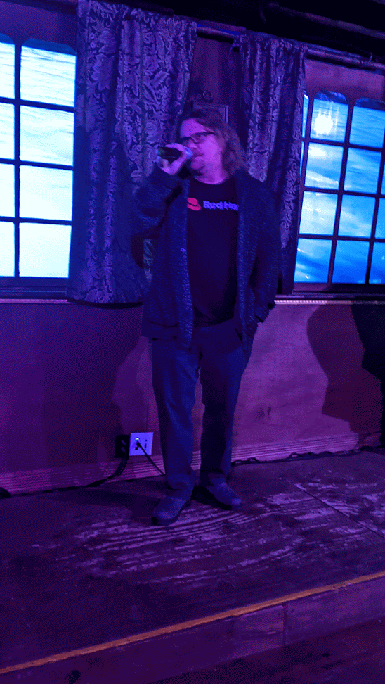 <figcaption class="wp-block-jetpack-slideshow_caption gallery-caption">Rob McBryde: Coordinator of Karaoke goodness.</figcaption></figure>
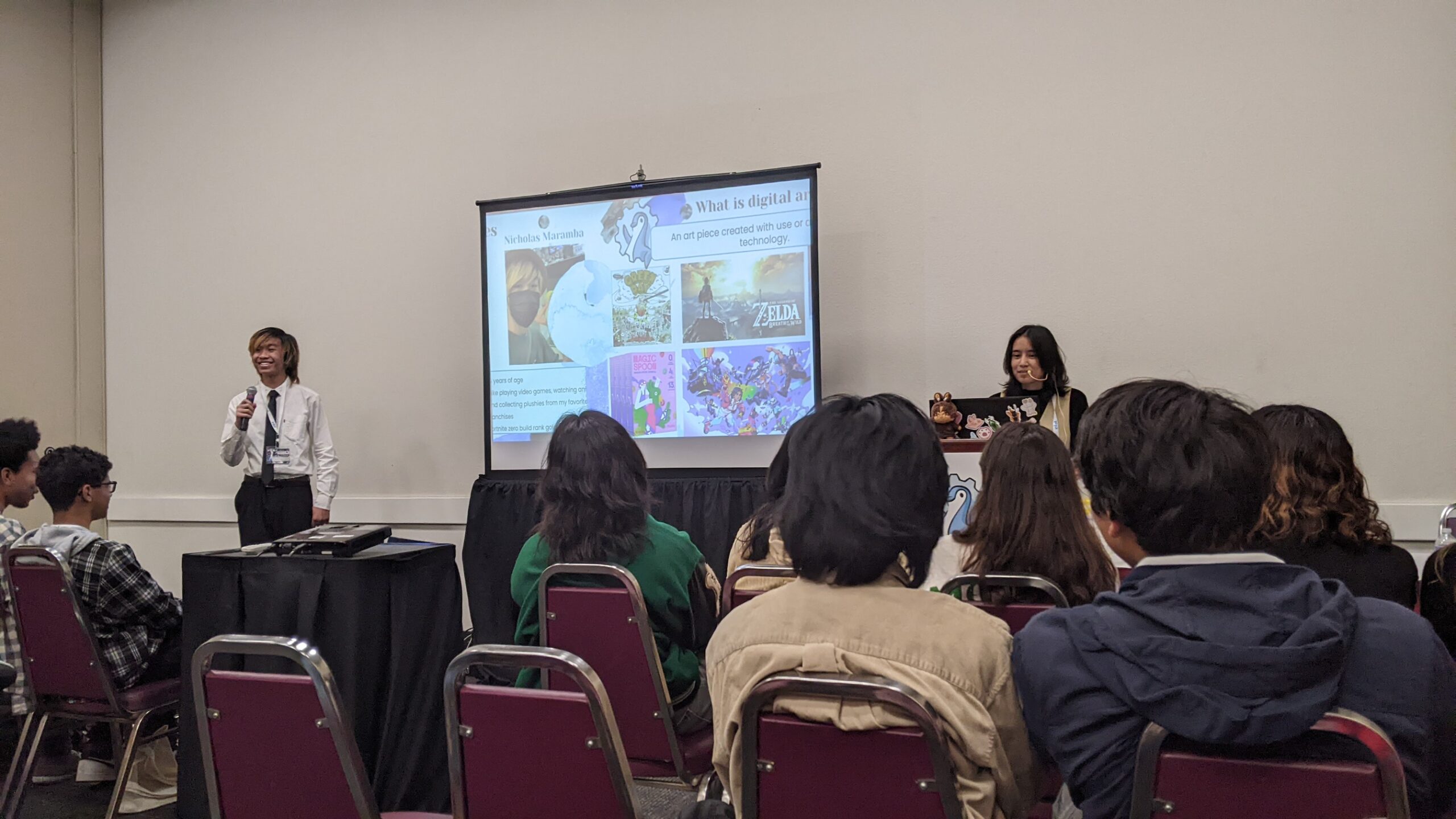 <figcaption class="wp-block-jetpack-slideshow_caption gallery-caption">Nicholas Maramba and Helen Ortiz present “Digital Art Makes You Smart”</figcaption></figure>
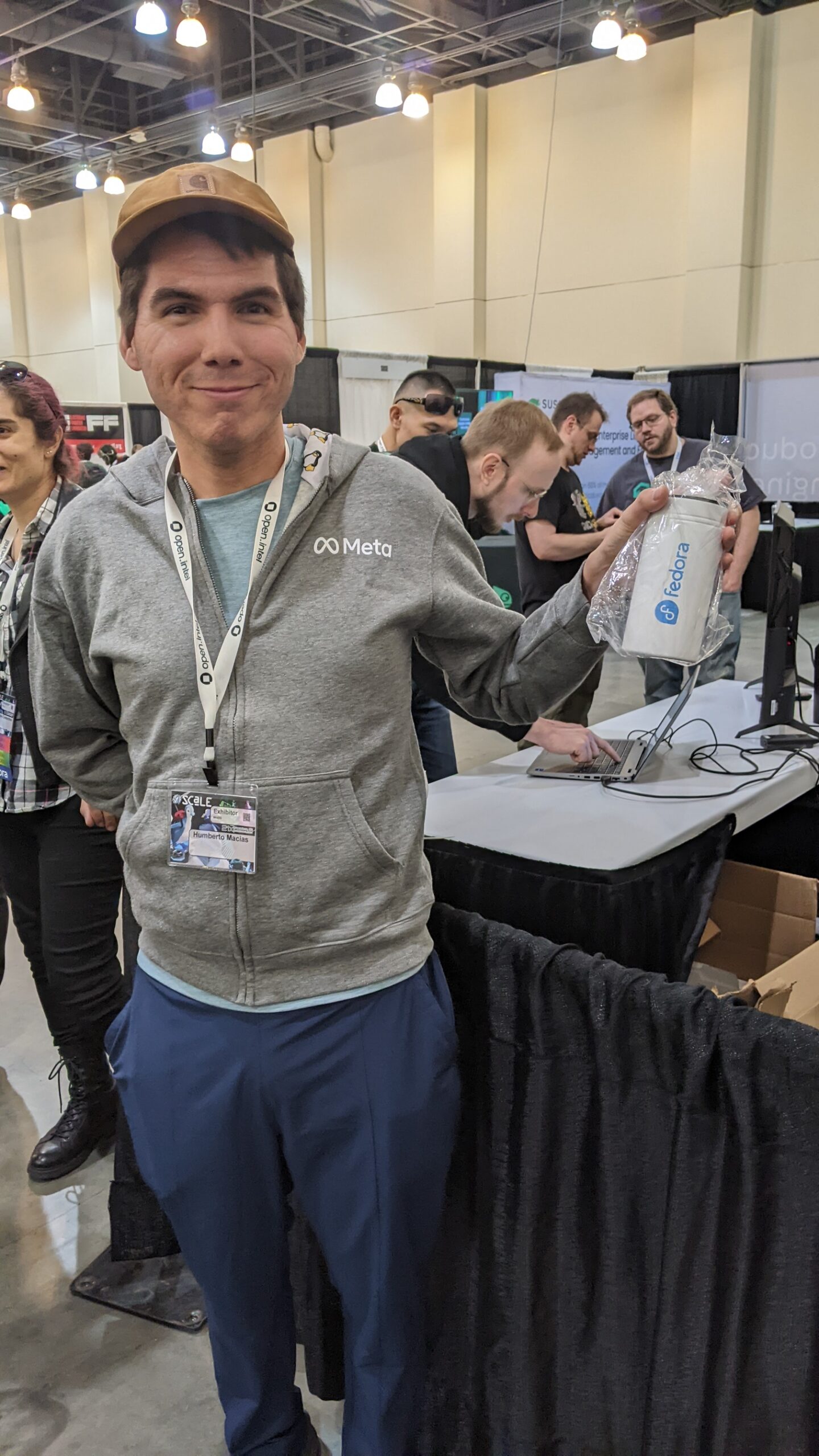 <figcaption class="wp-block-jetpack-slideshow_caption gallery-caption">Humberto Macias, lucky winner of a Fedora commuter tumbler.</figcaption></figure>
 <figcaption class="wp-block-jetpack-slideshow_caption gallery-caption">Portal to the endless wonder of immutable desktops..</figcaption></figure>
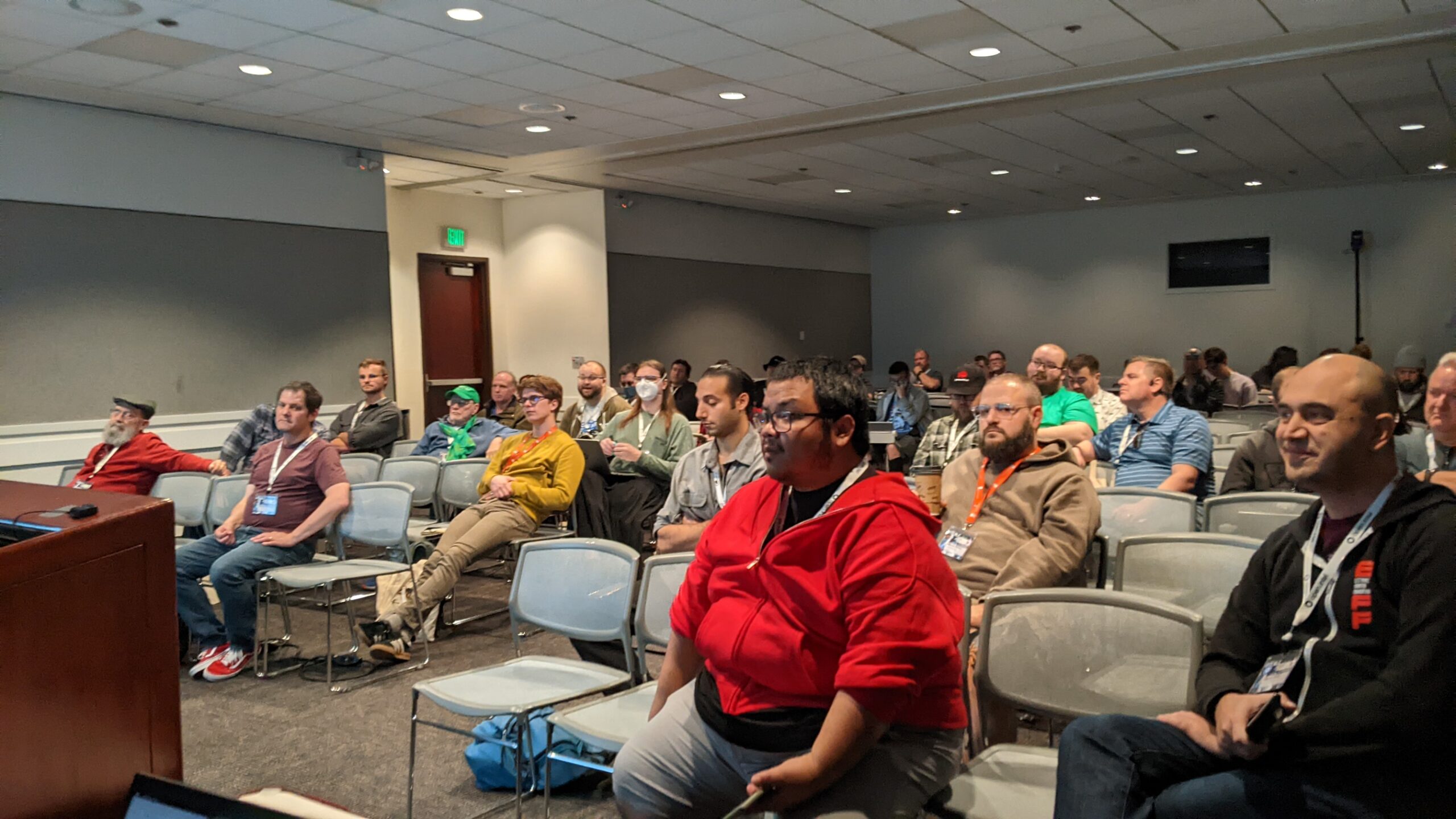 <figcaption class="wp-block-jetpack-slideshow_caption gallery-caption">Guests listened attentively at the Immutable Desktop presentation</figcaption></figure>
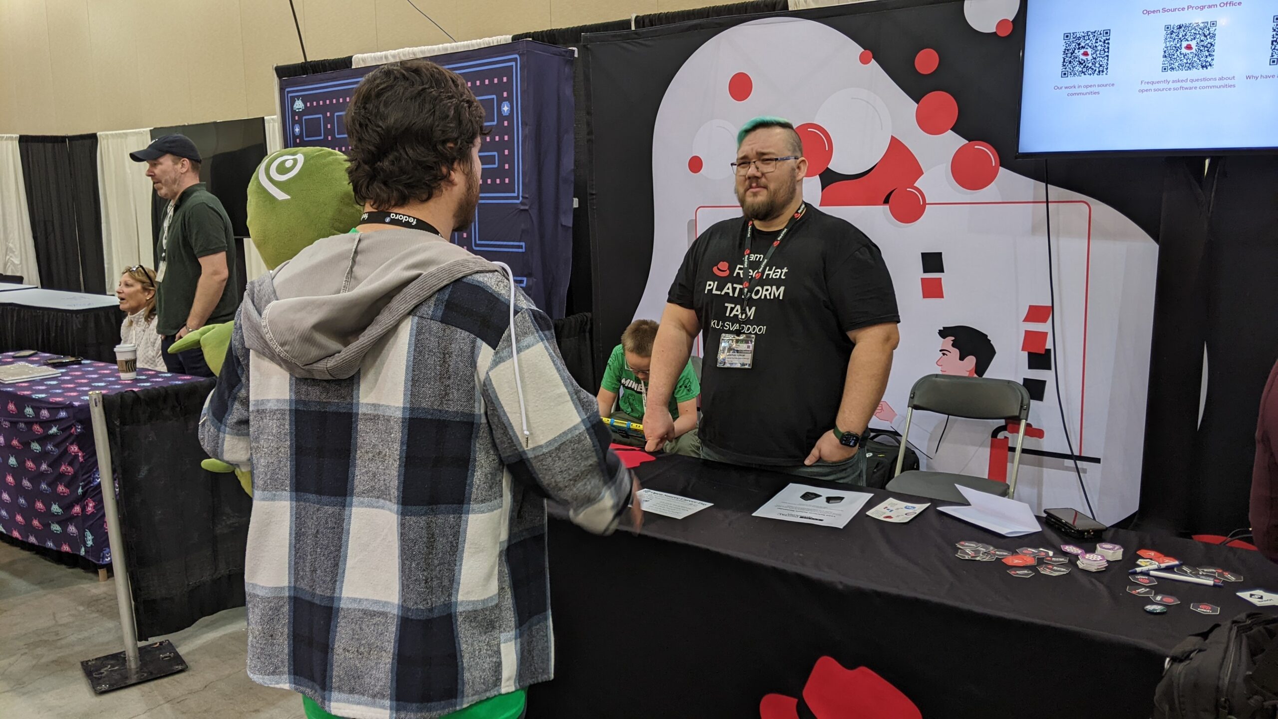 <figcaption class="wp-block-jetpack-slideshow_caption gallery-caption">Scott Williams chats with Joshua Loscar at the Red Hat Booth</figcaption></figure>
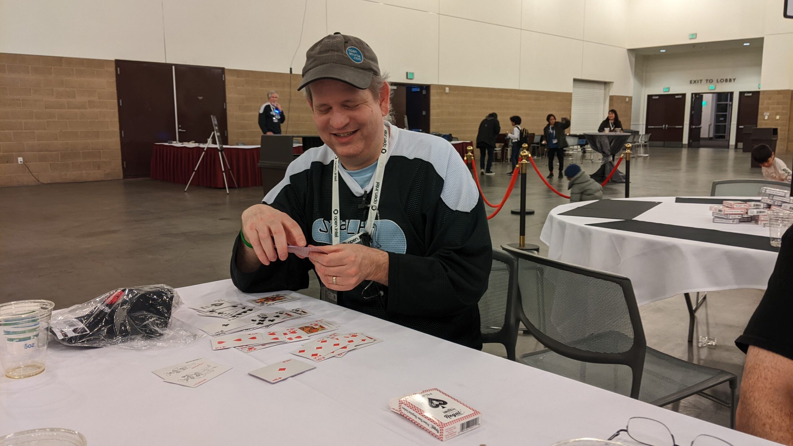 <figcaption class="wp-block-jetpack-slideshow_caption gallery-caption">Jeff Carlson ponders his next move..</figcaption></figure>
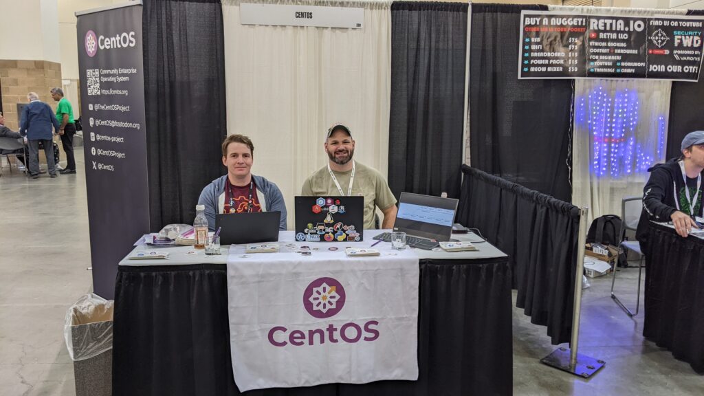 <figcaption class="wp-element-caption">Shaun McCance and Carl George exhibiting at the CentOS booth</figcaption></figure>
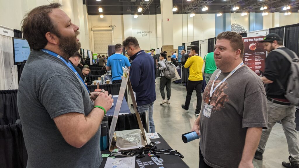
 <figcaption class="wp-element-caption">Brian Monroe chats with a guest</figcaption></figure>
 <figcaption class="wp-block-jetpack-slideshow_caption gallery-caption">Perry Rivera and Kevin Howell</figcaption></figure>
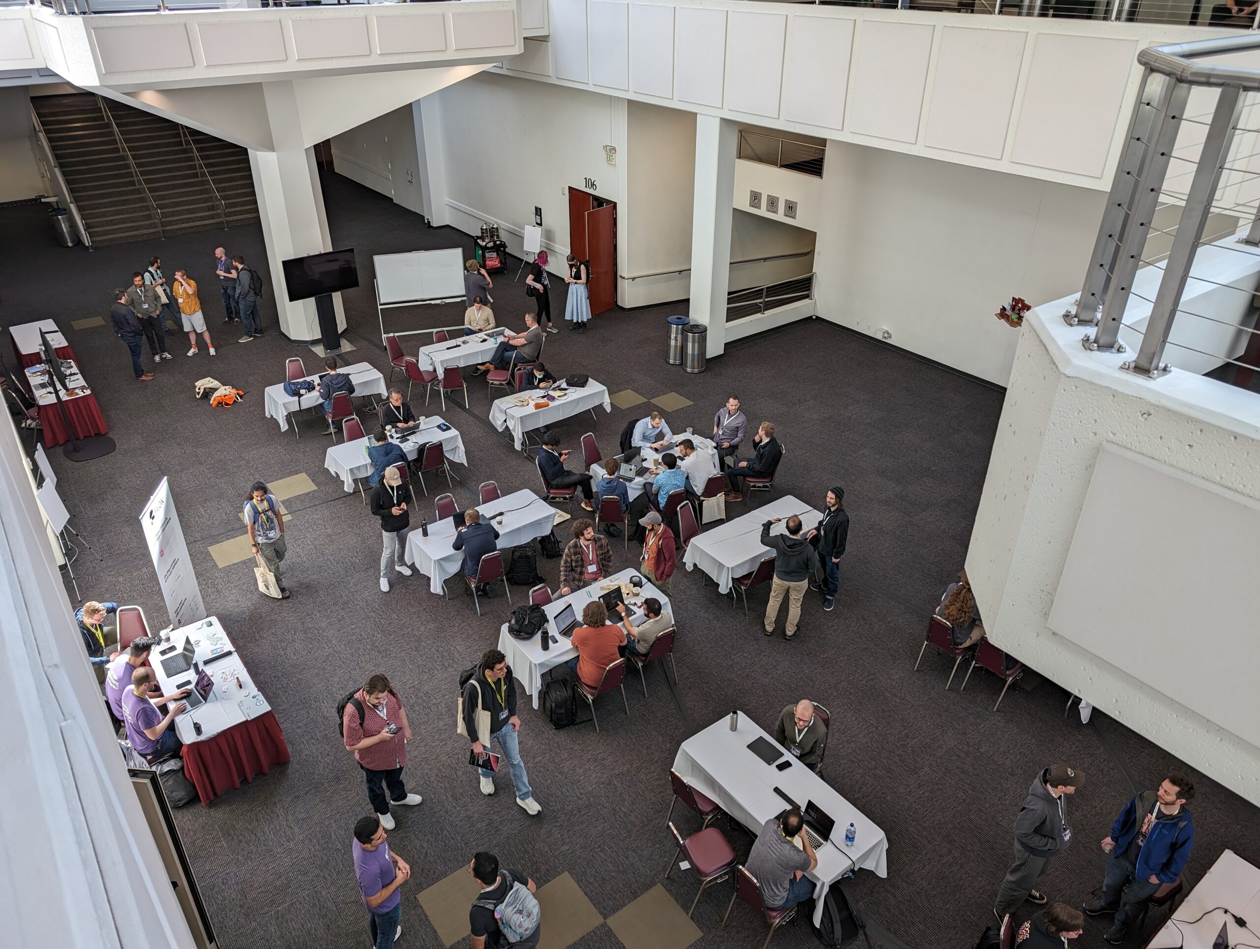 <figcaption class="wp-block-jetpack-slideshow_caption gallery-caption">Conference Center Conversation Flows. Photo by Carl George</figcaption></figure>
 <figcaption class="wp-block-jetpack-slideshow_caption gallery-caption">Patrick Finie and Perry Rivera</figcaption></figure>
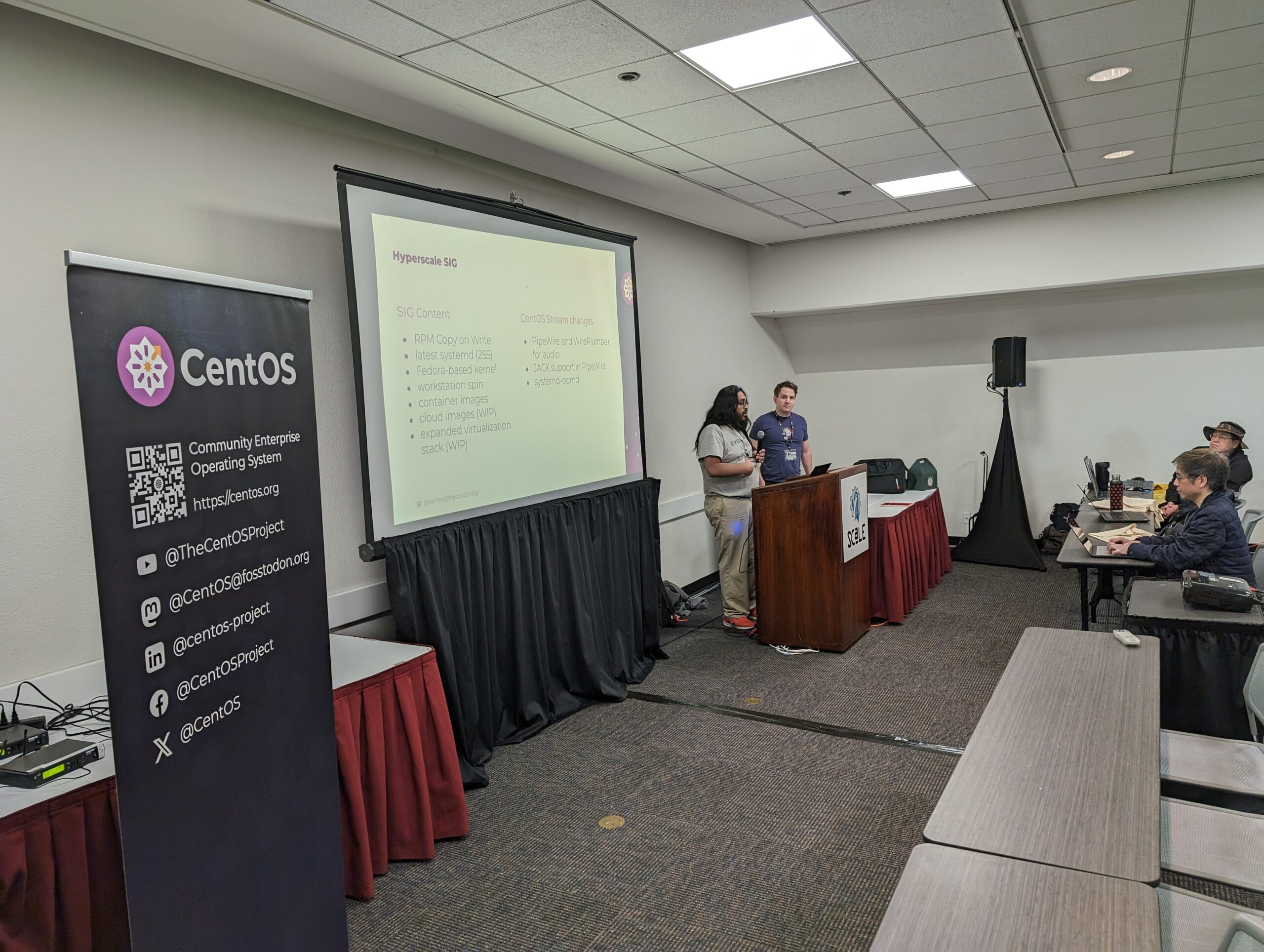 <figcaption class="wp-block-jetpack-slideshow_caption gallery-caption">An engaging kernels workshop by Neil Gompa, Shaun McCance, and Carl George. Photo by Carl George.</figcaption></figure>
 <figcaption class="wp-block-jetpack-slideshow_caption gallery-caption">Ana Ma and Perry Rivera</figcaption></figure>
 <figcaption class="wp-block-jetpack-slideshow_caption gallery-caption">Romy Meyerson@SuSe stops by to visit to say hello..</figcaption></figure>
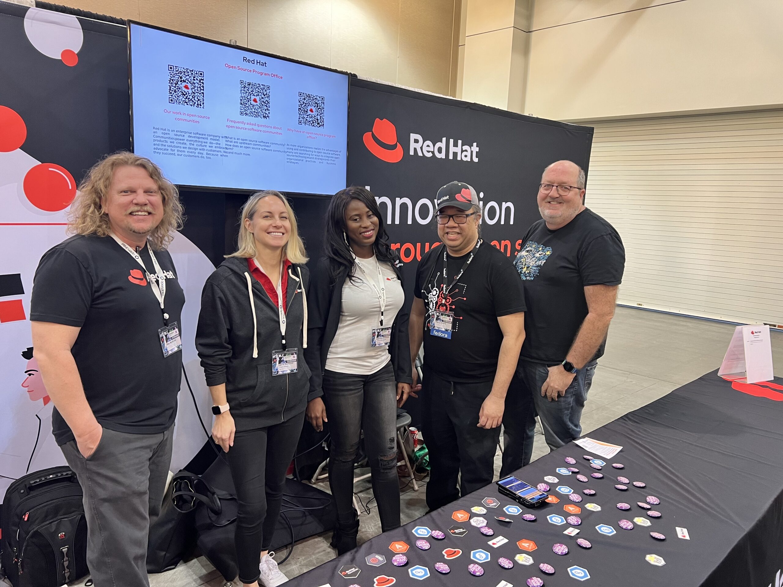 <figcaption class="wp-block-jetpack-slideshow_caption gallery-caption">Rob McBryde, Jaime Burwood, Katherine Nnanwubar, Perry Rivera, and Brian Proffitt</figcaption></figure>
 <figcaption class="wp-block-jetpack-slideshow_caption gallery-caption">Perry Rivera and Siggy</figcaption></figure>
 <figcaption class="wp-block-jetpack-slideshow_caption gallery-caption">Perry Rivera and Marc Provitt from SCaLE 21x’s Game Night event.</figcaption></figure>
 <figcaption class="wp-block-jetpack-slideshow_caption gallery-caption">Discussing SCaLE strategies. L to R: Scott Williams, Brian Monroe, Shaun McCance, and Carl George.</figcaption></figure>
 <figcaption class="wp-block-jetpack-slideshow_caption gallery-caption">Perry Rivera and Bill Cheswick</figcaption></figure>
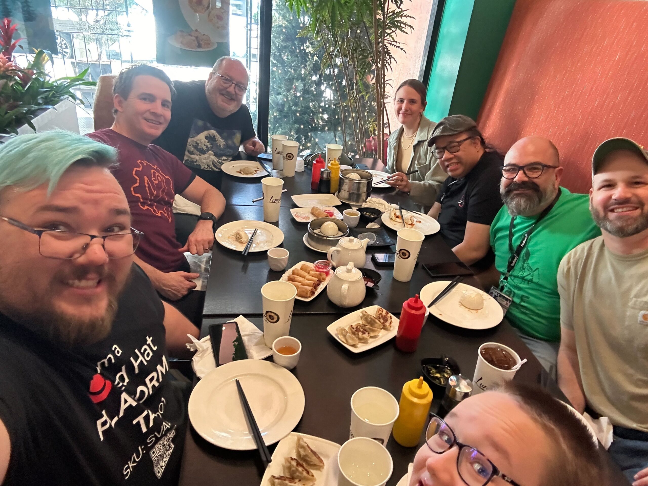 <figcaption class="wp-block-jetpack-slideshow_caption gallery-caption">Clockwise, L to R: Joshua Loscar, Shaun McCance, Brian Proffitt, Cali Dolfi, Perry Rivera, Alex Acosta, Carl George, and Joshua’s oldest son discussing SCaLE week highlights at Lunasia Dim Sum House…</figcaption></figure>


 </figure>
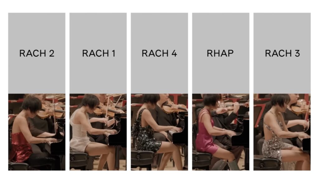
 — enquanto executava uma façanha sem precedentes: tocar todos os 5 concertos de piano de Rachamninoff em uma única apresentação de mais de 4 horas de duração. Mediram também a frequência cardíaca do regente
 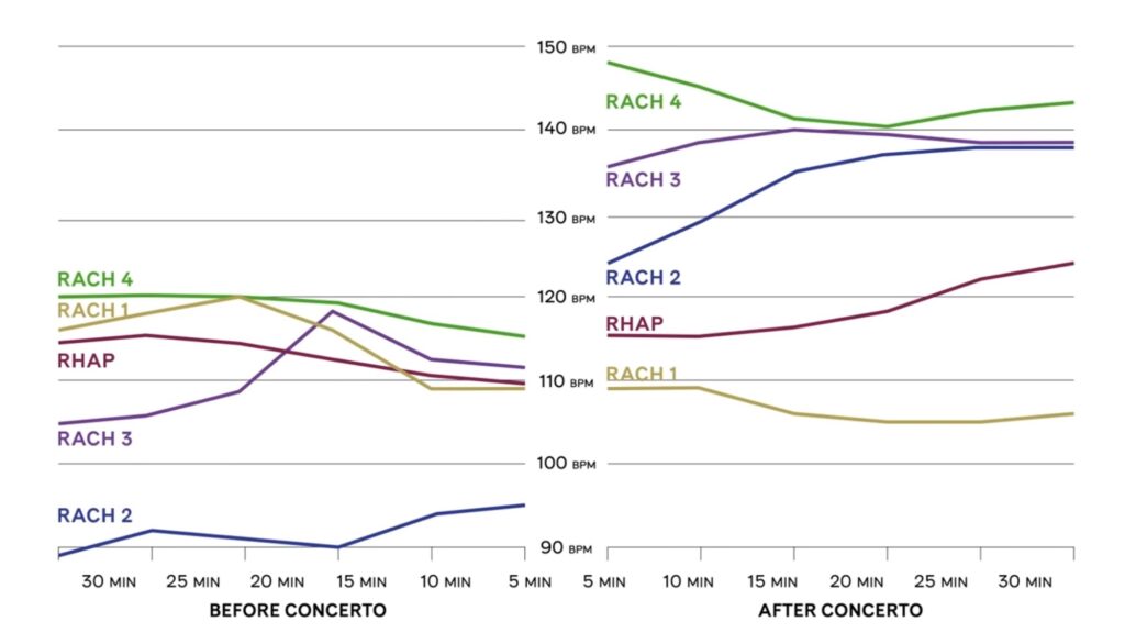 </figure>
<figure class="wp-block-embed is-type-video is-provider-youtube wp-block-embed-youtube wp-embed-aspect-16-9 wp-has-aspect-ratio">
</figure>
<figure class="wp-block-embed is-type-video is-provider-youtube wp-block-embed-youtube wp-embed-aspect-16-9 wp-has-aspect-ratio">
 </figure>
 Here are some stats from FAW 2023:

 You can check out all the articles highlighting what happened during FAW:
 </figure>
 </figure>
 </figure>

 ︎
︎ You helped solidify the core for the Fedora 42 rebase!
 You helped solidify the core for the Fedora 41 rebase!
 You helped solidify the core for the Fedora 40 rebase!